The WordPress sidebar has been a mainstay feature of both free and commercial themes. It seems that, no matter how the content management system (CMS) evolves, the sidebar has triumphantly (and, perhaps defiantly) come along for the ride.
How has it survived this long? For one, it continues to serve a useful purpose. It houses various widgets that can be consistently displayed throughout a website. Through the help of a plugin or theme, you can even display a sidebar or specific widgets based on things like the current page, post type, and user login status.
And, despite its name, a sidebar can be placed virtually anywhere within a template and arranged vertically or horizontally. Not only will you see them on the left or right side, but within footers and content areas as well.
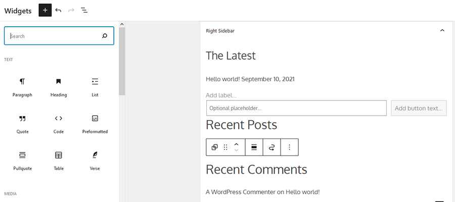
But things are changing. Now that the WordPress Widgets screen has adopted a UI similar to that of the Gutenberg block editor, it’s worth wondering what the future holds for this theme staple.
Today, we’ll take a quick trip back in time and examine what has made the sidebar so special. From there, it’s on to some potential ideas for a new era. Perhaps there’s a little life left in this old friend, after all.
The Most Flexible Part of a WordPress Theme
For many years, the sidebar brought something unique within the confines of WordPress. Namely, it was the antithesis of the old Classic Editor.
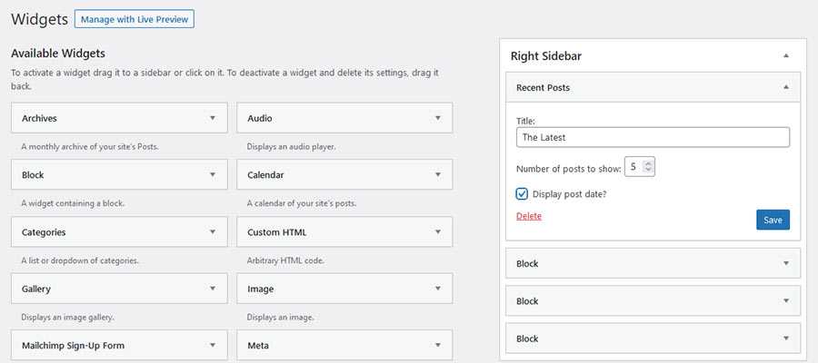
Whereas the Classic Editor was a basic WYSIWYG experience, the Widgets screen almost seemed futuristic. You had the ability to drag and drop individual widgets, reposition them however you like, and add new ones with a click. This was miles away from simply typing content into a box and formatting it.
Then there was the advanced functionality. Want to list all of the tags on your site? You can use the Tag Cloud widget. Want to curate a list of recent posts? It’s easily within reach – without having to utilize a single bit of code.
It was like blocks before there were blocks, people. And, while I’m not aware of any direct correlation, it’s not hard to see at least some philosophical similarity between the “classic” Widget screen and the block editor.
During its heyday, the sidebar ended up being the most flexible part of a WordPress theme – and it was built right into core. If you wanted that sort of functionality in the editor, it would require the use of a page builder plugin. That is until Gutenberg came along.

Blurring the Lines between Widgets and Blocks
There used to be a clear separation between widgets and other WordPress content types. Widgets looked and worked like nothing else in the back end. But that is no longer the case.
Now, virtually any Gutenberg block can be used in a sidebar. On the one hand, it adds a layer of flexibility that was missing. Sidebar content is no longer limited to just a list of posts, a search field, or login form.
At the same time, the block editor makes it possible to use content that was previously limited to sidebars – anywhere within a page. The result is that you no longer need a sidebar in order to add widget-like functionality.
The line has become blurred, if not altogether erased. Not to mention the fact that Full Site Editing (FSE) allows headers, footers and everything in-between to be tweaked via the editor.
This begs the question: what, if any, role does the sidebar have in modern WordPress themes?

Going Back to the Original Strength of the Sidebar
When you think about it, the WordPress sidebar has served as both a standalone feature and a workaround. It provided a way to do something that wasn’t possible with the Classic Editor.
However, the need to use it for workaround purposes has all but disappeared. At least, in the case of adding content or functionality to specific pages. That can be done just as well in the block editor itself.
You won’t, for instance, need to register a sidebar if you want to display a list of recent articles on a single page. Adding a block will accomplish the same thing, only easier.
Otherwise, the sidebar still remains relevant for niche use. Consider it for a situation where a consistent set of content needs to be displayed throughout a website or post type.
For example, if you want to provide users with a multicolumn area where they can log in, view the latest blog headlines and get the weather forecast, a sidebar may be the perfect solution. Users will have access to this content no matter where they are on your site. And you’ll be able to make edits in a centralized location.
And perhaps that’s more in line with the original idea of what a sidebar should do. We may have used it in all sorts of hacky ways, but that’s no longer necessary. Now, it’s just another tool that can be reserved for a specific use case.

The WordPress Sidebar Lives On
Maybe we can start likening the WordPress sidebar to the cockroach. Much like the pesky bug, sidebars are survivors – no matter what evolution throws at them.
The big difference is that the sidebar isn’t likely to be used as often as it once was (roaches, however, don’t appear to be any less prevalent). That’s not necessarily a bad thing.
Sidebars will still be there for the times when we need them. And they’ll still be good at what they do. Best of all, we no longer need to bend and shape them to fit an unintended use.
Instead of being a way to get around a limitation within WordPress, they’re a means to achieving a specific goal. That sounds like a pretty noble existence to me.
The post Pondering the Future of the WordPress Sidebar appeared first on Speckyboy Design Magazine.
0 Commentaires