When crafting business cards, it is often believed that everything lies solely in the design. We tend to rely on eye-catching illustrations, unique typography, or clever ideas that make our 3.5 x 2-inch card stand out in a sea of others. However, there is always an alternative worth exploring. This alternative involves experimenting with the actual material used as the base for your business card.
One solution that holds the power to truly transform a business card is the use of holographic foils. Their inherent properties offer a vibrancy that spans from light to dark tones, catering to the diverse needs of various designs and styles. Let’s delve into our selection of inspiring examples that demonstrate the immense potential of taking this approach.
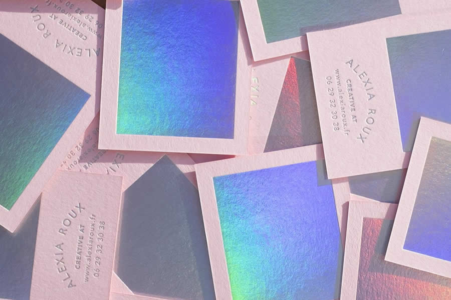
Pink & Holographic Business Card Designed by Alexia Roux
The name of this project says it all. The business card takes its beauty from the color pink and a holographic foil that covers a significant part of the front side.
The latter has been designer using colder colors that perfectly balance the pink background, keeping it from looking too schmaltzy. Paired with the letterpress effect, it makes the content look fantastic. The business card conveys not just a feminine beauty, but also the creative soul of the designer.
Sweetland’s Business Card Designed by Lukasz Drozdz
Standing in stark contrast to the example above, the brand identity of Sweetland shows everyone that dark paper and holographic foil can form a potent partnership.
While the black paper gives the design a strong businesslike feel, the radiant holographic foil features a gorgeous gradient, making it feel sophisticated.

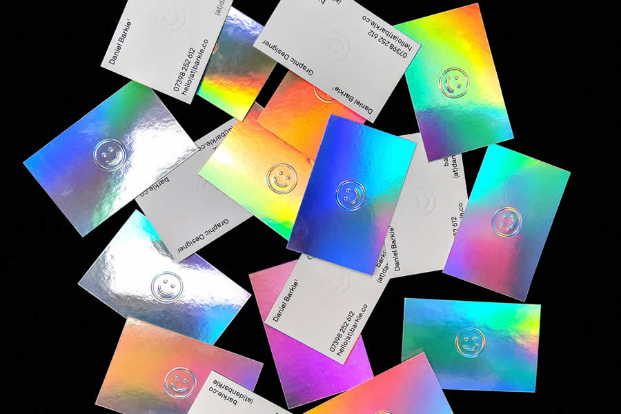
Daniel Barkle’s Personal Identity Designed by Dan Barkle
The personal identity of Daniel Barkle gives us a lovely combination of silver foil with a gradient overlay that creates a subtle holographic effect.
It is used on the entire front of the business card, making it eye-catching. The backside of the card is fairly minimal and clean, with all the contact information allocated to the corners, making it feel spacious. On the whole, the card looks businesslike with a touch of chic.
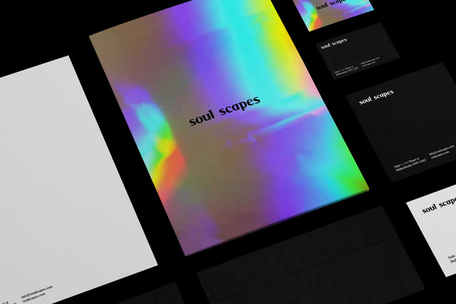
Soul Scapes Branding Designed by Mai Creative
Much like the previous business card, the silver foil effect in this example is the focus. It not only offers a simple metallic effect, but it also establishes the mood.
Both cards look similar, but the designer behind Soul Scapes has used a dark background and white font on the backside. This twist gives the design a classy appeal.
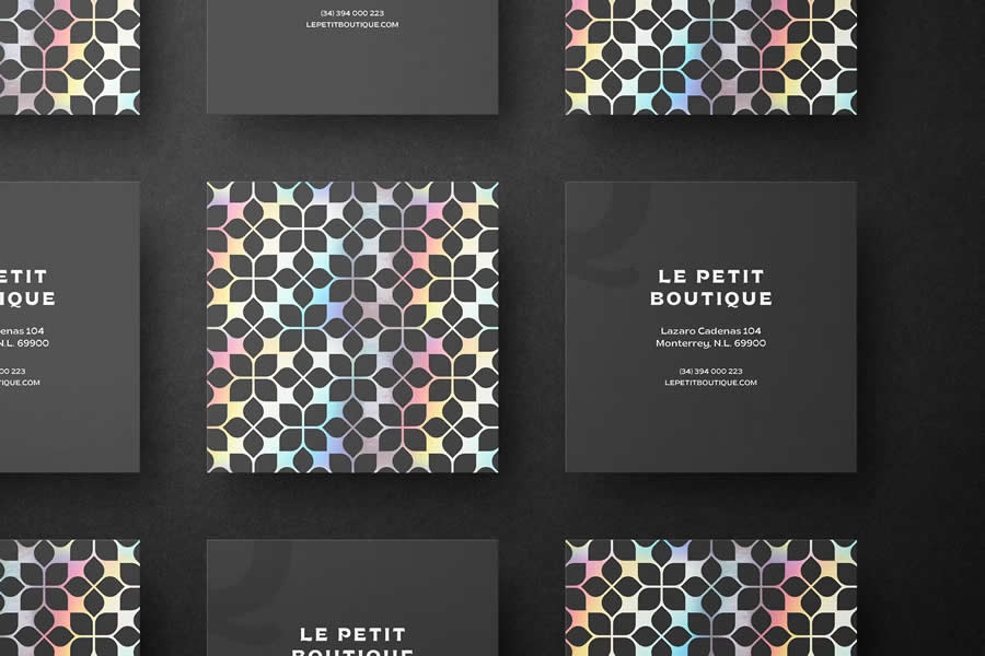
Square Holographic Business Card Designed by Pixelbuddha
This high-resolution, square-shaped business card template boasts a mesmerizing holographic effect. Its unusual and effective memorable layout guarantees a lasting impression.
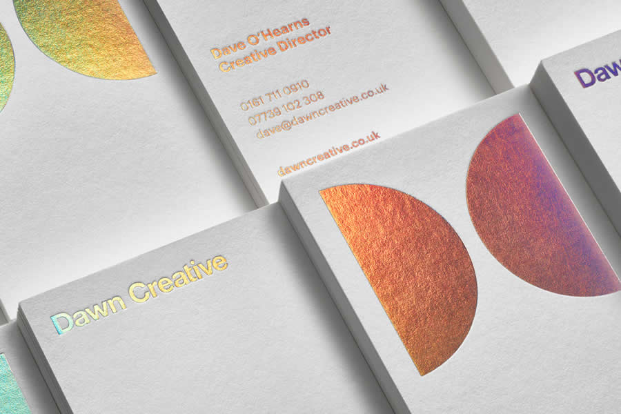
Dawn Creative’s Identity Designed by Dawn Creative
With Dawn Creative, the holographic foil is not just used for decorative purposes. It’s also a way to display the content on both sides of the business card. The card’s front side greets potential clients with two clever semi-circles that symbolize the agency’s branding.
The back of the card, in turn, contains all of the contact information, which glows at various angles. Note the high quality of the paper. As a result, the business card feels sophisticated.
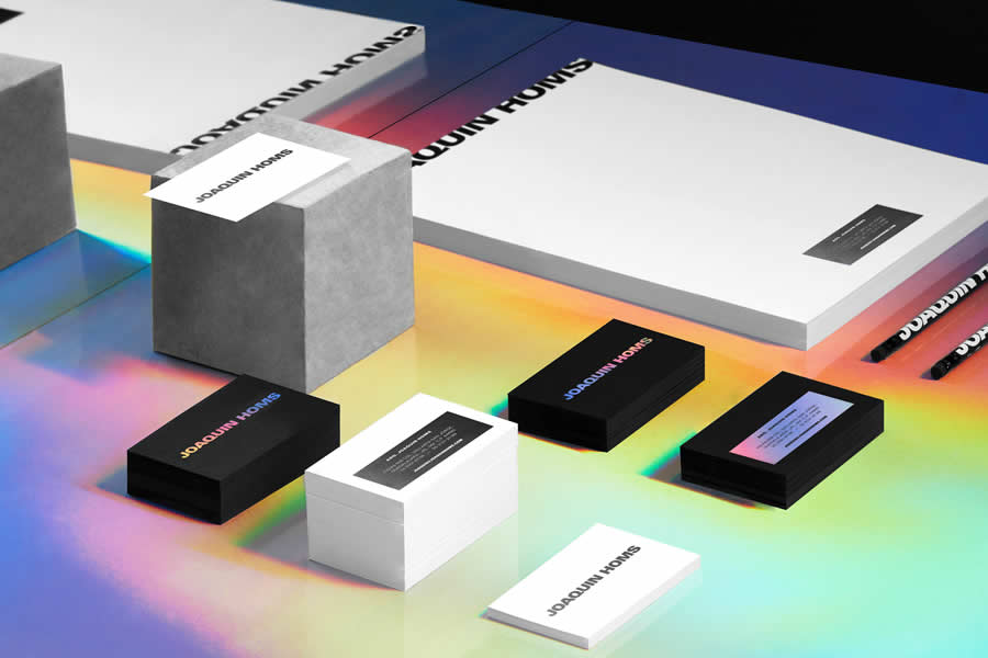
Joaquin Homs Branding Designed by Anagrama Studio
The personal brand identity of Joaquin Homs has two variants. The first features a radiant holographic foil to display his name on the front. It serves as a base for the contact information on the back. In contrast, the second option has the same design but uses silver foil.
The business card with the holographic effect instantly commands attention with its warm appearance. Even though the black paper attempts to hold back the vibrancy of the foil, you can still feel its power.
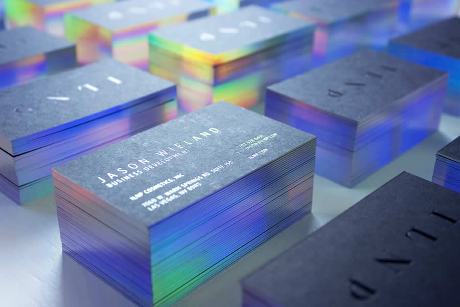
ILNP Boutique Cosmetics Designed by Marcin Usarek
In this business card example, the silver foil makes the letterpressed name stand out from the textured grey background, and the holographic effect on the edges gives the card a touch of vibrancy. This design is excellent for those who want to stick to a businesslike card yet still be brave enough for a little holographic creativity.
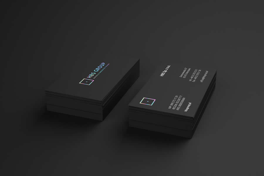
HBS Group Designed by Lange & Lange
If you are not quite ready to be swept away by the holographic effect, you can simply use it for establishing natural focal points on your business card, like the way the creative team behind the HBS Group brand identity has done.
They have merely sprinkled the business card with a bit of holographic magic that lightens the mood and enriches the dark environment with a marvelous classic appeal.
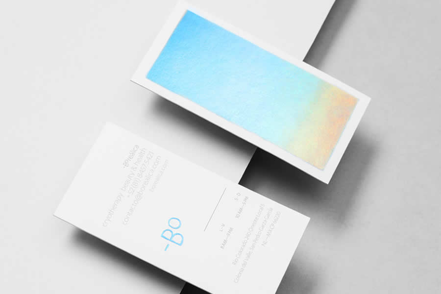
Borealica’s Business Card & Identity Designed by Anagrama Studio
In this example, the designers behind Borealica have used a holographic pattern as a decorative panel on the front side of the card and made it the main design feature.
Even though it occupies almost 90% of the card, it doesn’t feel overwhelming. On the contrary, its gentle beach-inspired gradient makes it soft and kind to the eye.
Holographic foil is a compelling medium. It is not just fancy paper with intricate coloring. It’s much, much more than that. It can sometimes exude a personality that can sometimes be difficult to hold back.
But, if you pair it with high-quality paper, subtle coloring, a beautiful font, and a large scoop of creativity, you will end up with a business card that no one will forget in a hurry.
The post 10 Beautiful Business Cards with Holographic Effects for Inspiration appeared first on Speckyboy Design Magazine.


0 Commentaires