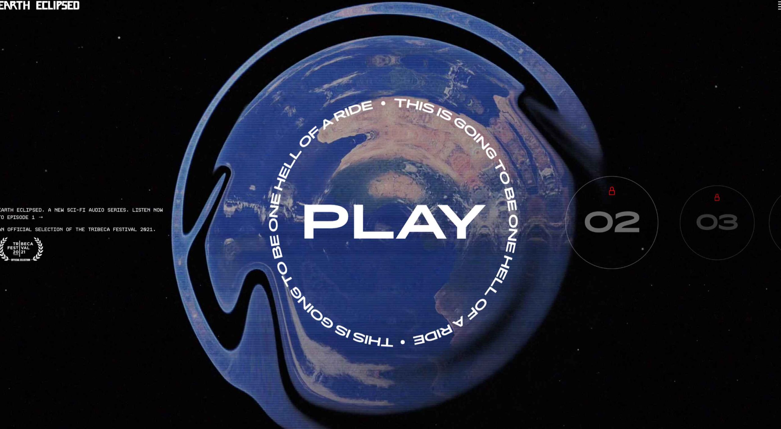
 Design trends on top of design trends. This theme of this month’s collection is trends that seem to build on each other. These examples use multiple trends listed here: hero typography, round buttons, and big branding.
Here’s what’s trending in design this month…
1. Hero Typography
Big, bold, and even unusual typography choices are the norm right now for hero headers in website design. The thread in this design trend is that type options seem to break all the rules – and it doesn’t matter.
These hero typography styles are often dramatically oversized, use unusual or nontraditional type styles, and break at least one common rule of typography. The trick is to do these things while creating a visual that still works.
For the most part, that means the typographic element is the dominant art, although not always. The examples below each take a different approach and can give you an idea if you love this website design trend or not.
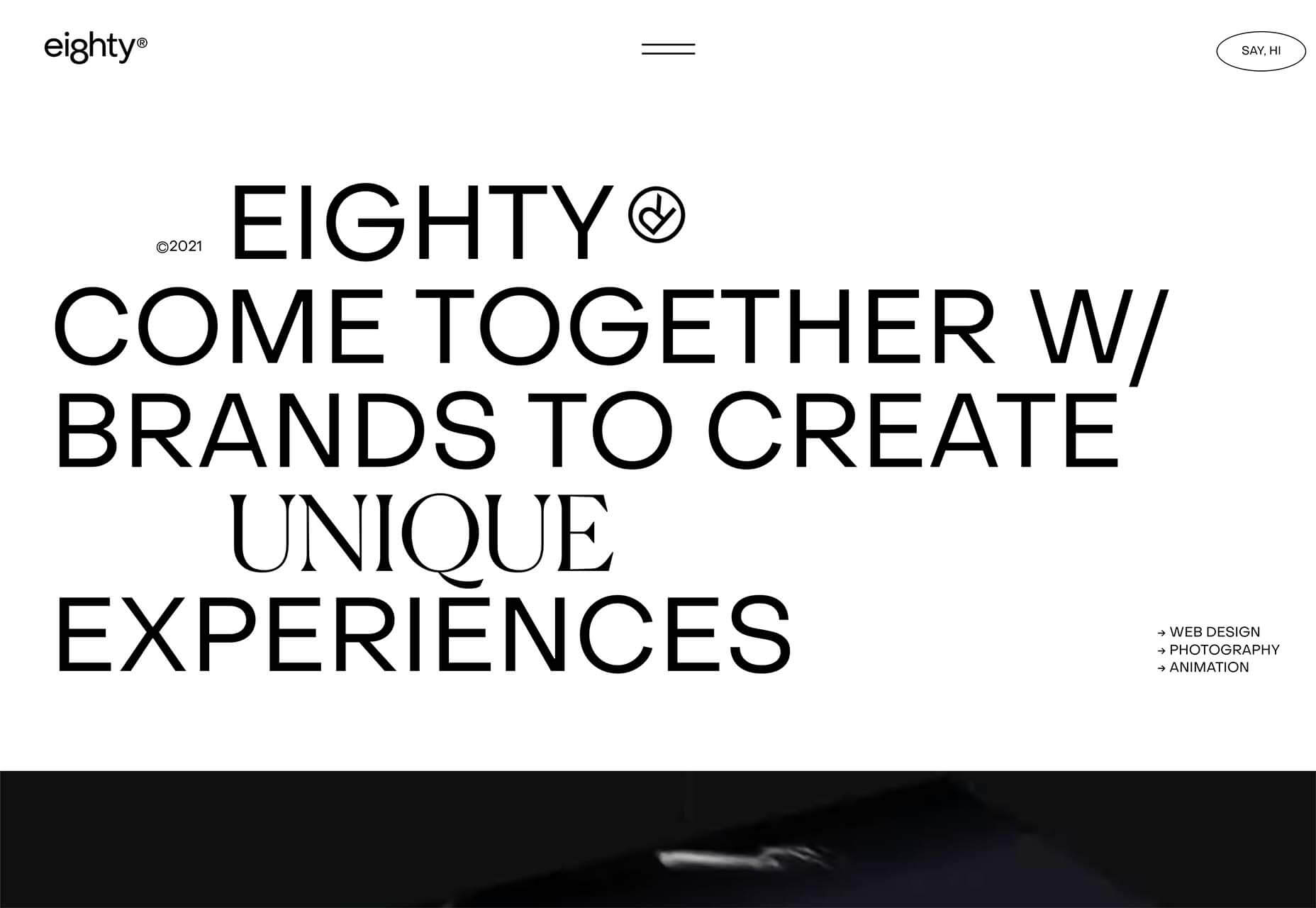
Eighty uses oversized type elements with almost nothing else above the fold. The rule-breaking happens on the fourth line of text with a scrolling series of serif words. The two typefaces don’t seem to match and have a stark contrast. There’s also the sneaky registered trademark icon that’s spinning next to the brand name. (Another trend – big branding – that we dive into more below.)
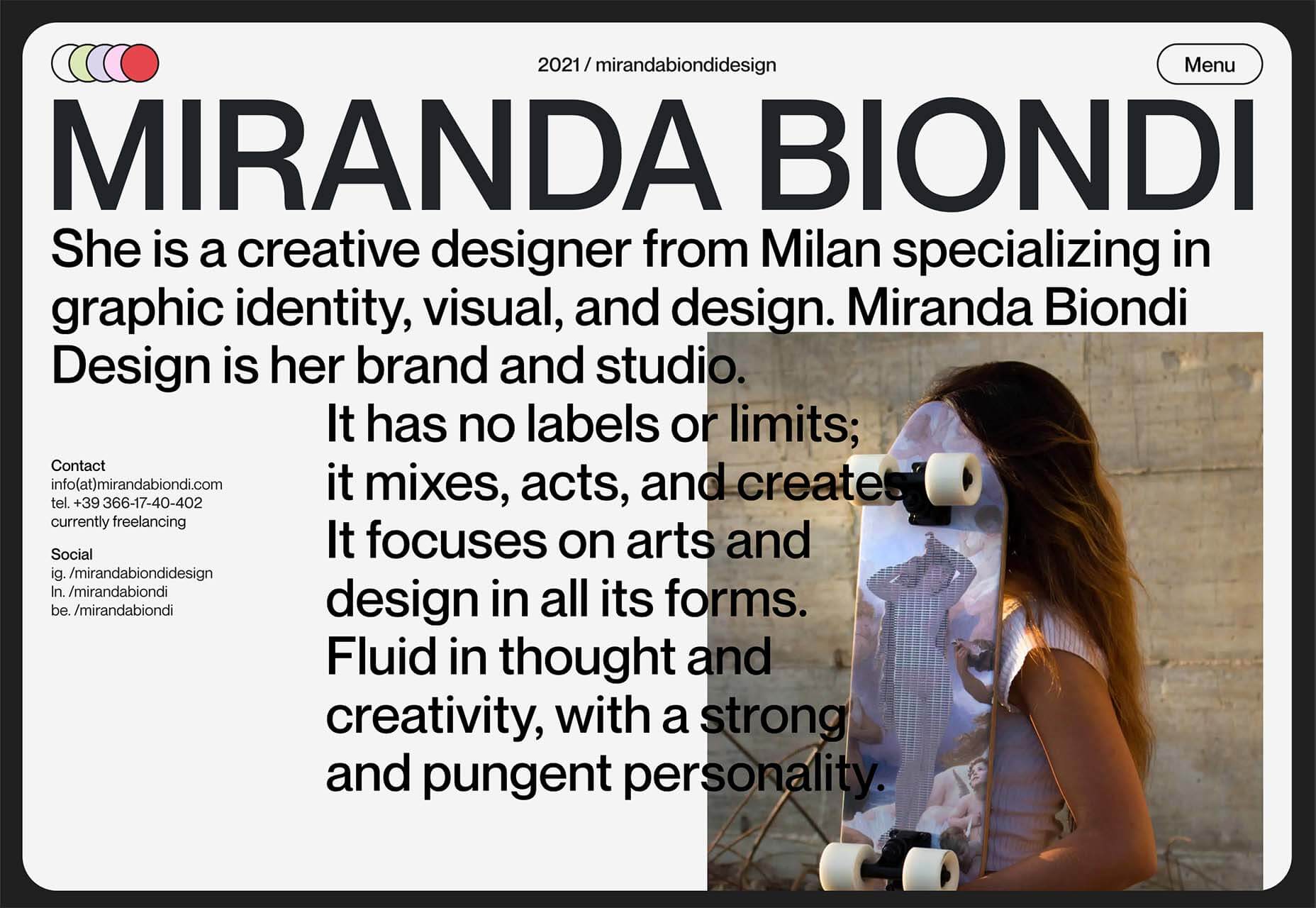
Miranda Biondi uses super large text to grab attention – and a lot of it. The design also sneaks the contact and social media links in an unusual location, creating an odd text wrap that pushes the image. You can see the broken “rules” there. Overall, it is very attention-getting but a little difficult to read.
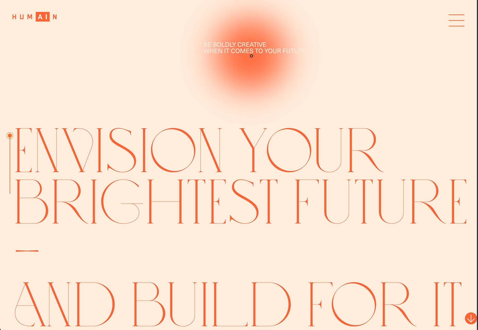
Humain’s homepage is rooted in a font choice that’s pretty unexpected. The all-caps serif is thin and complex. It’s not exceptionally easy to read, although it is beautiful. There’s a second level of hidden text that you can discover with hover and the brighter sphere.
2. Round Buttons
Buttons have been mostly rectangular for a while. Some have hints of rounded edges, but nothing as distinct as the circular buttons that are growing in popularity.
Round buttons are having a moment from major call to action click elements, to timeline navigation or secondary actions.
What’s nice about this trend is that simply the change from a rectangle to a circle is enough to make you look at the element because it is different from what you might expect. The challenge is ensuring that users understand the interactive quality of circles in these instances.
When using a nontraditional element such as this, it is important to include common cues so that users know what to do with round buttons. This might include tooltips, hover actions, shadows, or tiny animations that draw users to the designs.
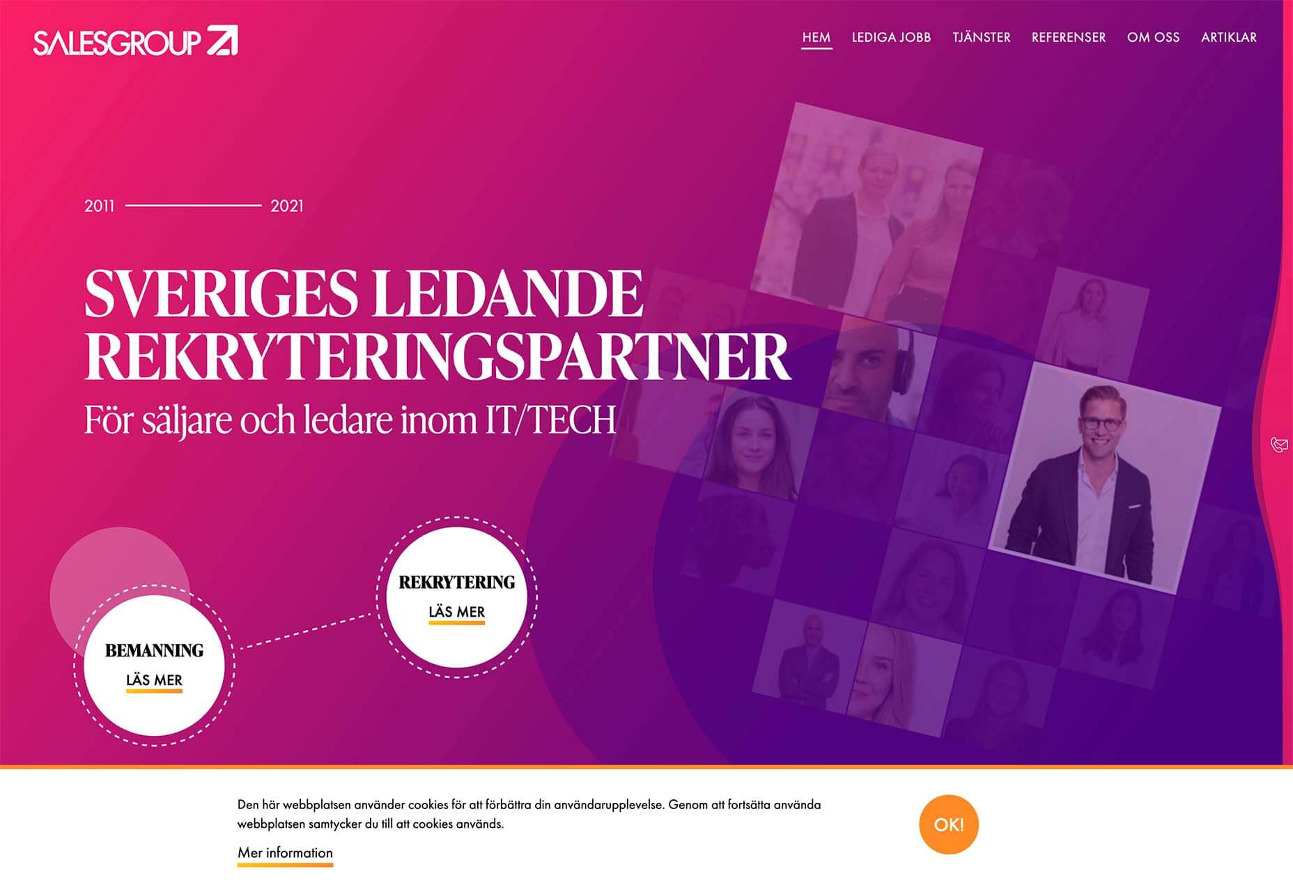
Salesgroup uses small hover animations on the circular buttons. It further emphasizes it with a circlular button for the cookie notice that pops up on the screen.
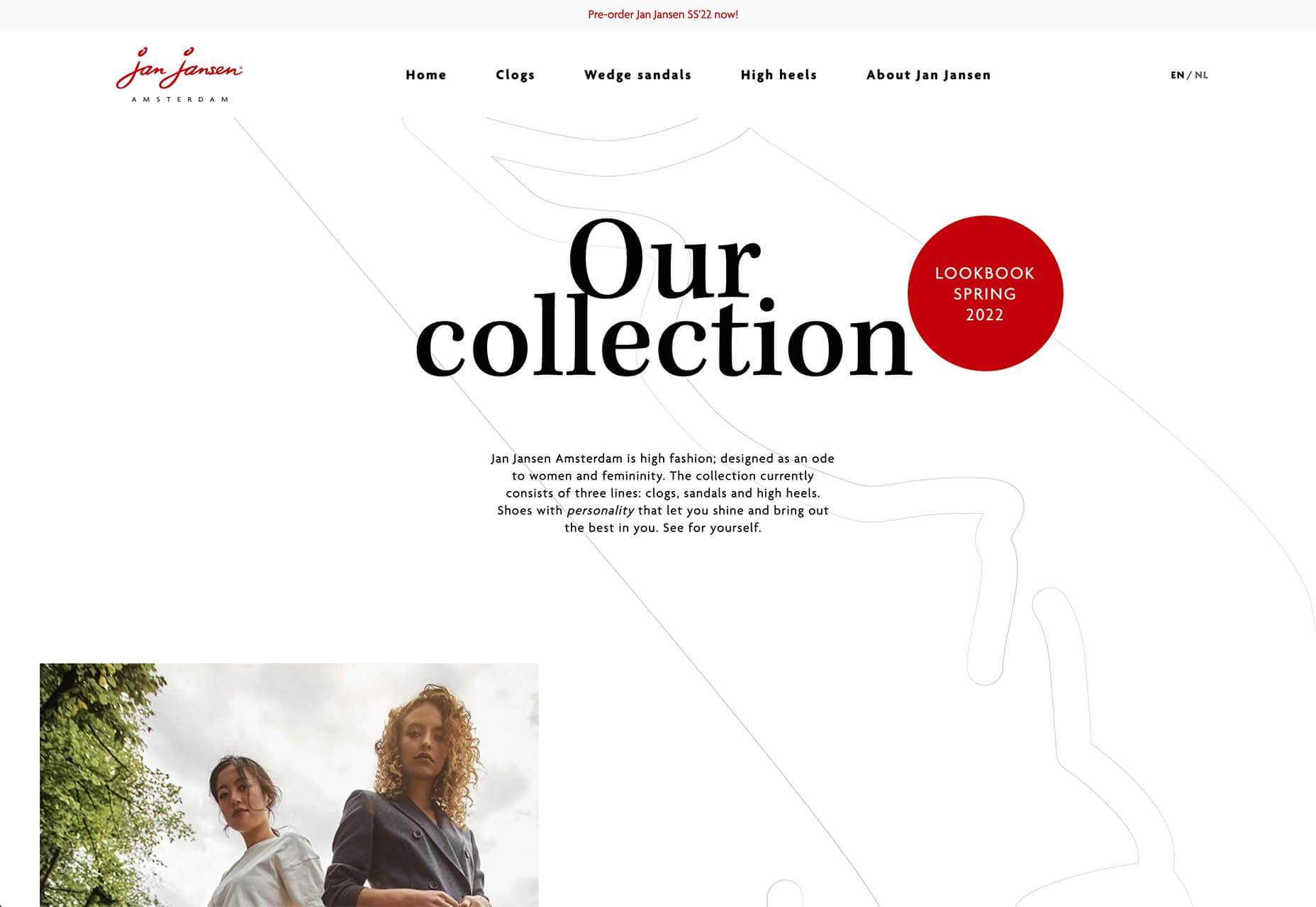
Jan Jansen uses a big circular button, the only thing to click on the screen, and a hover state to imply functionality.
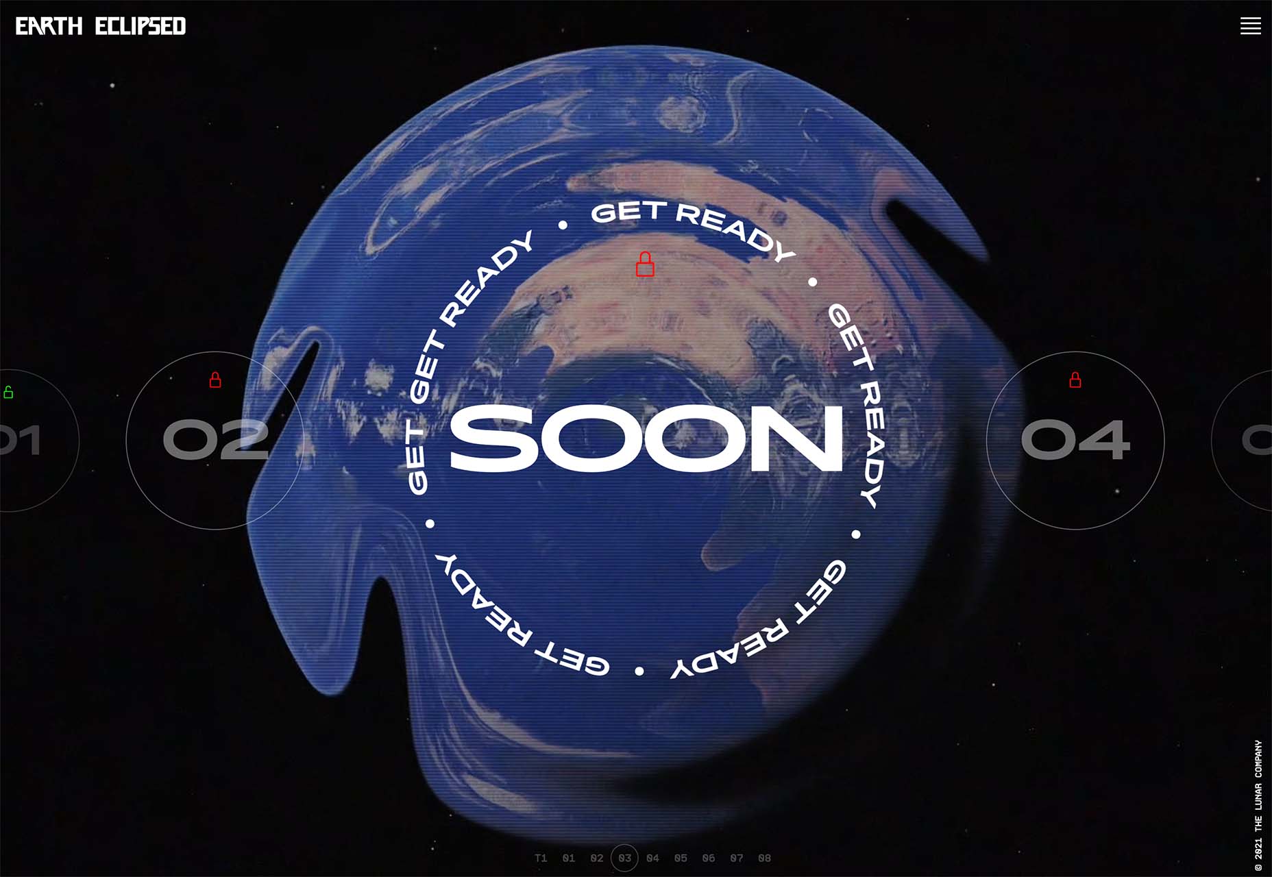
Earth Eclipsed uses a series of different circular click elements to facilitate understanding. Sometimes just the lack of another button style is enough to show that circles are for clicking.
3. Big Branding
After a long time of subtle, rather small corner branding for websites, big branding is in.
This design trend features logos – most commonly logotypes – that are almost uncomfortably large on the homepage. They can be in the traditional top-left location or almost anywhere on the screen.
The trick is to integrate branding with the rest of the design not to feel garish. This can be rather difficult to pull off and seems to be one of those things that people either love or hate when they see it.
Here’s how three different websites are doing it:
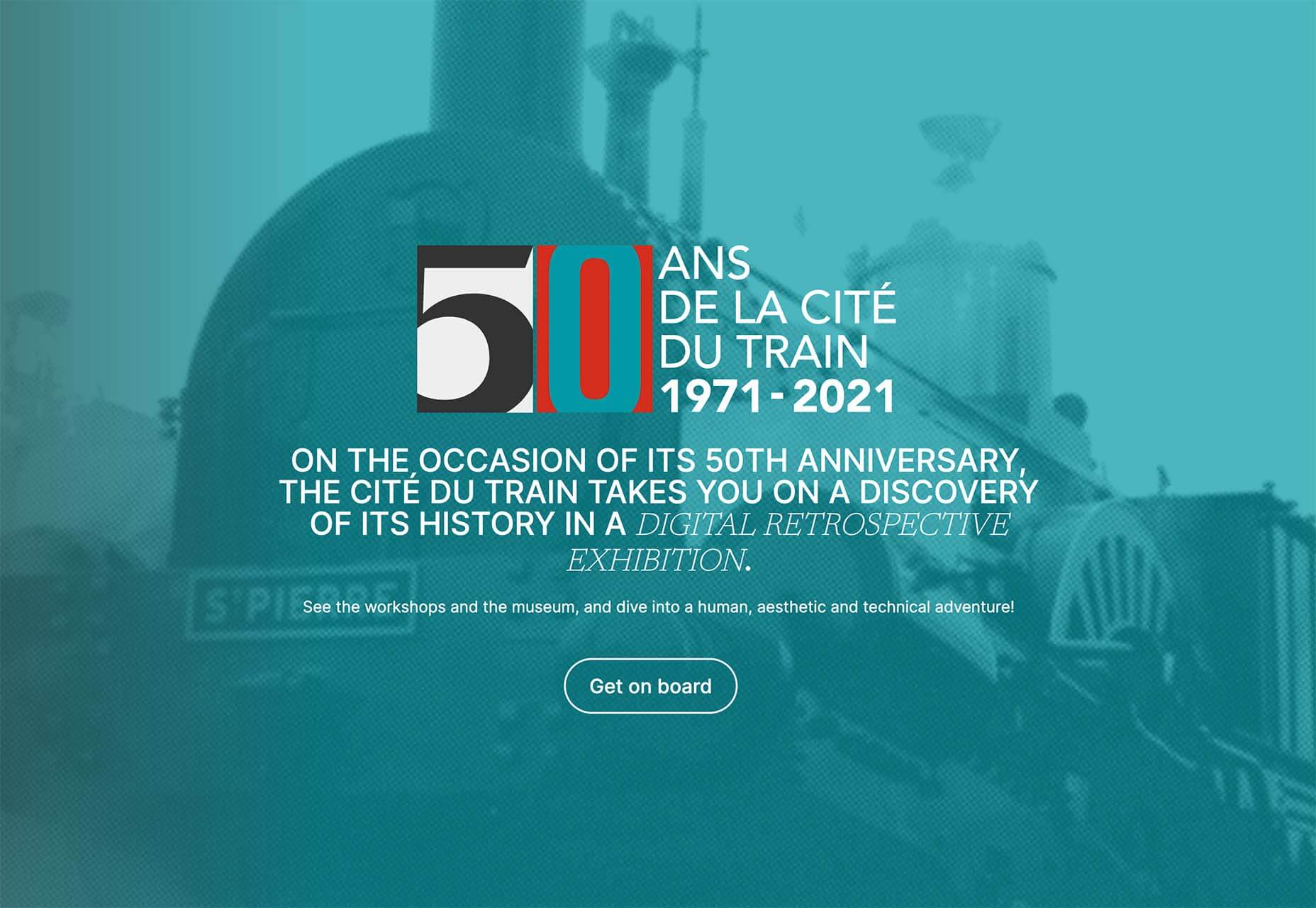
The 50th anniversary logo is a timed solution with big branding. It creates emphasis on the historical aspect of the train. Not only does the logo appear large on the homepage, but there’s also a loading animation as well.
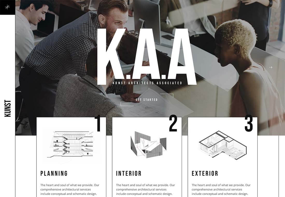
Kunst Architects Associated uses a very large brand representation in the middle of the hero slider. The giant type element brings your eye into the design for sure and is re-emphasized by the company name in the left sidebar. The trick here is the balance between brand and other information in that valuable homepage space.
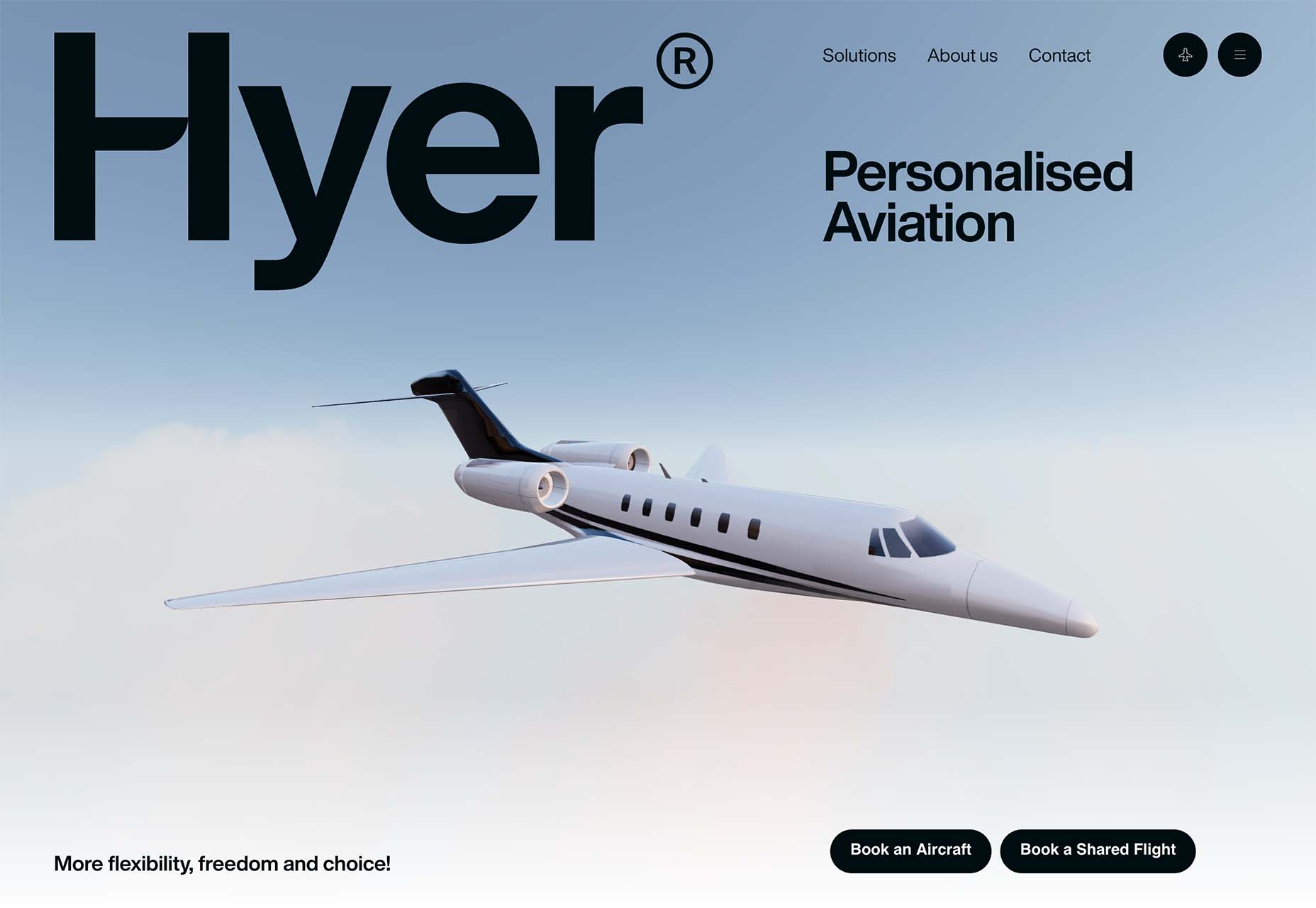
Hyer might use one of the biggest corner logotypes you’ll find. There’s no second-guessing what website you are on. The longer-term question is, does the big lettering imprint more on your memory so that you come back to the website later when you need the products or services offered? That’s a hard question to answer, but one that might be worth debate for design teams considering a visual outline such as this one.
Conclusion
There’s a risk when it comes to layering trends in a single design. If they don’t take off, the design can look dated fast, and there’s a lot of work to remove multiple trendy visuals from the project.
But when trends take off, they can work wonders. So it will be interesting to look back in a few months and see which of these trends is still making waves.
SourceThe post 3 Essential Design Trends, October 2021 first appeared on Webdesigner Depot.
0 Commentaires