 The quality of websites in 2023 has moved up a gear, with designers cherry-picking trends as tools, embracing new ideas, and plenty of innovative UI details.
Every month we put together this roundup of the best new websites we’ve seen over the previous four weeks. In February’s edition, you’ll find warm colors to brighten grey days and lots of animation. Enjoy!
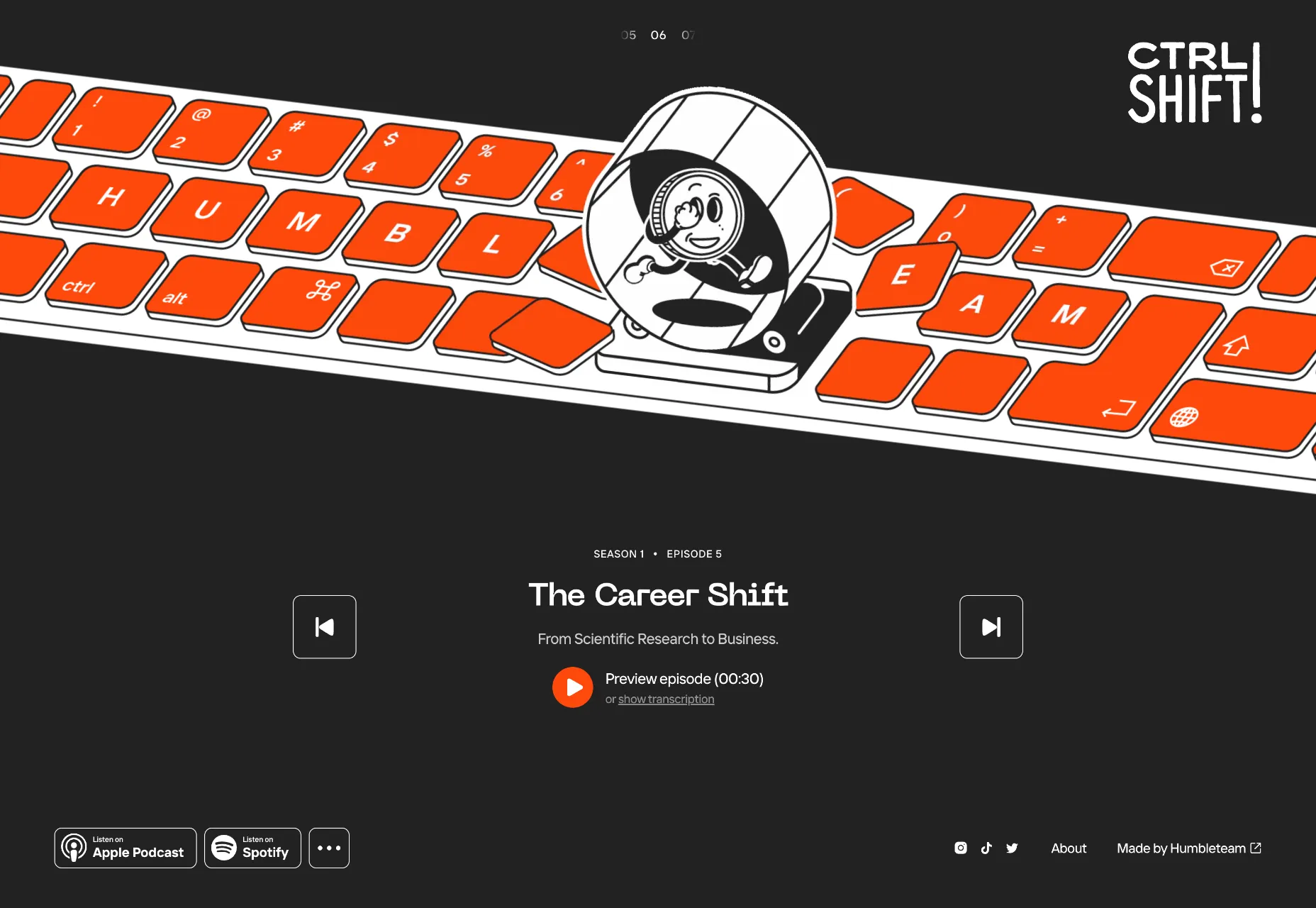
CTRL SHIFT!
CTRL SHIFT! is a podcast about people who changed the world by changing their perspectives. Its site features an excellent scrolling set of animations.
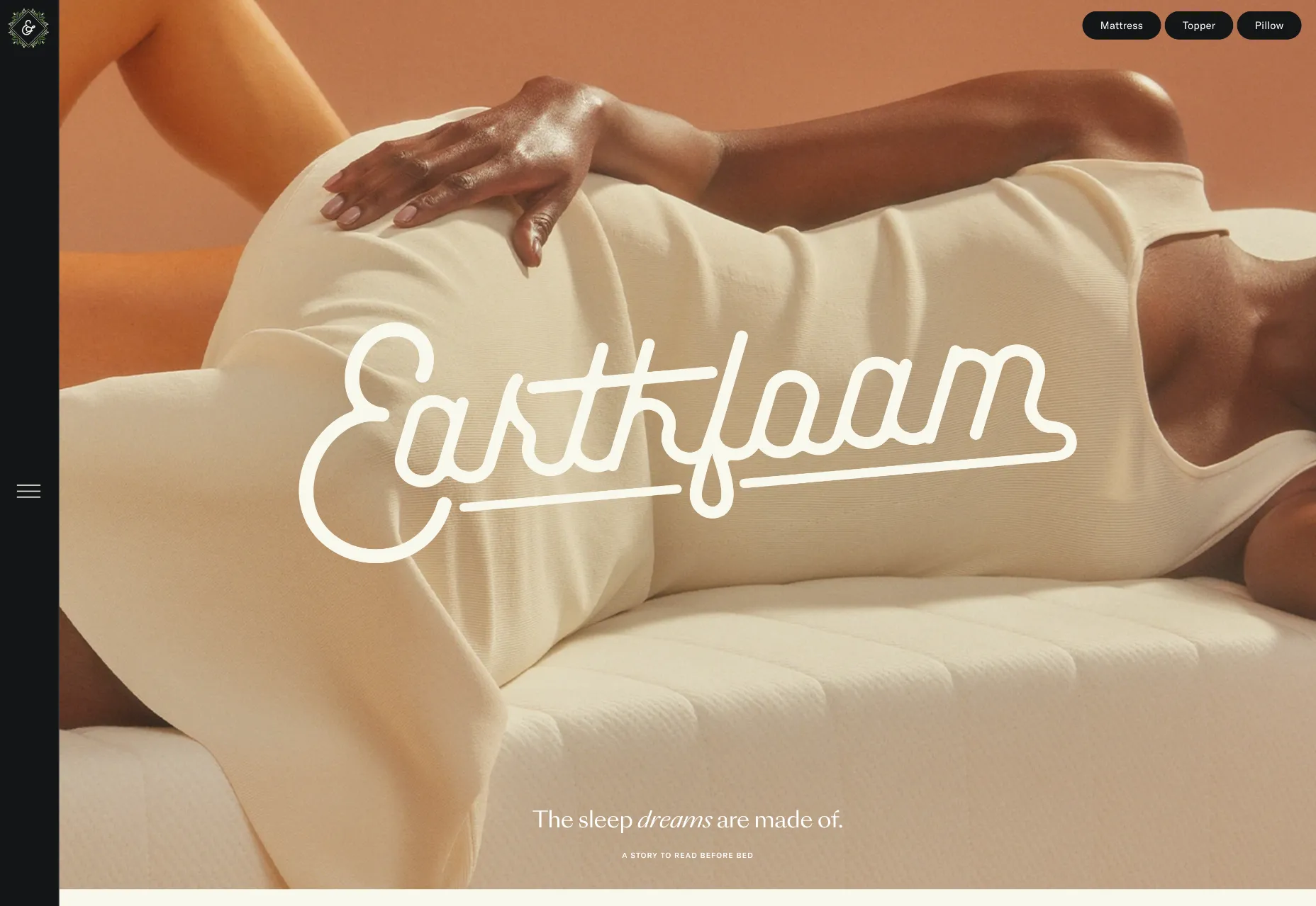
Earthfoam
Earthfoam is a new kind of mattress and pillow. It uses soft colors and subtle animation to create a sense of calm and well-being. There’s fantastic attention to detail on this site.
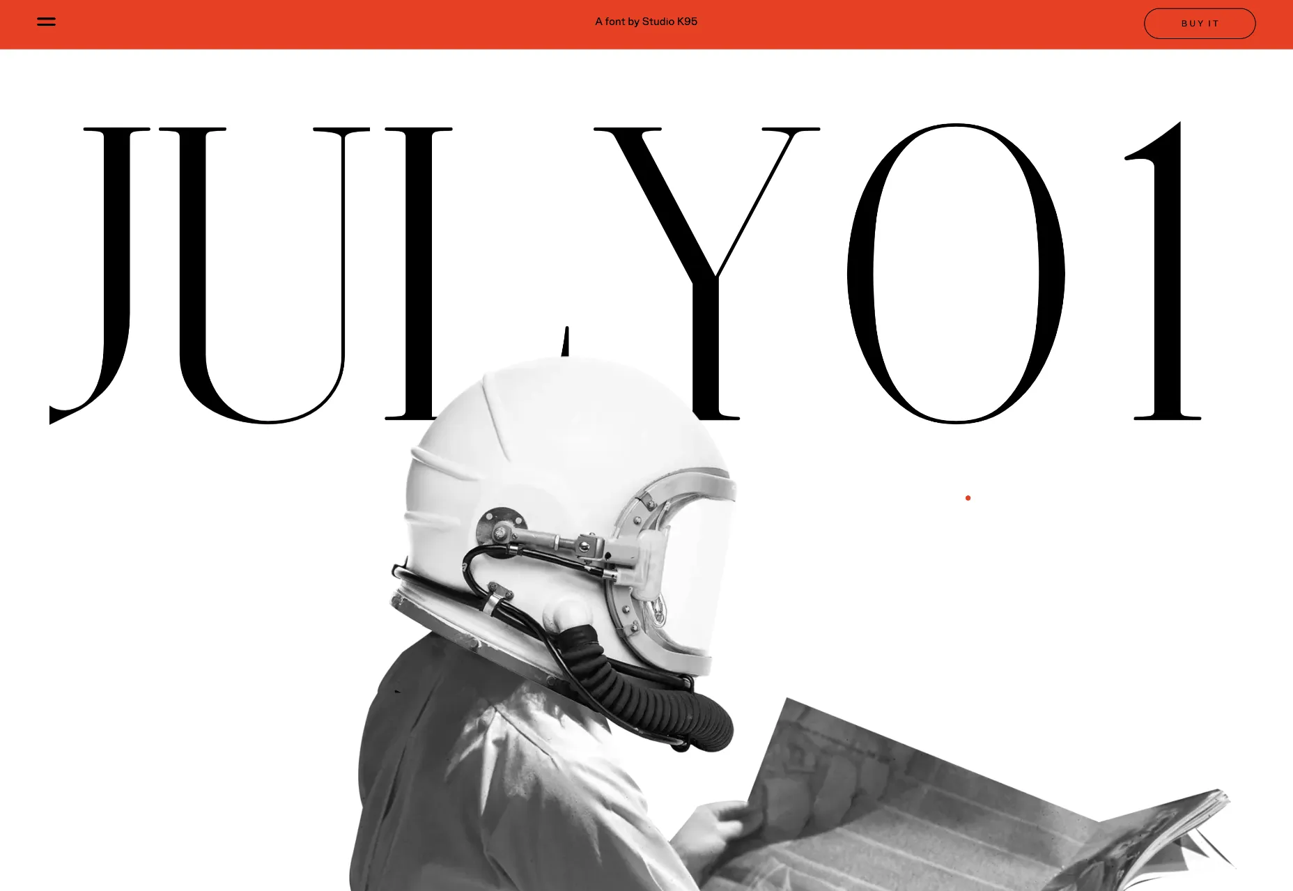
July 01
The microsite for July 01, a new typeface from Studio K95, is brilliantly engaging with retro art direction and some well-chosen gradients. This is how fonts should be sold.
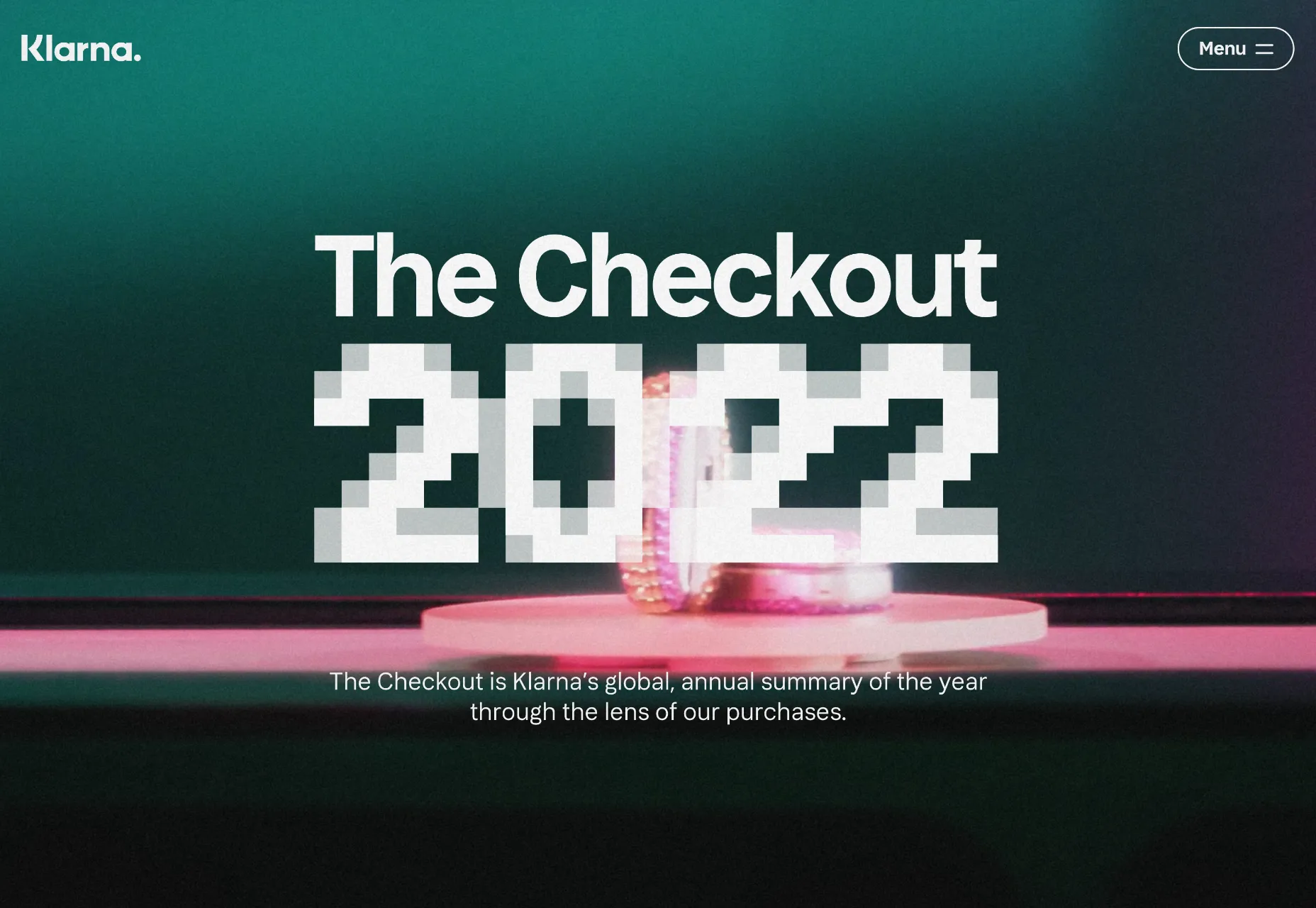
The Checkout 2022
The Checkout 2022 is a look back at last year through the lens of purchases made via Klarna. The microsite features pixel-style animation and typography that is very 2023.
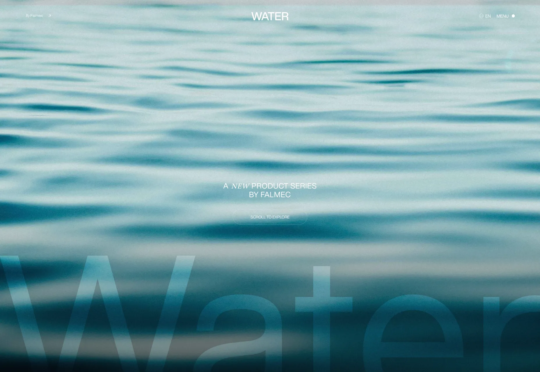
Water
Water is a collection of kitchen products by Falmec. The site is like a high-end brochure, with intelligent content design and an overarching aesthetic.
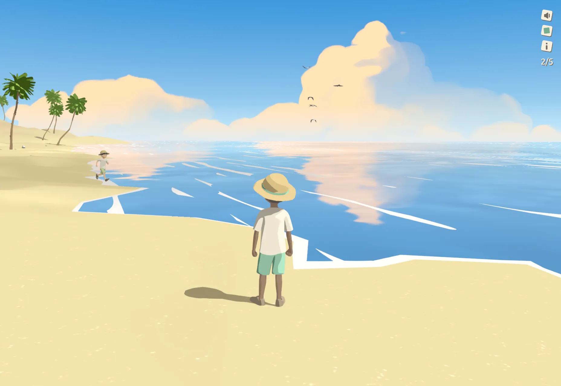
Summer Afternoon
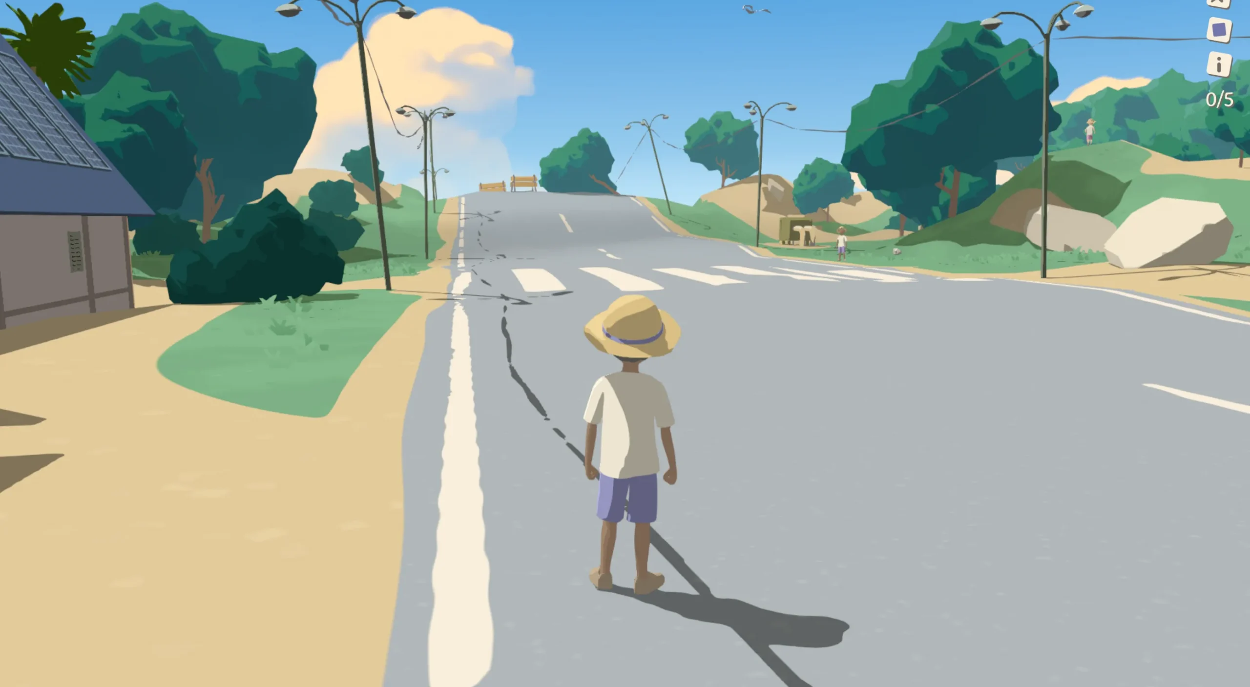
Summer Afternoon is a beautiful Studio Ghibli-esque 3D experiment. Explore the environment and discover five different secrets. It’s delightful.
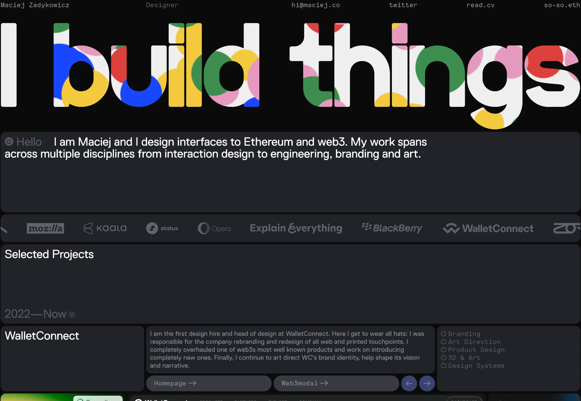
Maciej Zadykowicz
Maciej Zadykowicz’s portfolio is suitably dark mode for someone who specializes in Ethereum and web3, but it’s brought to life by the splashes of animated color.
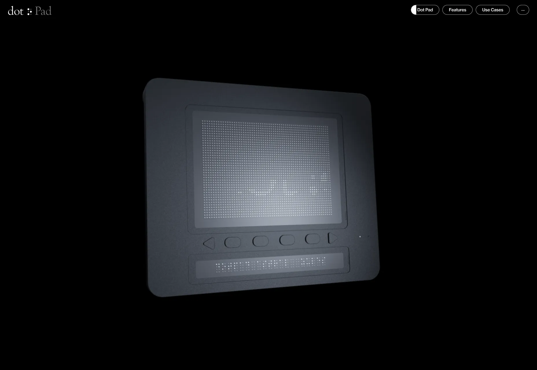
Dot Pad
Dot Pad is an innovative tactile display for visual data. It allows you to feel the world you see. Its site has many clever details; we particularly like what happens with the menu when you scroll.
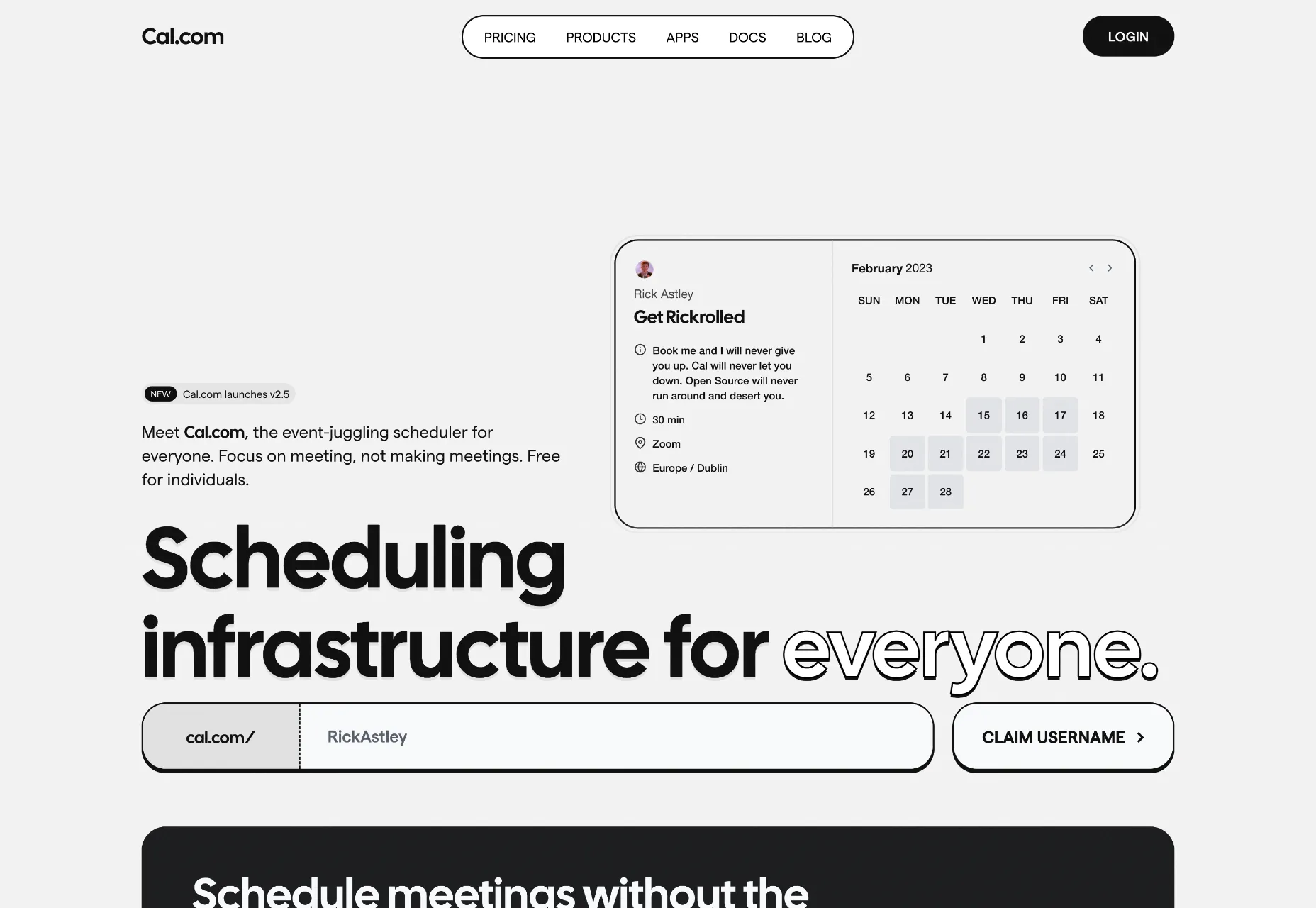
Cal.com
Cal.com is an event scheduler app. Its site features black-and-white typography that is elevated by subtle shadows and a clear hierarchy. Simple ordered, and appropriate.
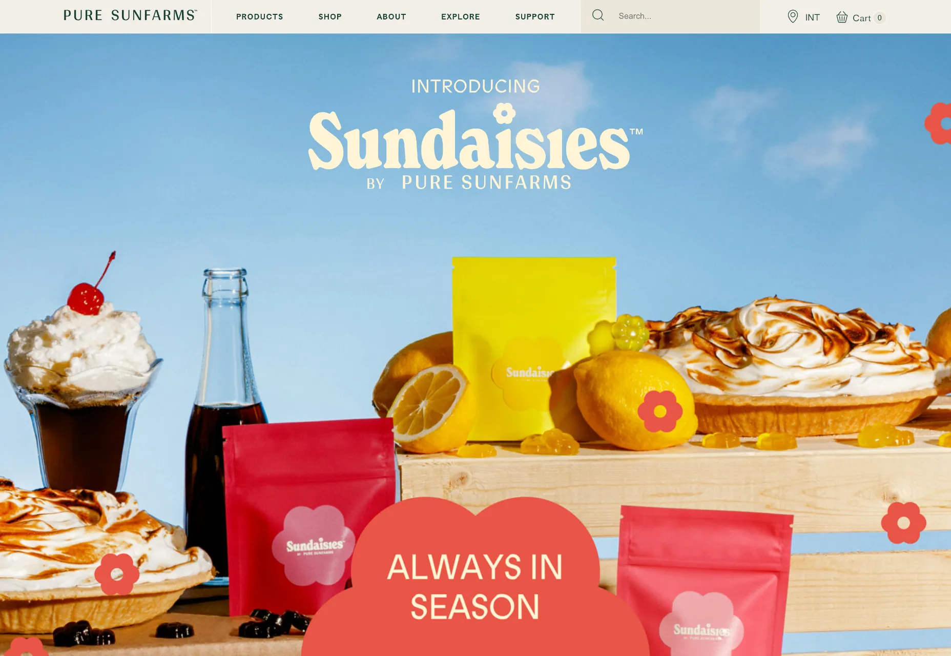
Pure Sunfarms
Pure Sunfarms sells cannabis, and its retro vibes take us all back to long Summer days when the world seemed more innocent and chilled.
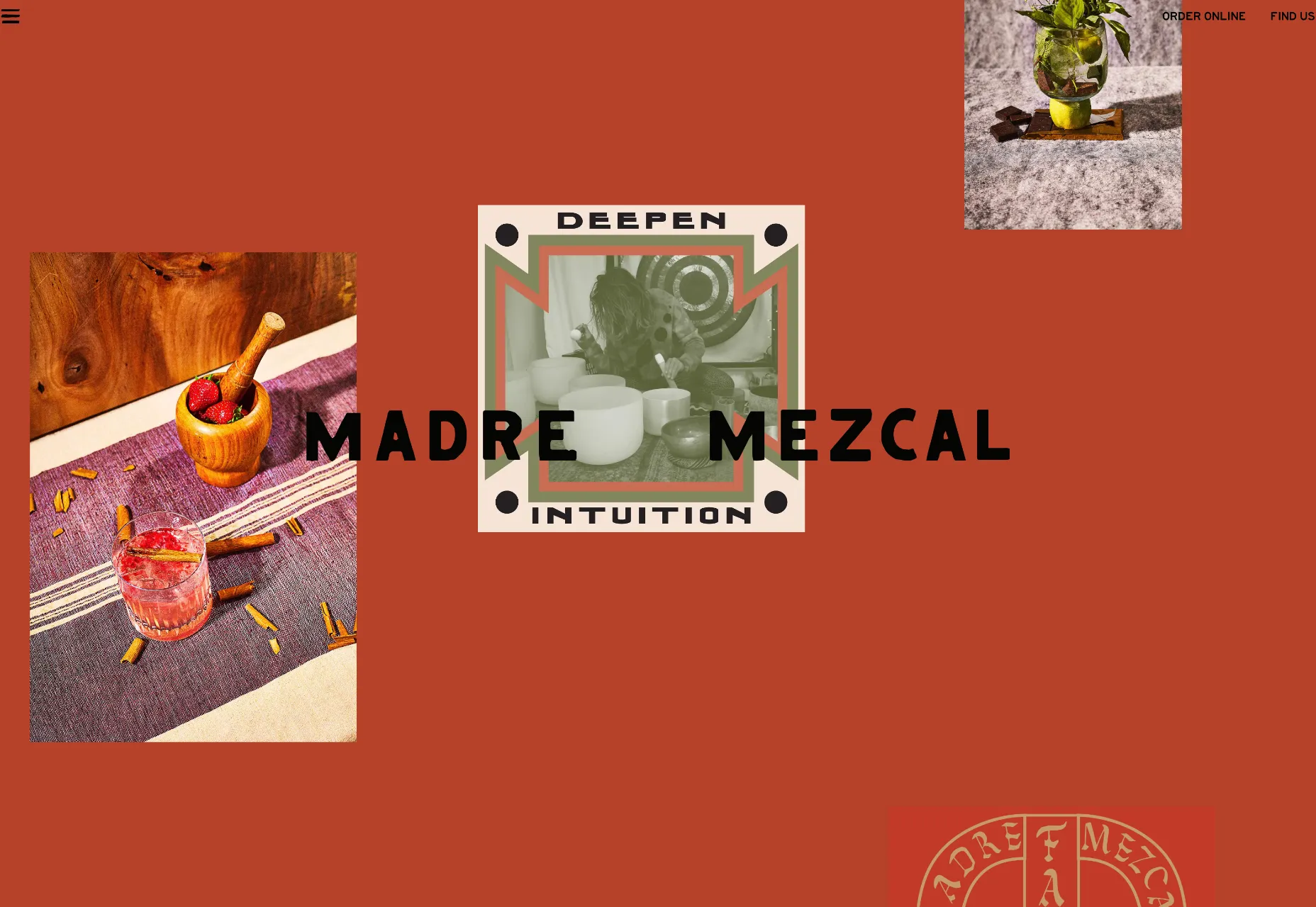
Madre Mezcal
The warm terracotta color of Madre Mezcal transports you to warmer climes. The illustrations and typography are on-brand, but what we really love is the variable scrolling on the content columns.
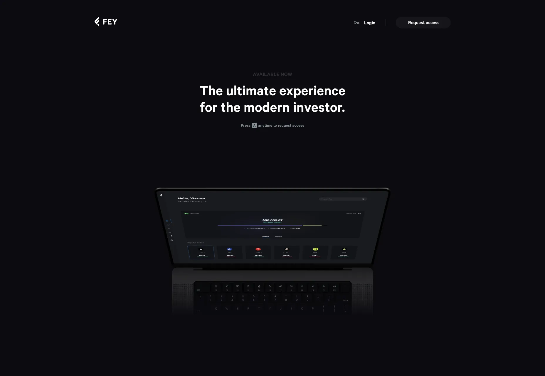
Fey
Fey is an app for investors, and its simple site is suitably restrained and high-quality. Some nice animations do a great job of highlighting the app’s features.
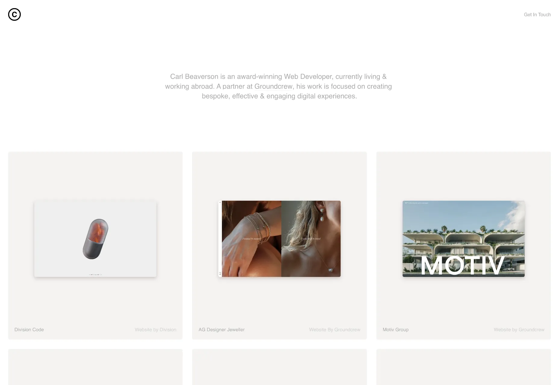
Carl Beaverson
Carl Beaverson’s portfolio is an exercise in restraint. It‘s just a series of tastefully presented thumbnails. Obvious accessibility issues aside, the pale text looks beautiful against the soft grey backgrounds.
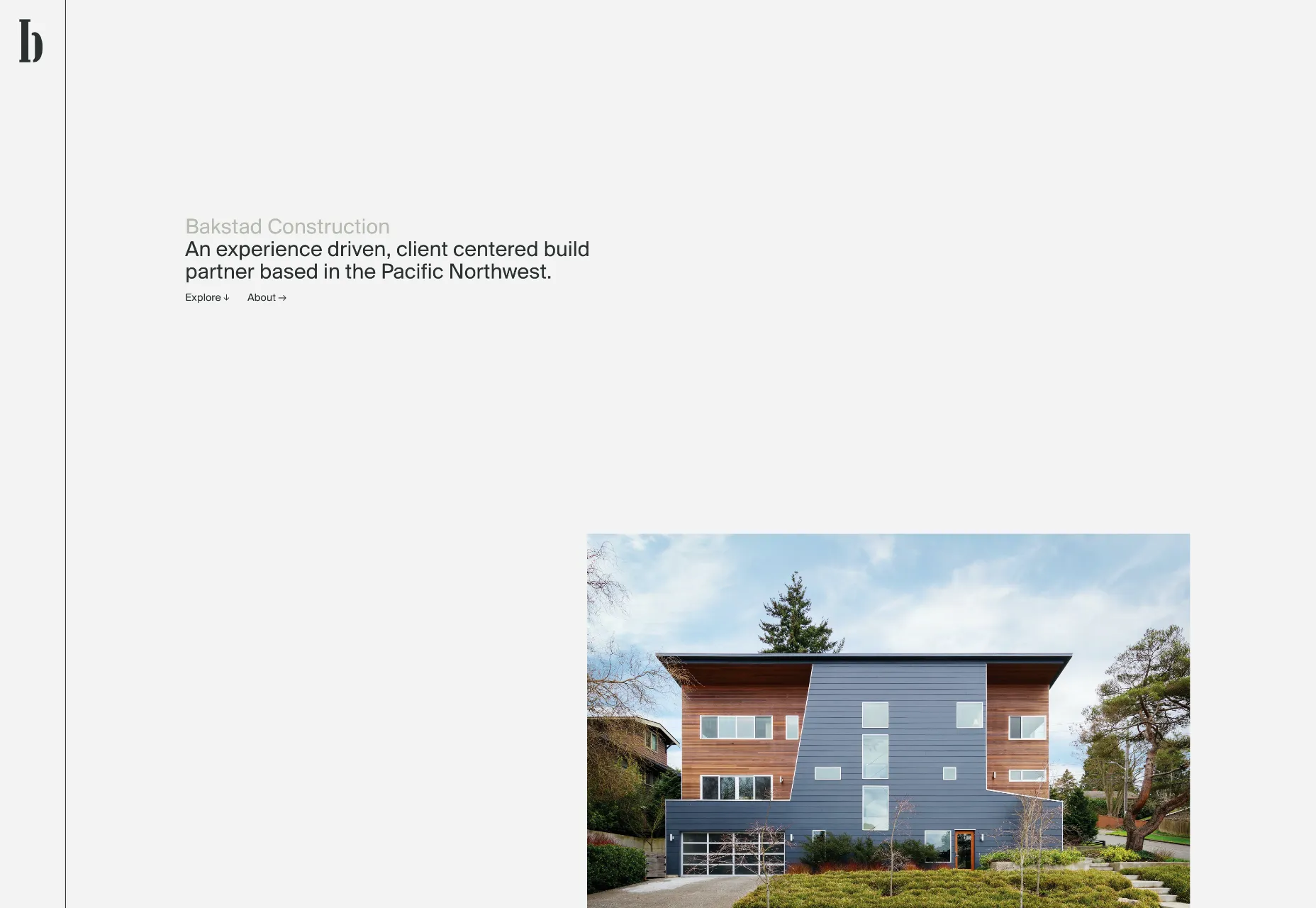
Bakstad Construction
2022’s Brutalism trend has waned, and we’re seeing a lot less of the style. But in the case of Bakstad Construction, nothing could be more appropriate.
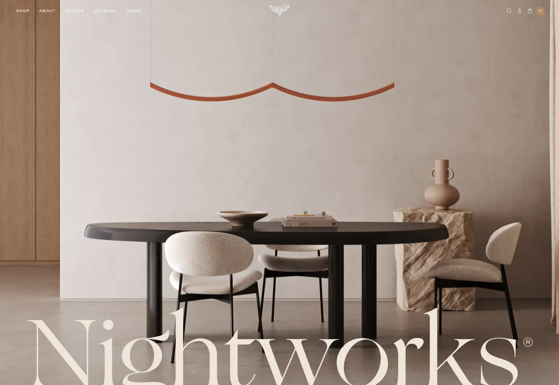
Nightworks
Nightworks creates stunning lighting products that would grace any home. Its site oozes luxury from every pixel. The type, colors, and layout all convey quality.
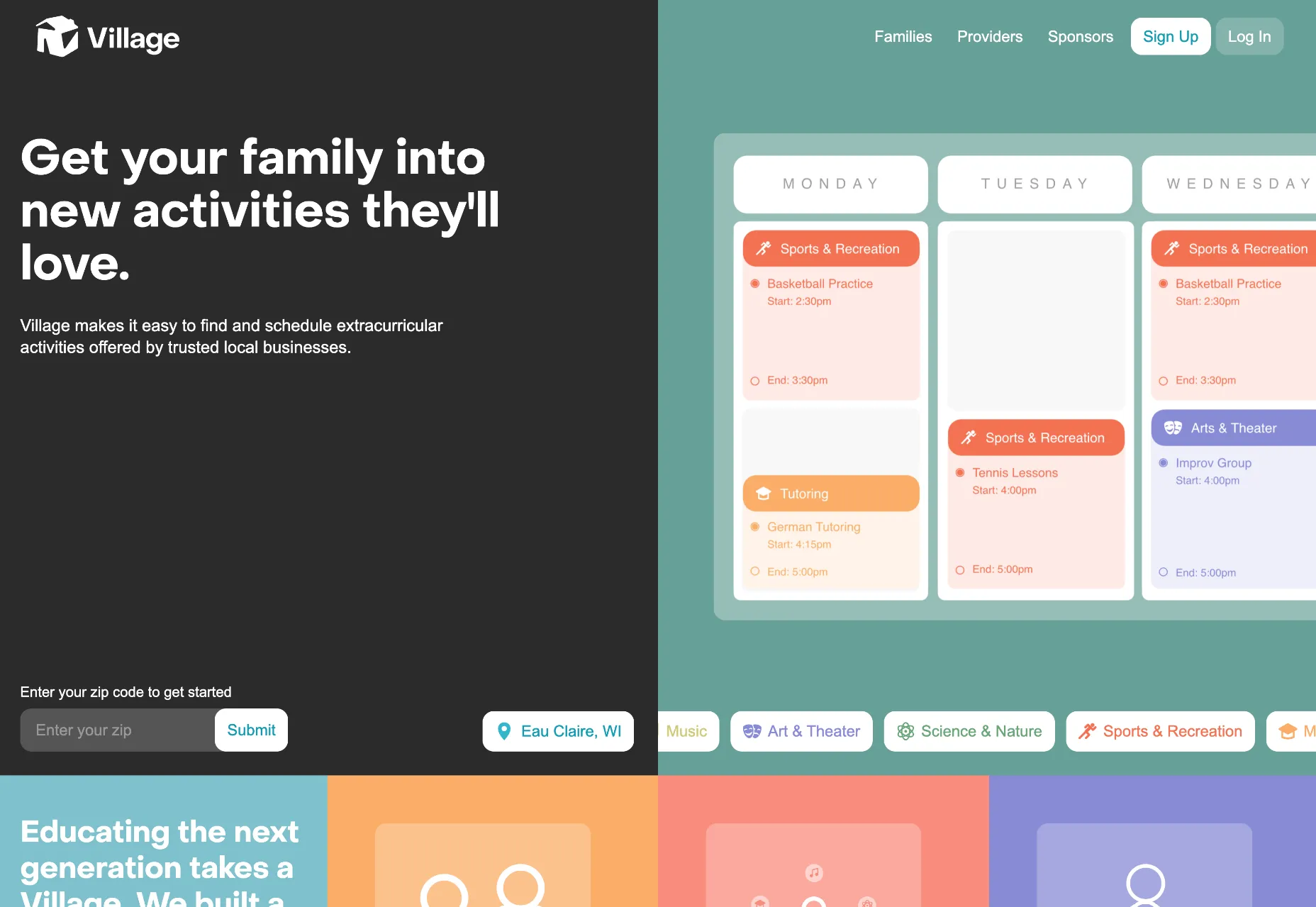
Village
We’re used to team scheduling apps, but Village is a team scheduling app for your family. The desaturated colors and modern look is perfectly pitched at young families.
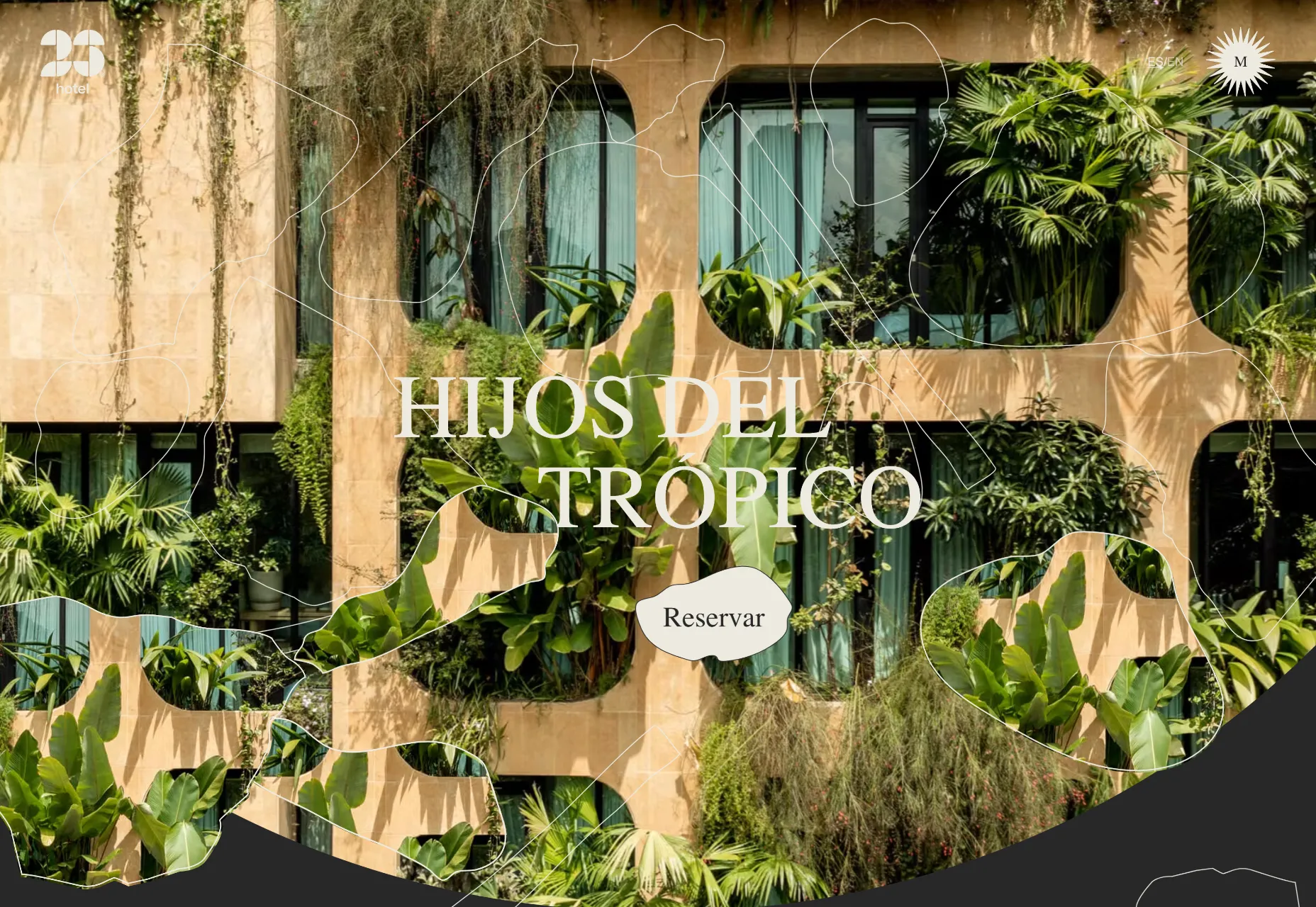
Hotel 23
Hotel 23 is amazing-looking in Medellín, Columbia. Its site features shapes and colors that reflect the building’s decor, and the room slideshow is charming and original.
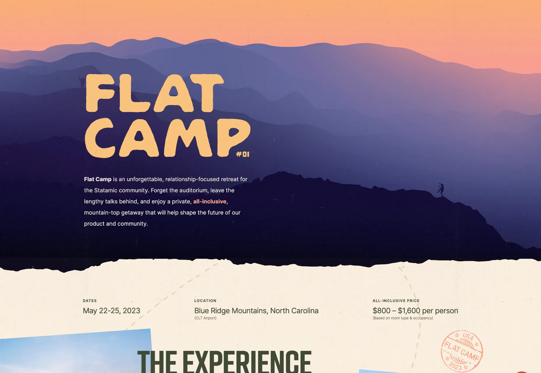
Flat Camp
Flat Camp is a retreat for up to 50 members of the Statamic community. Its site is clean and clear without being dull and minimal. And the hilltop illustration is highly appealing.
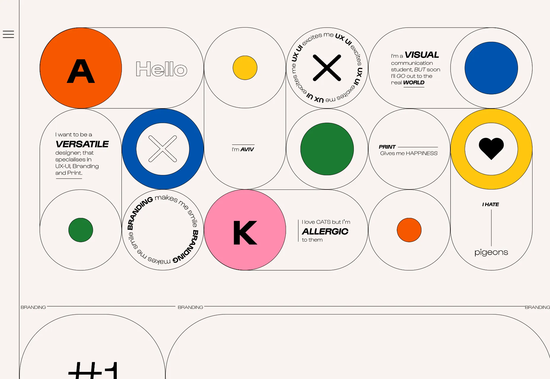
Aviv Katz
We love the playfulness of Aviv Katz’s portfolio. There’s lots to explore in the UI and some great work on display.
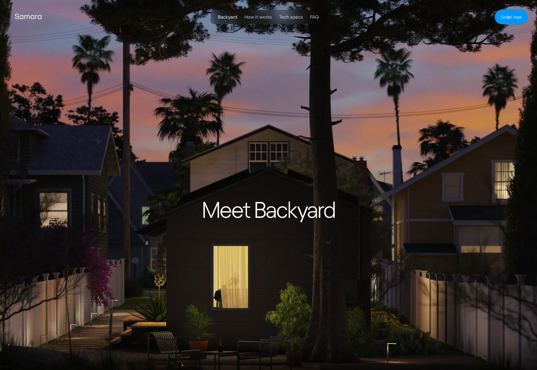
Samara
When you’re selling six-figure products, you better have a great site. Samara sells small houses that fit in a backyard, with everything you need included. It’s ideal for a home office or an Airbnb.
SourceThe post 20 Best New Websites, February 2023 first appeared on Webdesigner Depot.
0 Commentaires