 We’ve seen some incredible websites in 2022. There have been more than the usual number of sites with a political mission, and plenty that made us want to travel. The big design trends were brutalism, huge typography, and bold positive color. We’re looking forward to what the web will bring in 2023, but in the meantime, take a look back at the best 50 websites of 2022. Enjoy!
Justice Reskill
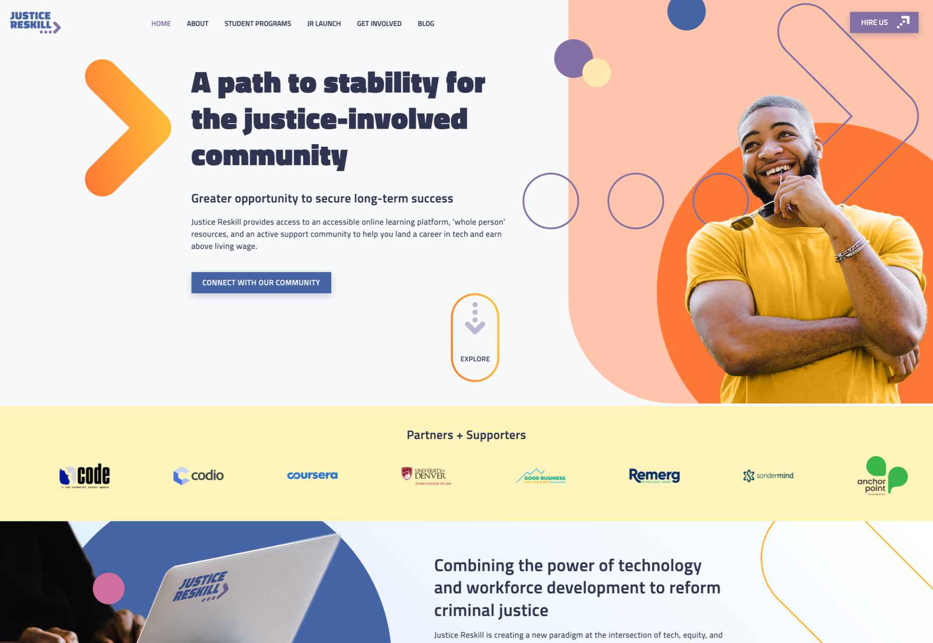
Justice Reskill used bright colors and positive, uplifting artwork to create a supportive platform for people who’ve been through the justice system.
Pienso
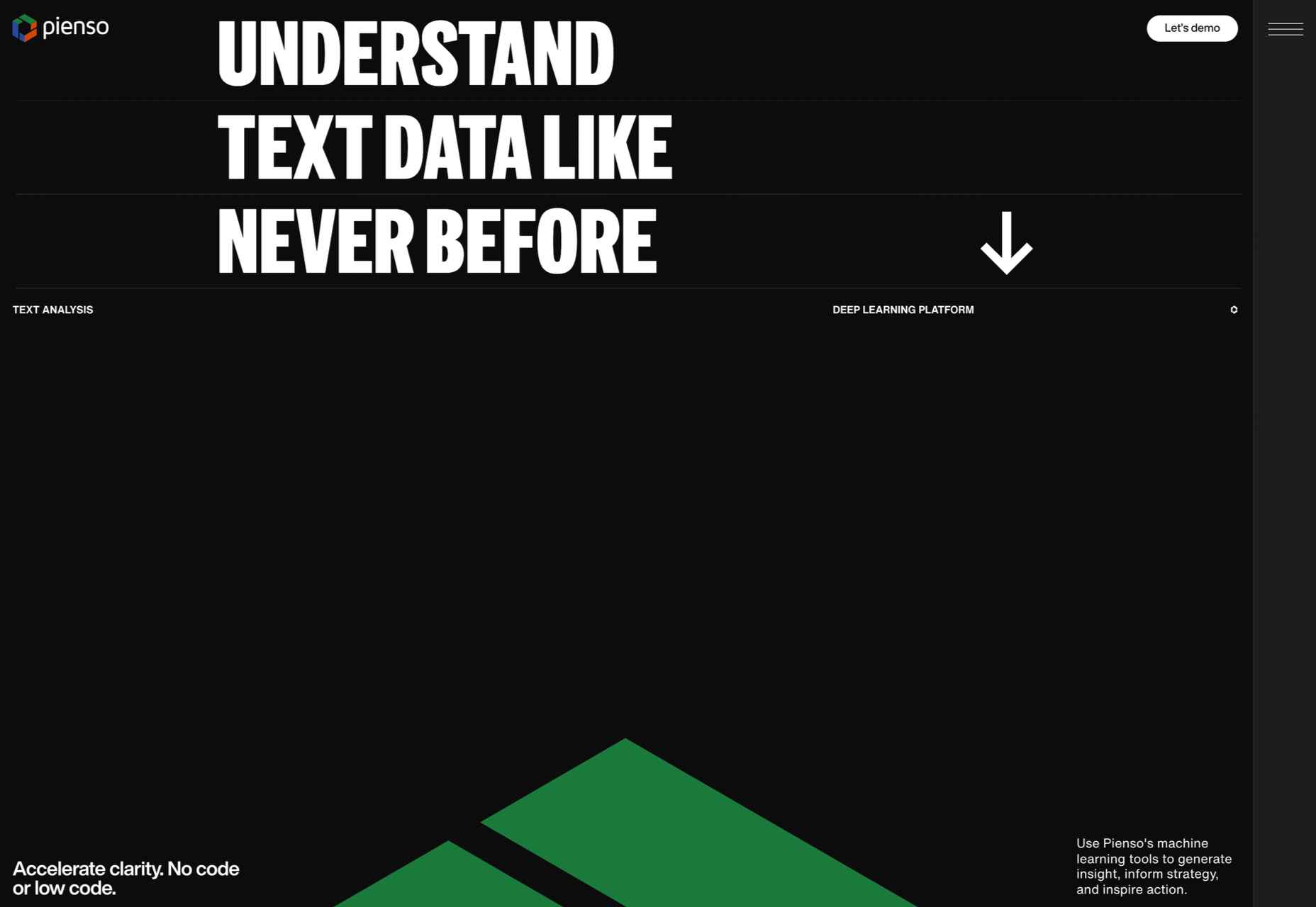
Bold type and plenty of on-scroll animation made this site for Pienso stand out back in January.
Gazelle No.1
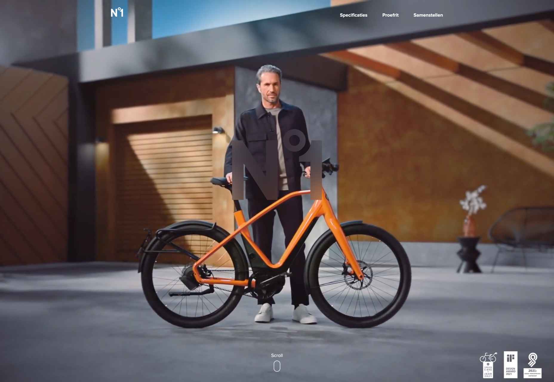
The promotional site for Gazelle No.1 used innovative scroll-activated video to sell the electric bike.
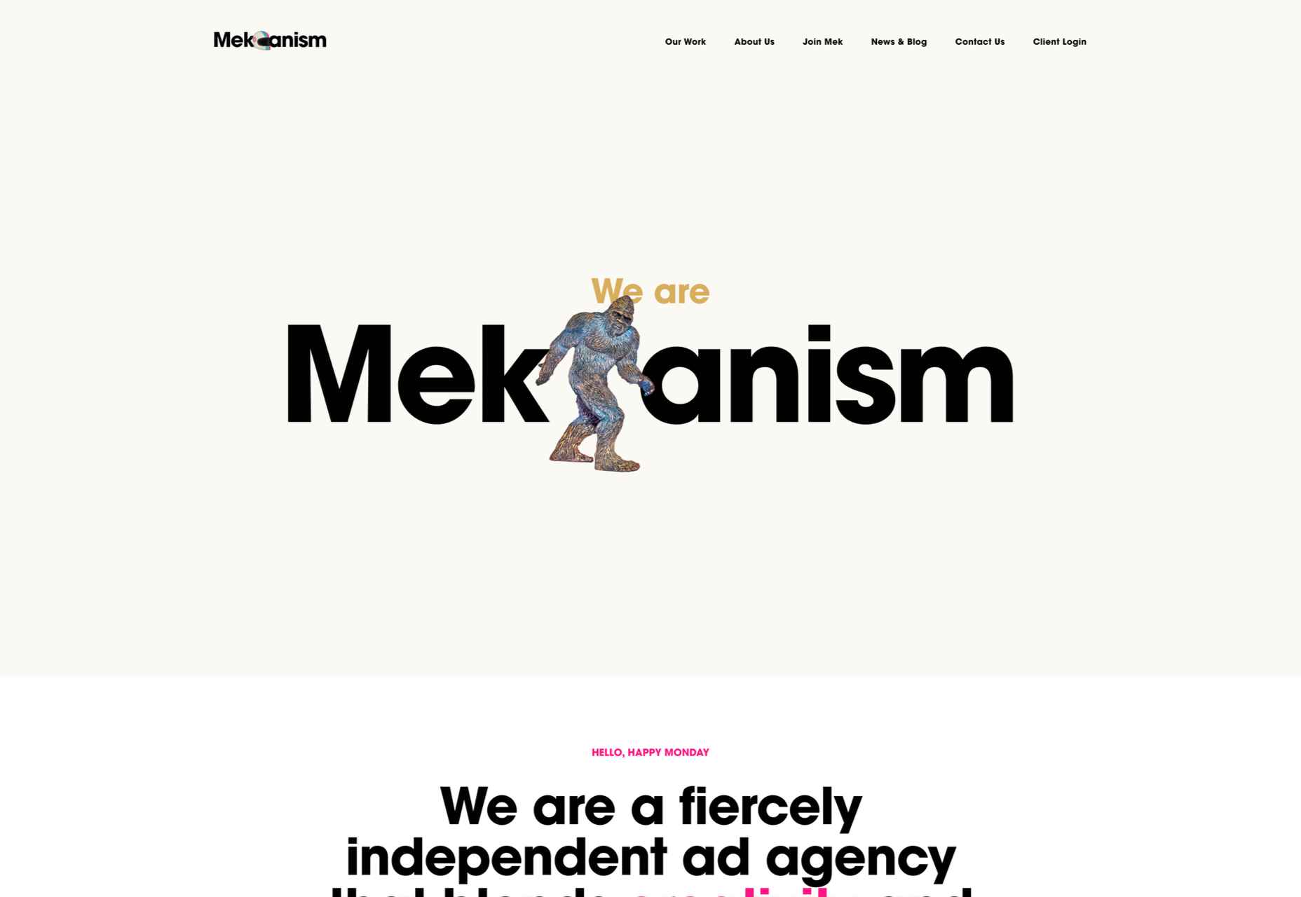
Mekanism
Mekanism’s site was the first agency redesign to impress us in 2022. Super-polished then, super-polished now.
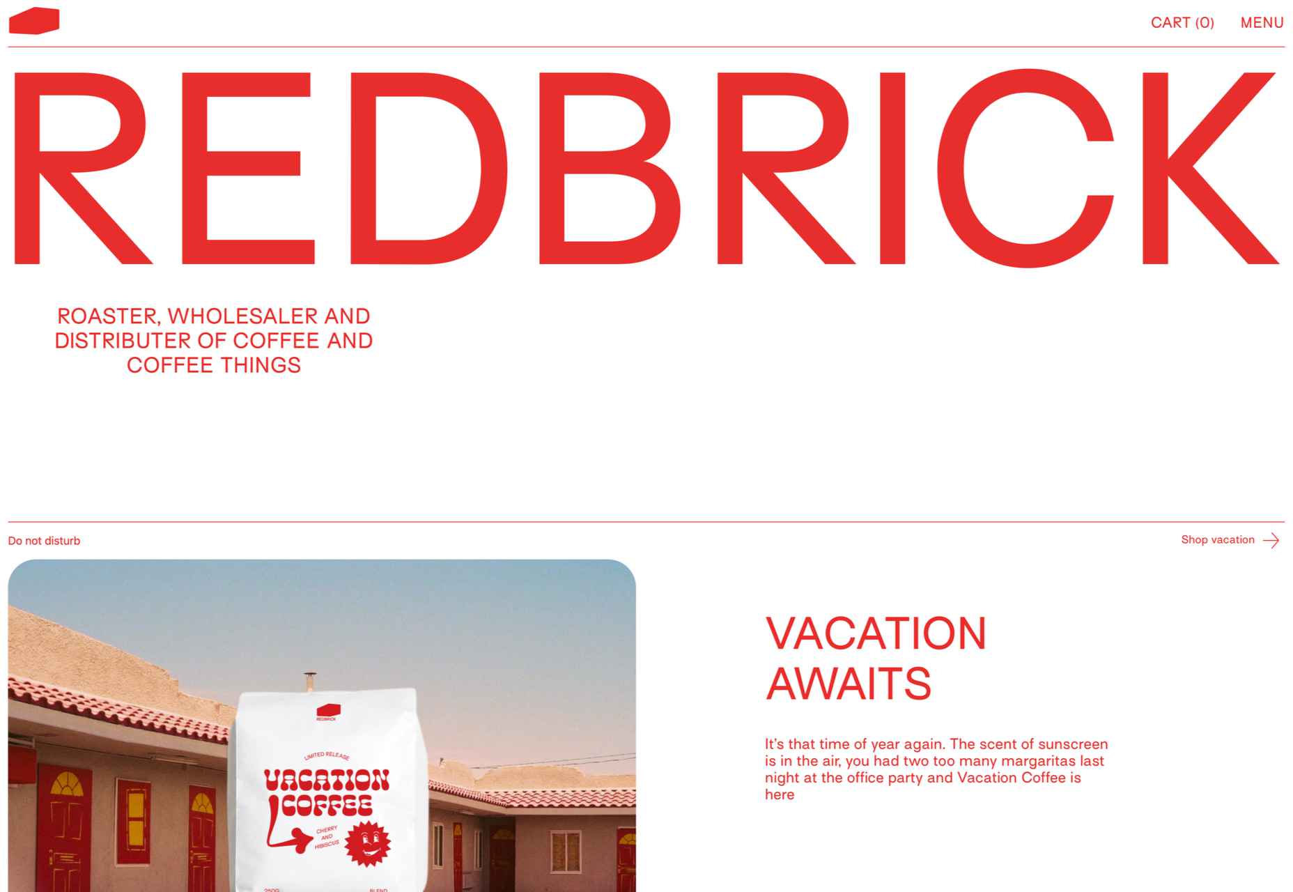
Redbrick
Redbrick was well ahead of the trend for brutalism with a twist when it released this site promoting its coffee.
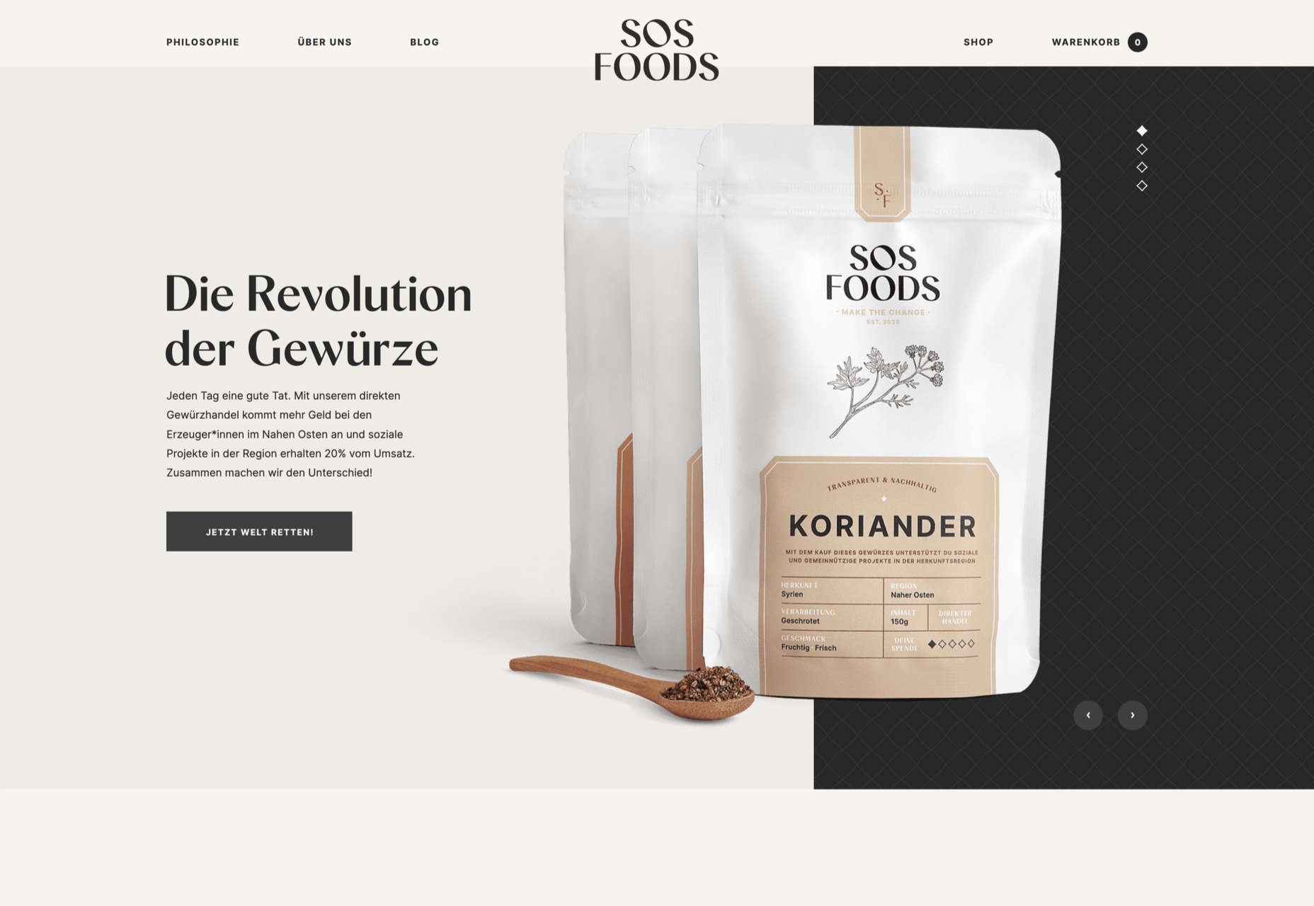
SOS Foods
Ethical and sustainable goods were top of the sales charts in 2022, and SOS Foods did a great job capitalizing on the style.
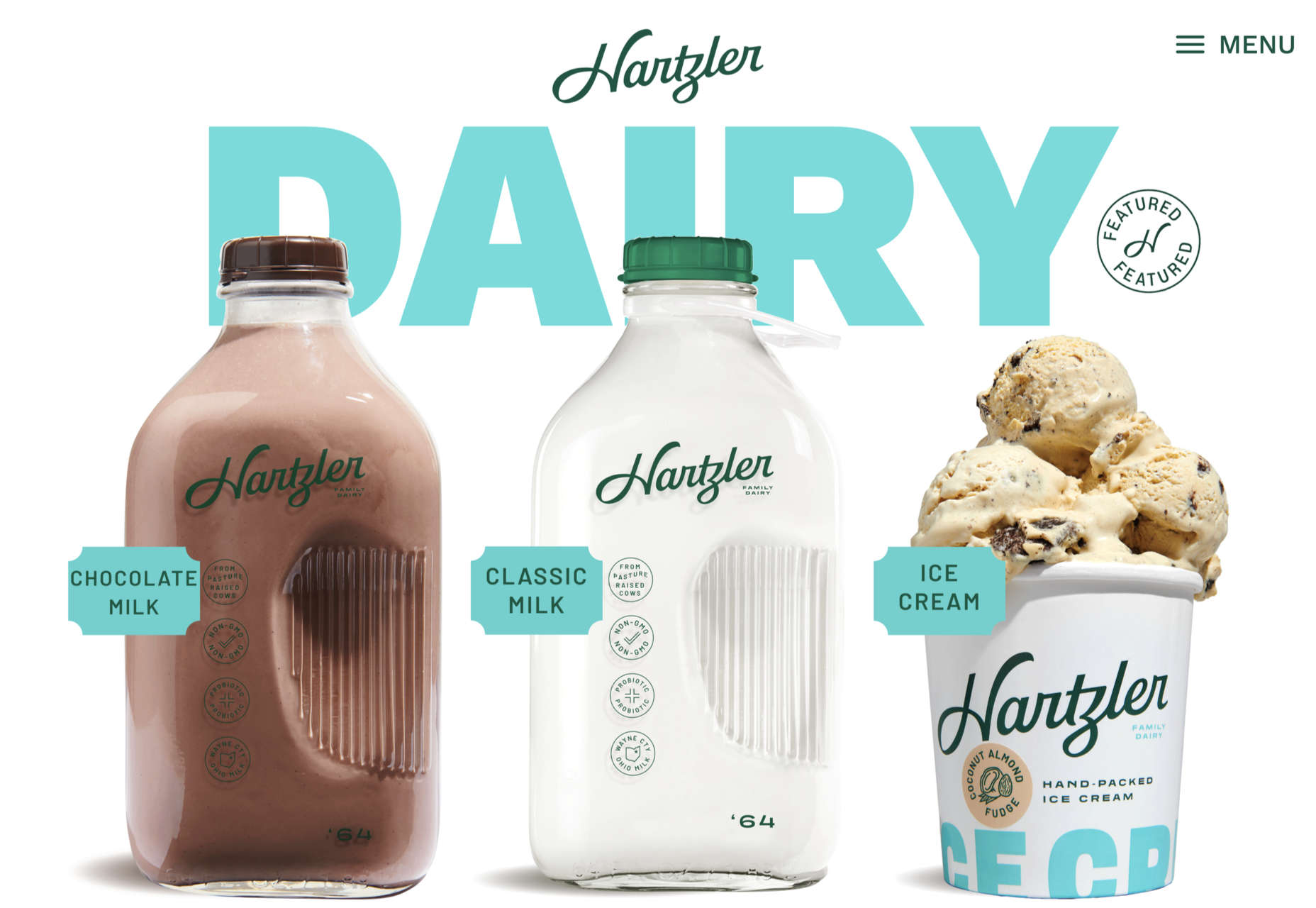
Hartzler Dairy
Hartzler Dairy embraced its mid-20th-century branding with a nostalgia-infused site.
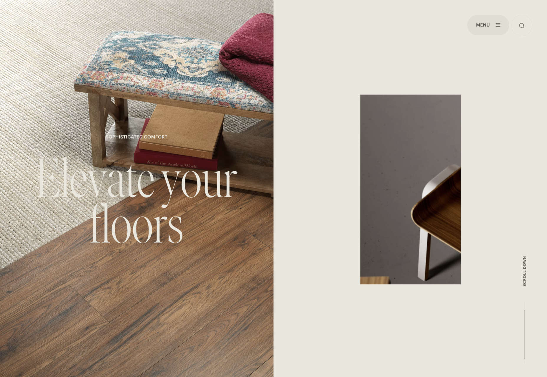
Engineered Floors
Even in 2022, designers are still paying mobile short shrift, but this site for Engineered Floors is excellent on mobile.
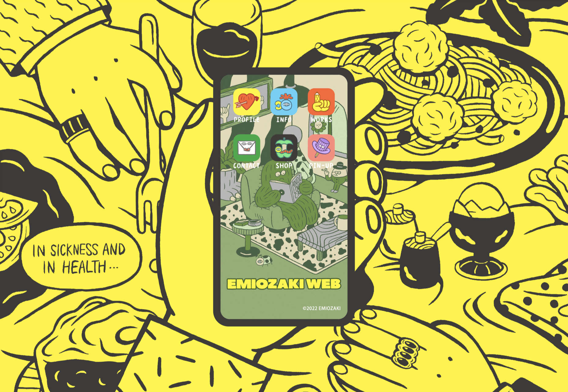
Emi Ozaki
We loved the quirkiness of Emi Ozaki’s phone-style interface for her portfolio back in February.
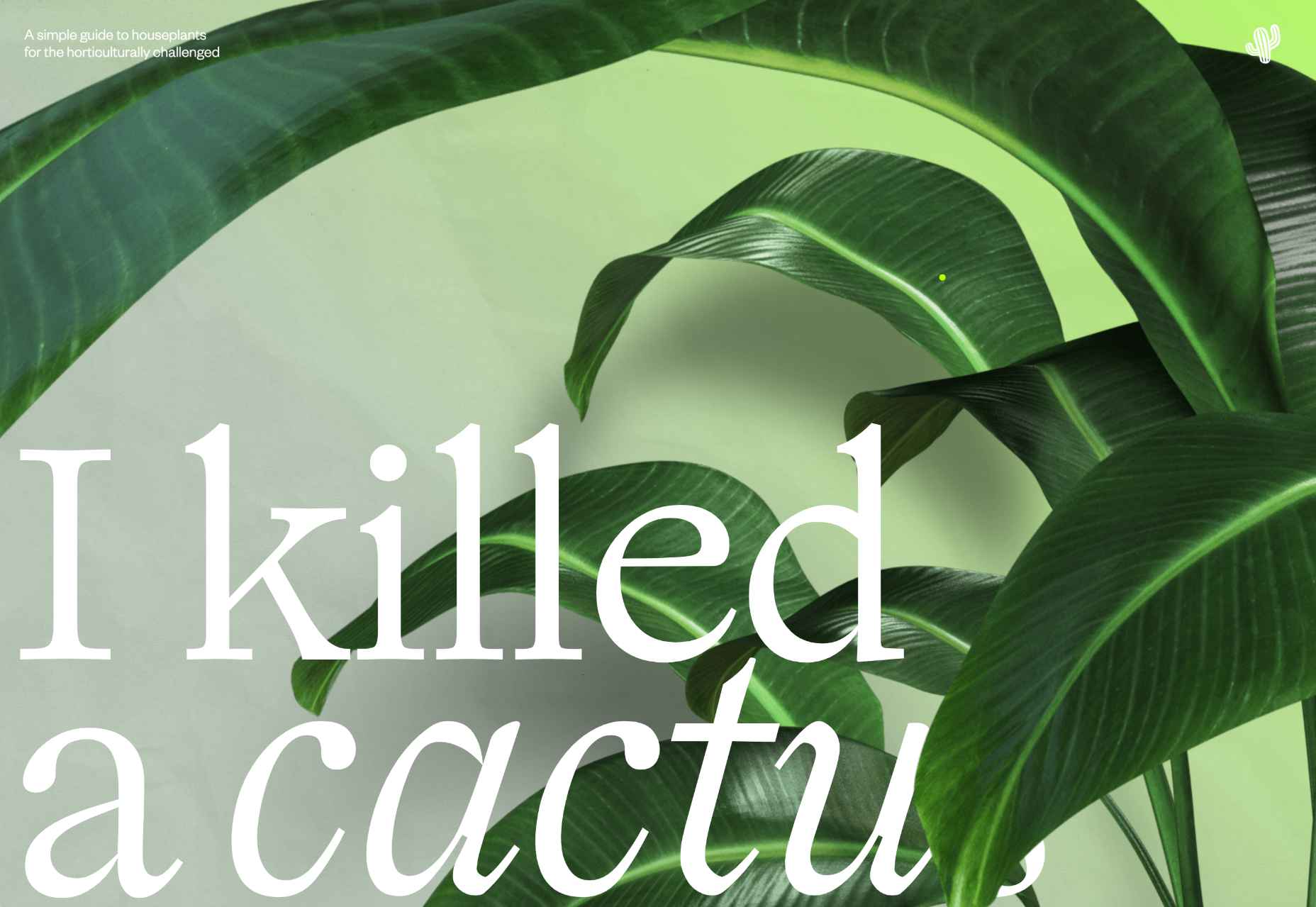
I Killed A Cactus
I Killed A Cactus is a beautiful 3D site designed to help people care for houseplants.
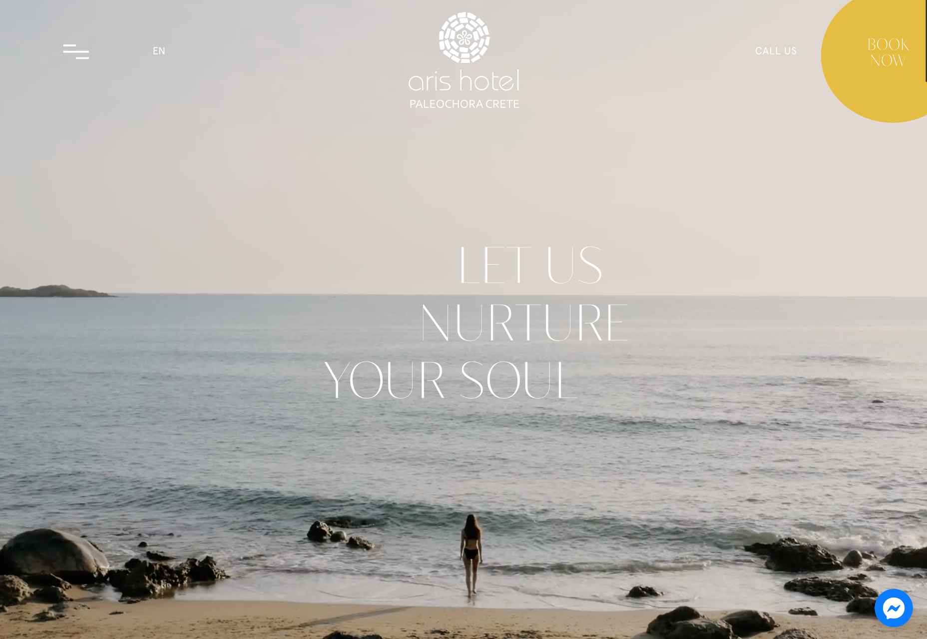
Aris Hotel
We were tempted in the direction of Crete by this stunning luxury site for Aris Hotel on the island.
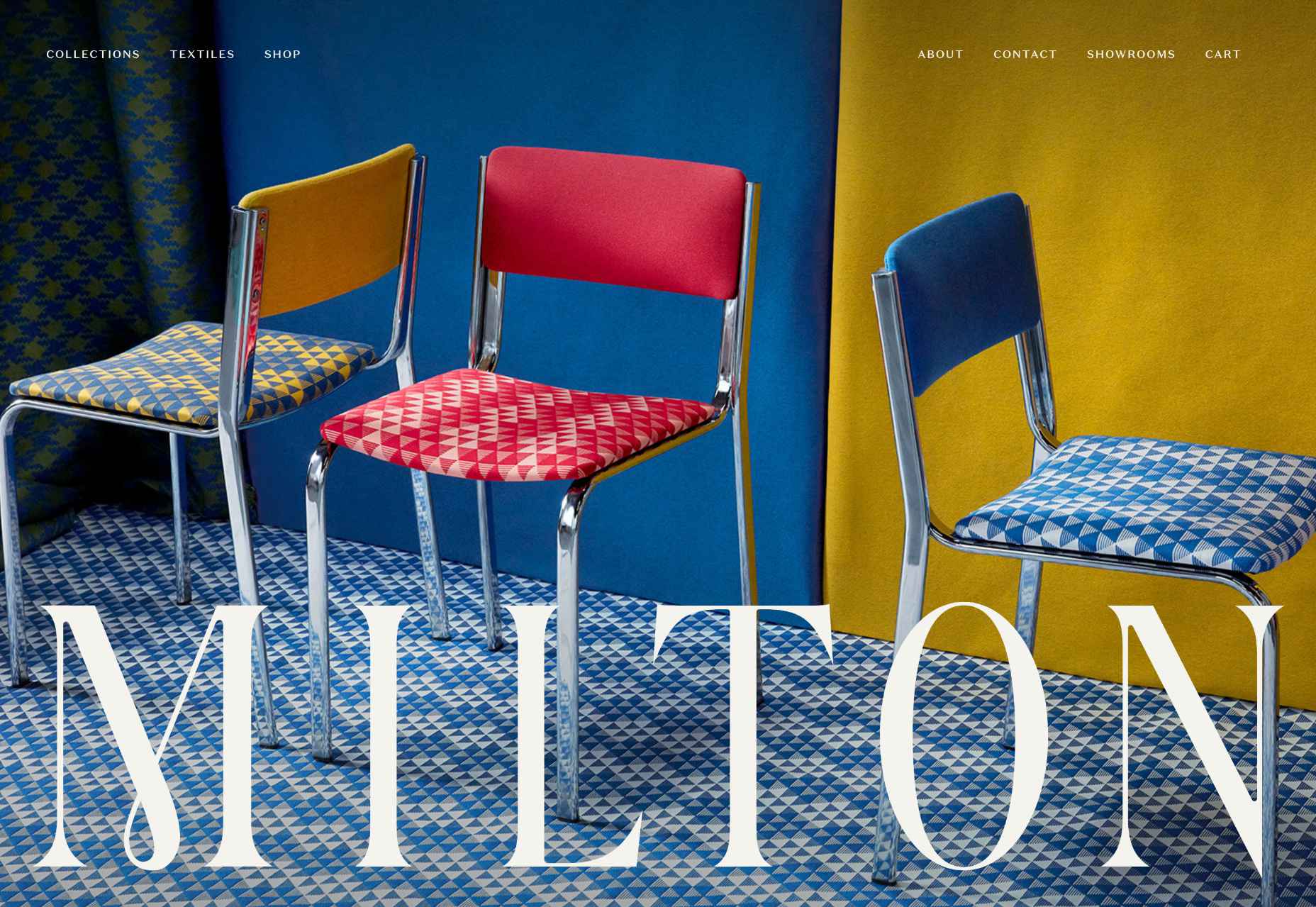
Milton Textiles
Milton Textiles is a big, bold site for a product that is usually an afterthought in the interior design world.
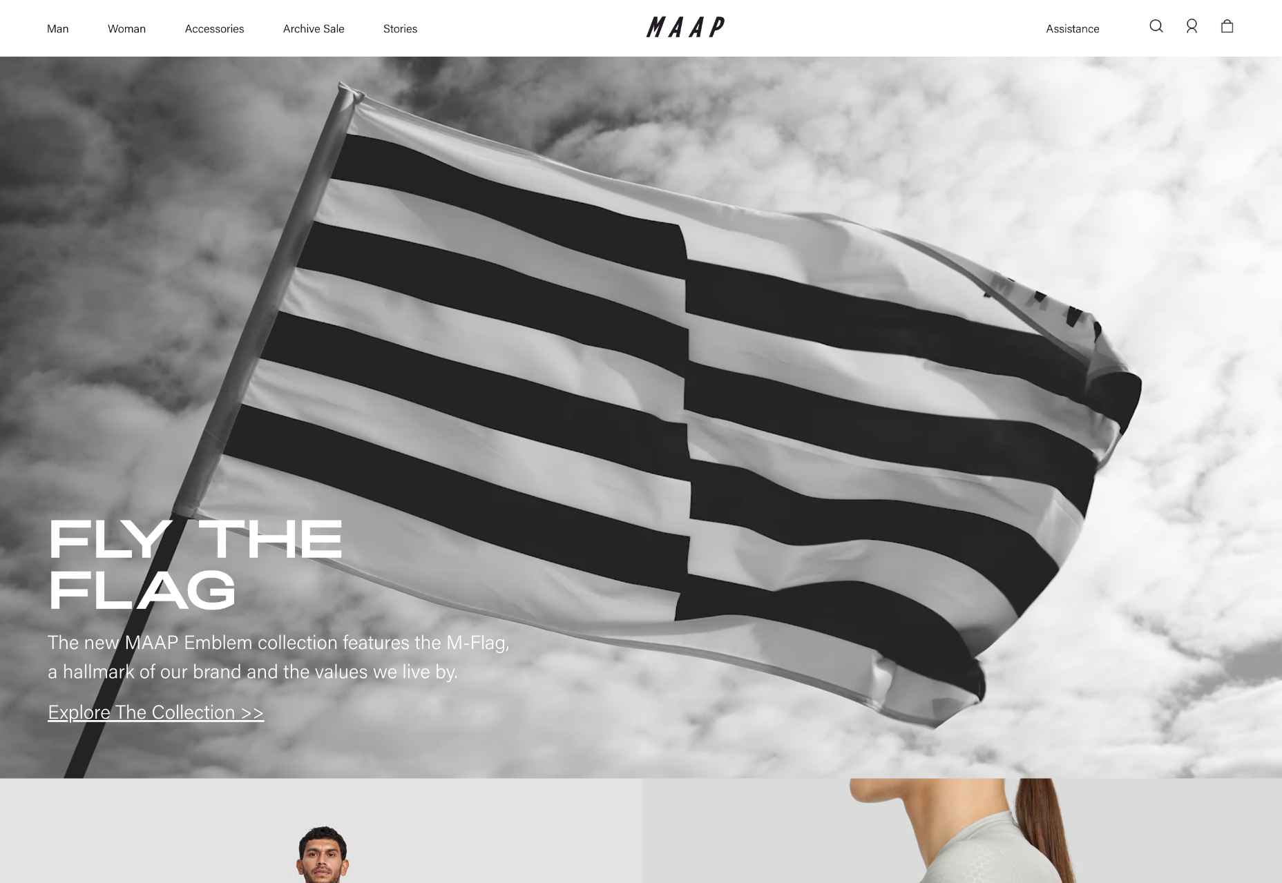
MAAP
The site for MAAP is predictably excellent, modern, and efficient. It encapsulated the apparel brand’s values perfectly.
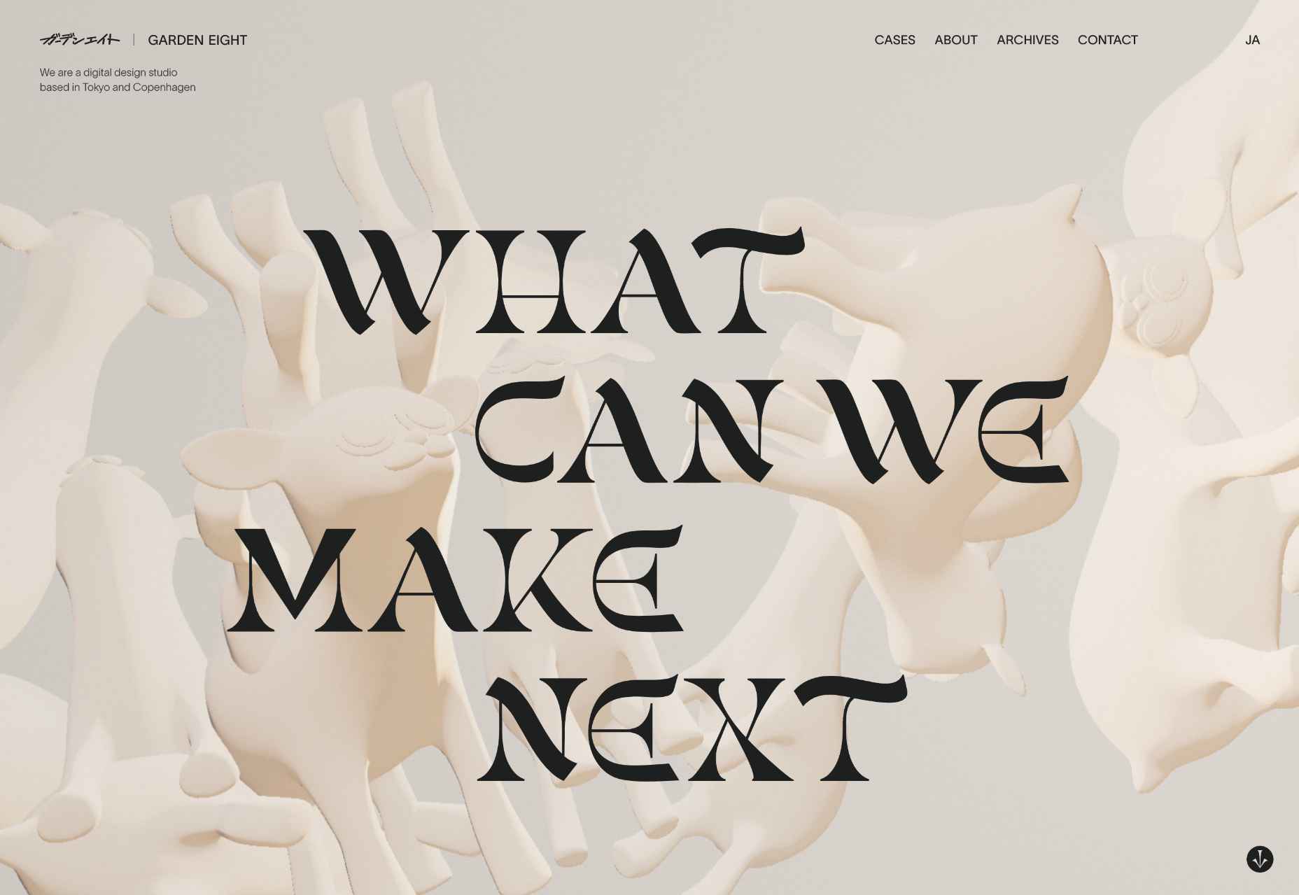
Garden Eight
The promotional site for Garden Eight, a digital design studio in Tokyo and Copenhagen, was suitably standout eccentric.
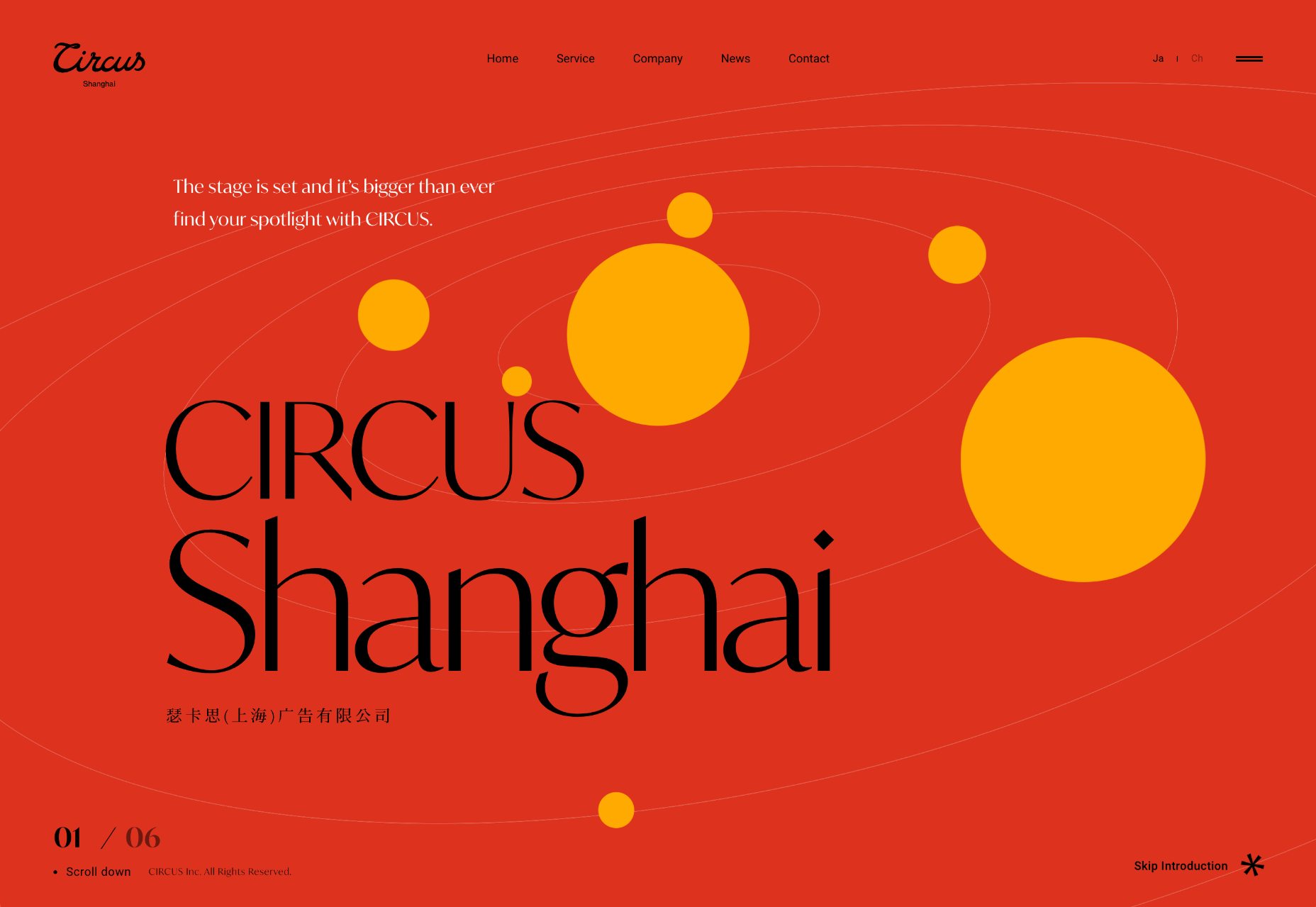
Circus Shanghai
Circus Shanghai used a mid-century illustration style to reference the solar system and the Chinese flag.
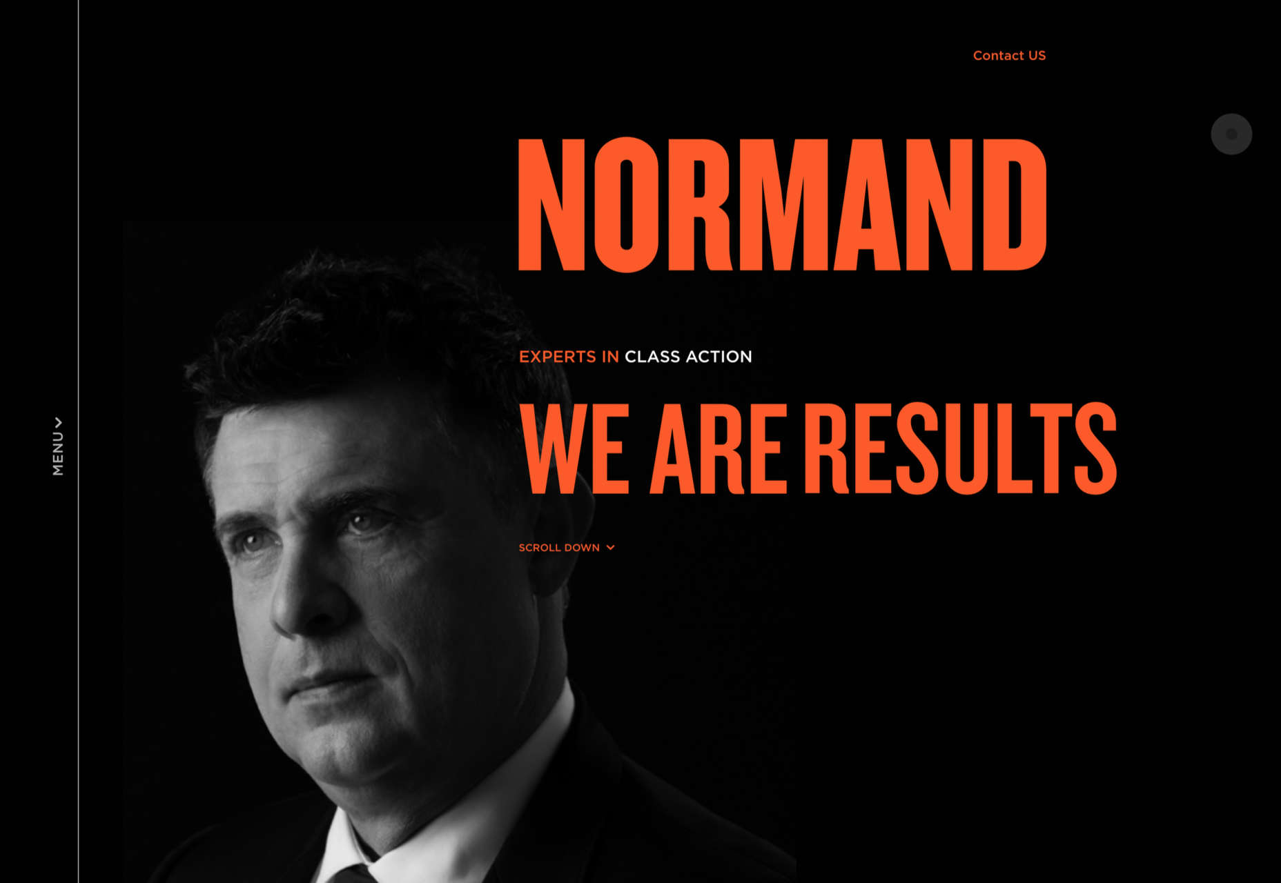
Normand
Normand took the bold decision to step away from the typical law firm design strategy.
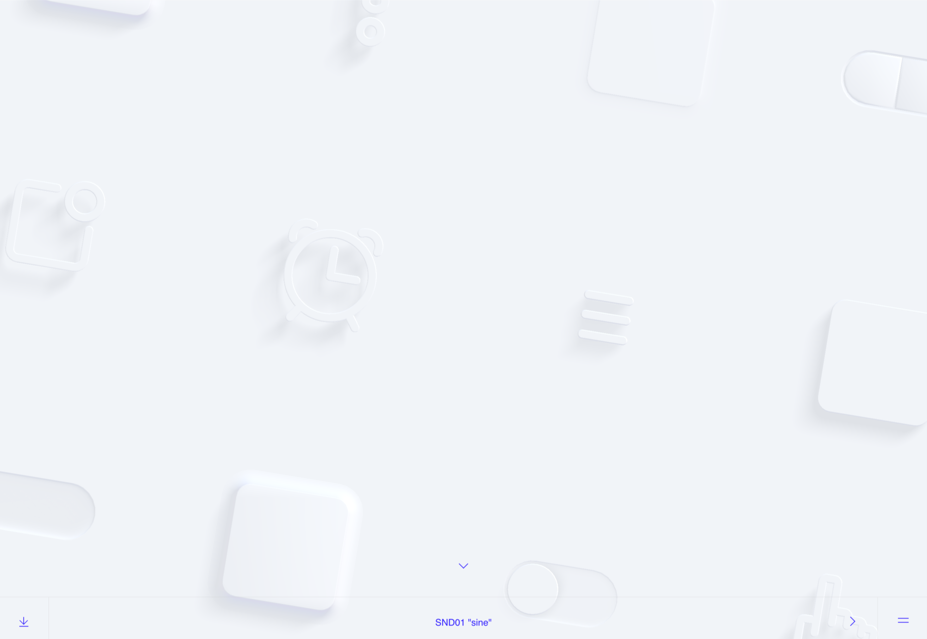
SND
Designing a site for UI sound kits is challenging, but SND pulled it off perfectly with this minimal site.
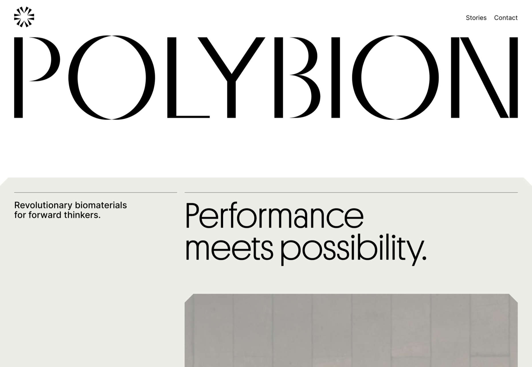
Polybion
We saw lots of brutalism in 2022, and Polybion’s site was a standout example of how to make the trend work.
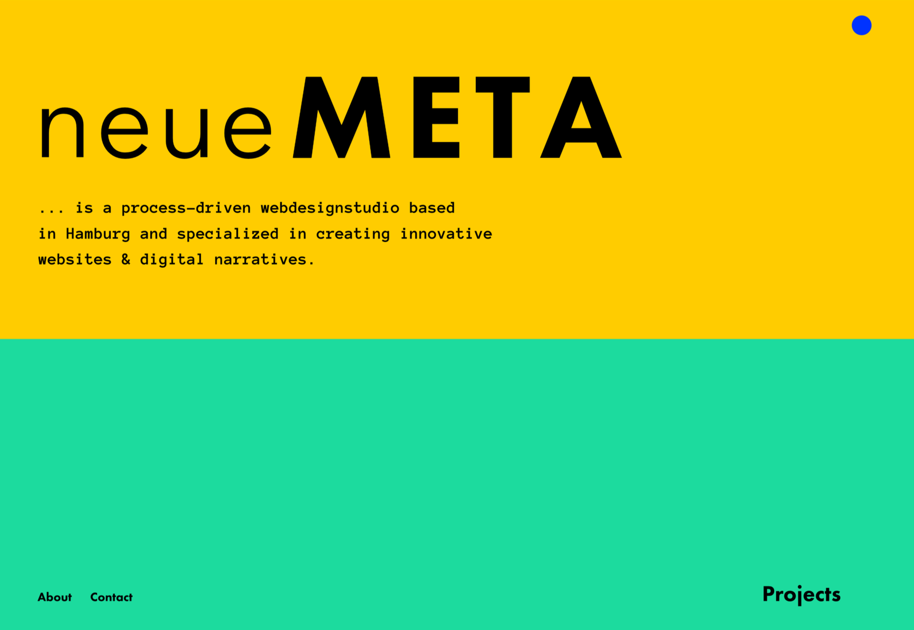
neueMeta
Bold block coloring added depth and interest to this portfolio site for design studio neueMeta.
Dumpling Delivery
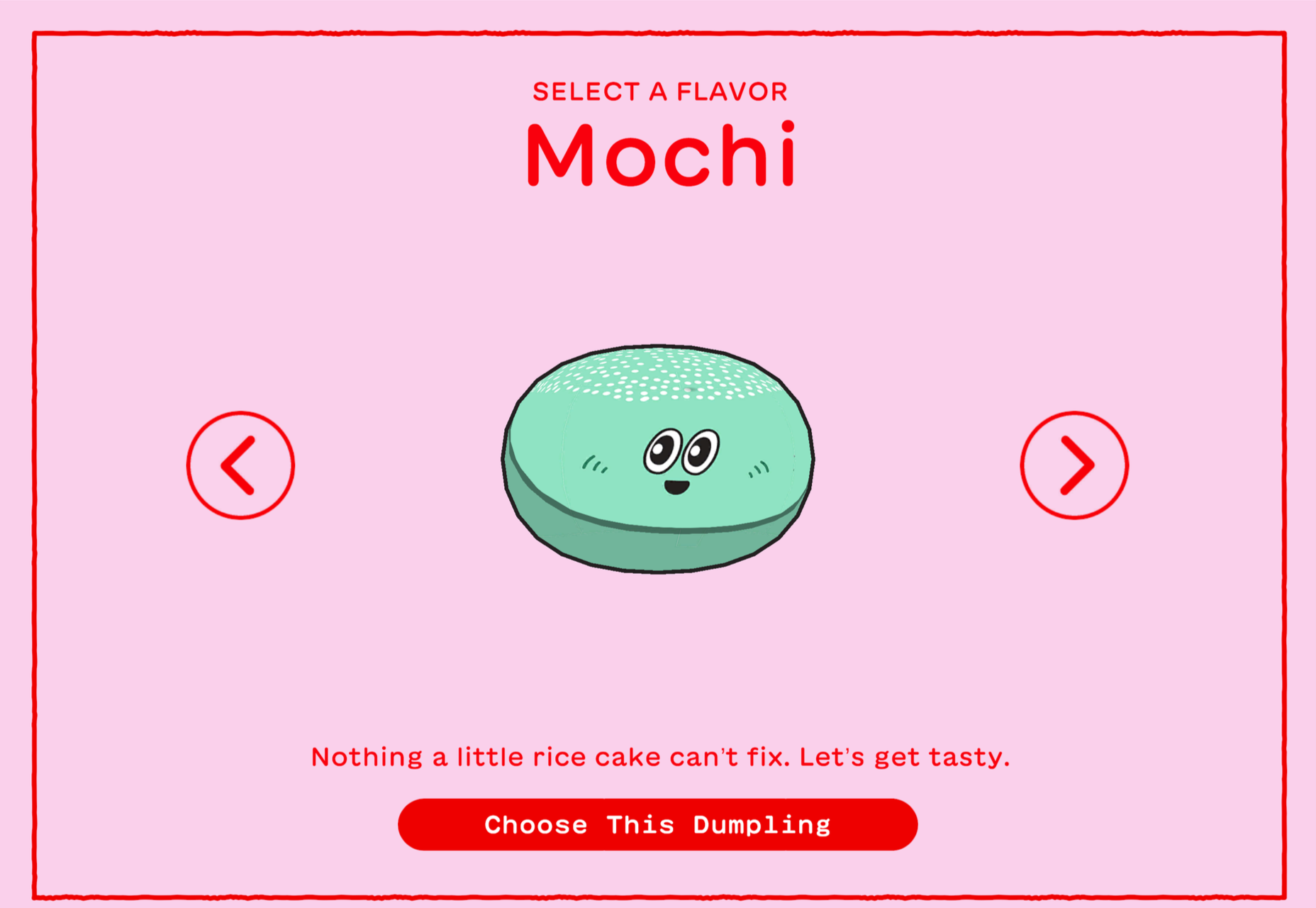
OK, we confess we spent waaay too much time playing this dumpling delivery game from Mailchimp back in May.
Nowhere Bakery
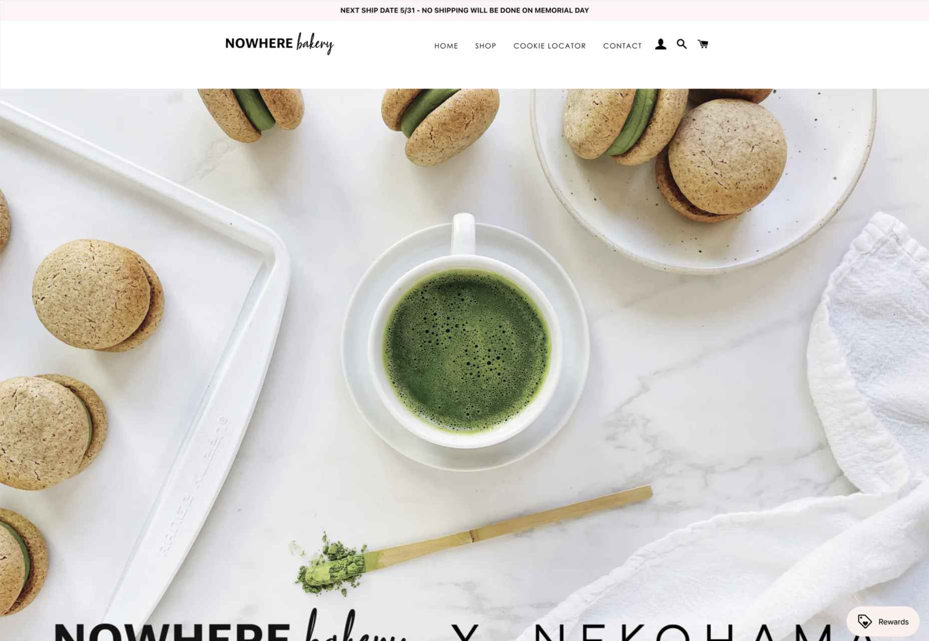
Nowhere Bakery succeeded in making vegan, paleo, gluten-free cookies seem appealing.
Triniti
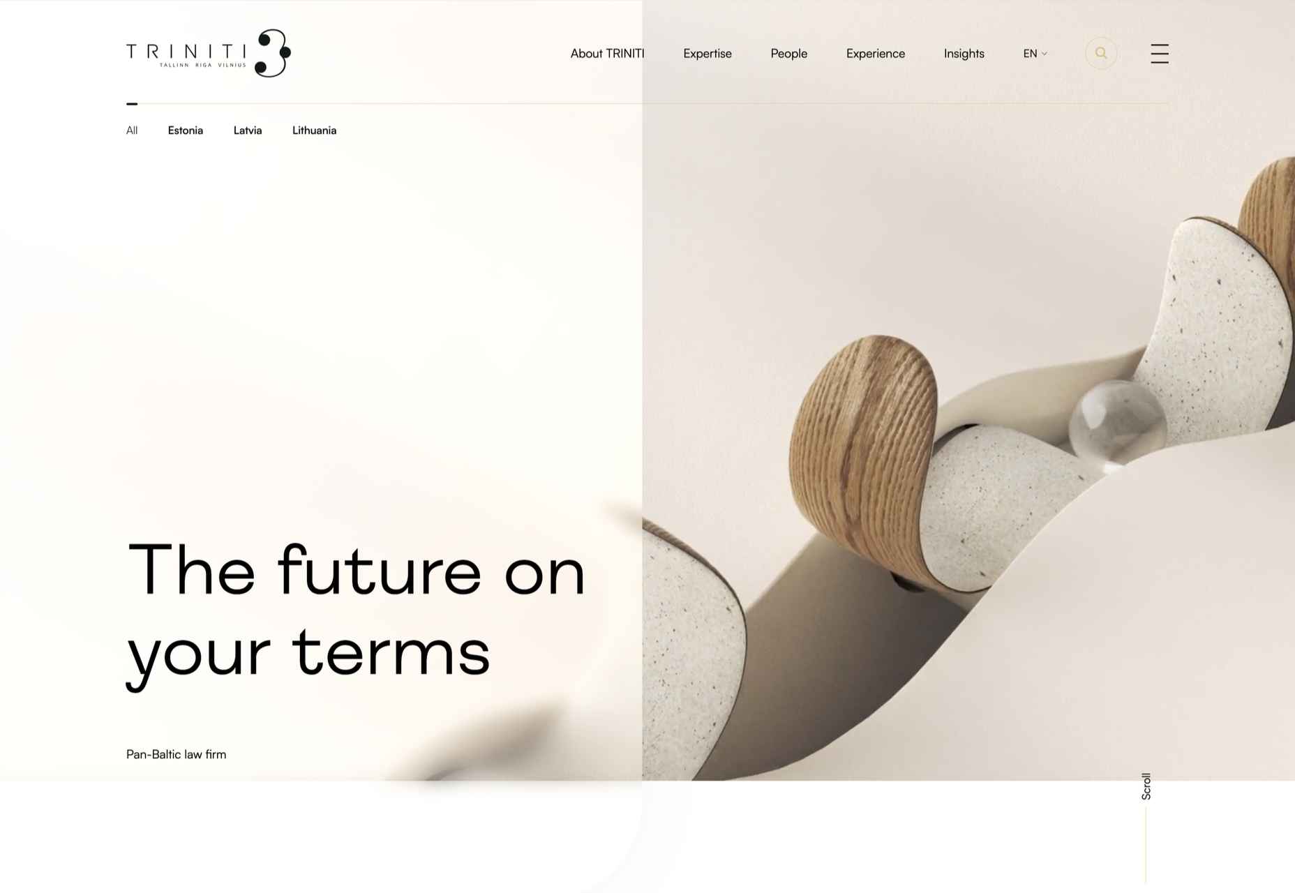
We were mesmerized by the perpetual motion video for the pan-Baltic law firm Triniti.
Kim Kniepp
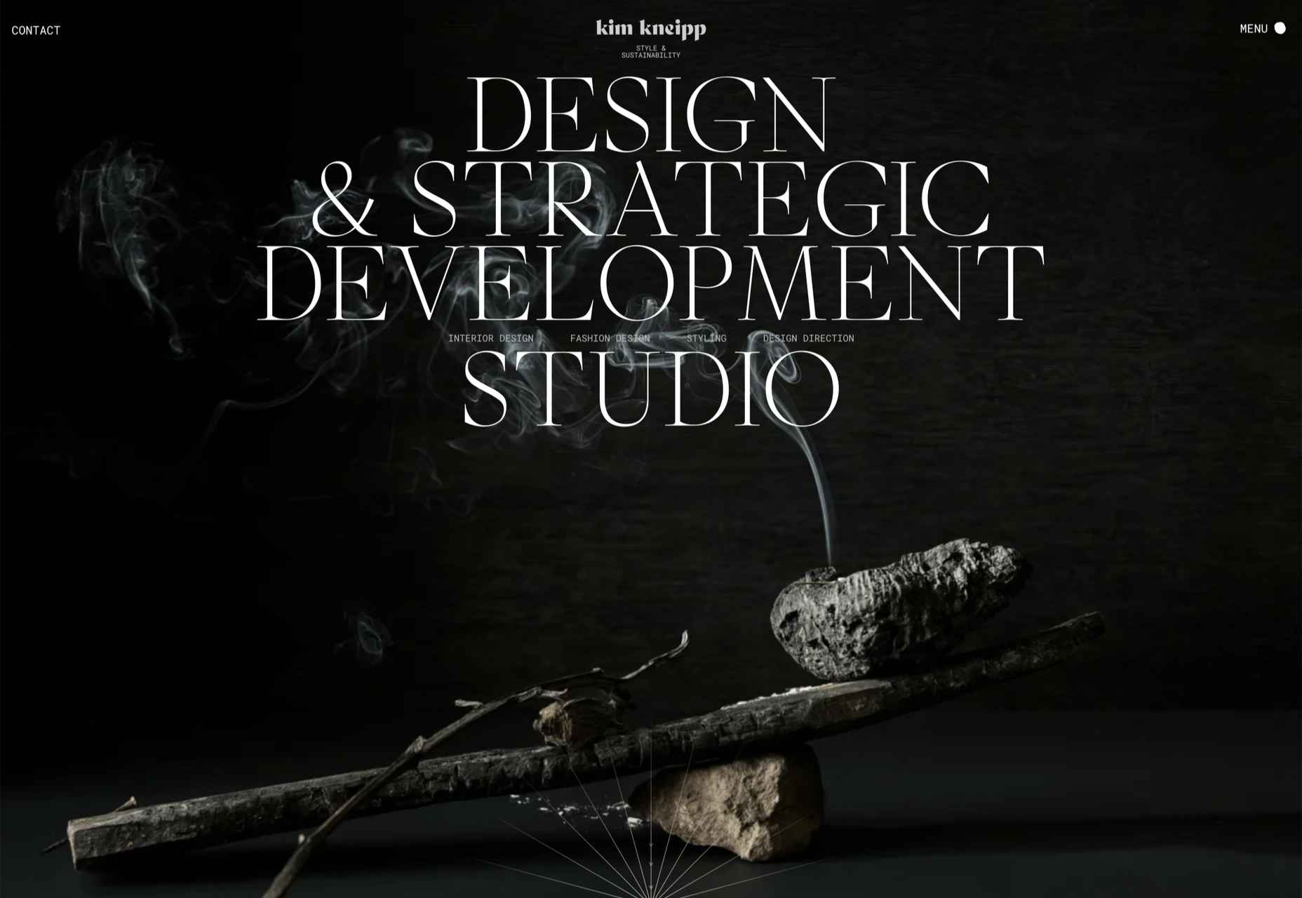
Kim Kniepp’s site impressed us with interconnected navigation and a superbly coded masonry grid.
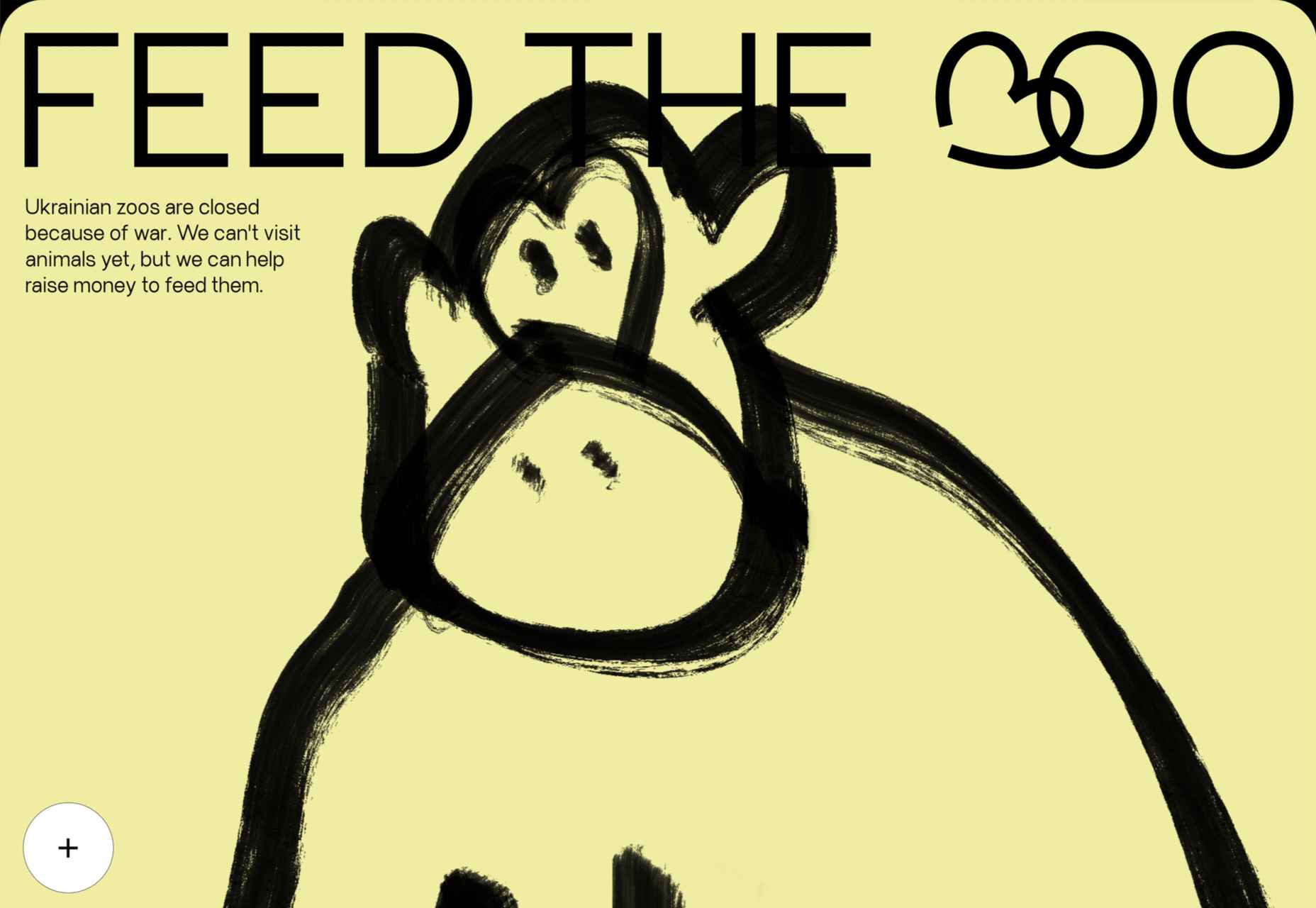
Feed The 300
Feed The 300 is one of dozens of great sites to combat Russia’s invasion of Ukraine. In this case, it was aimed at feeding zoo animals.
Icons By Menu
Icons By Menu is a stunning minimalist site that is a pleasure to browse.
Museum Of Pink Art
The Museum of Pink Art is an immersive experience celebrating the color pink. It was easy to lose hours wandering around.
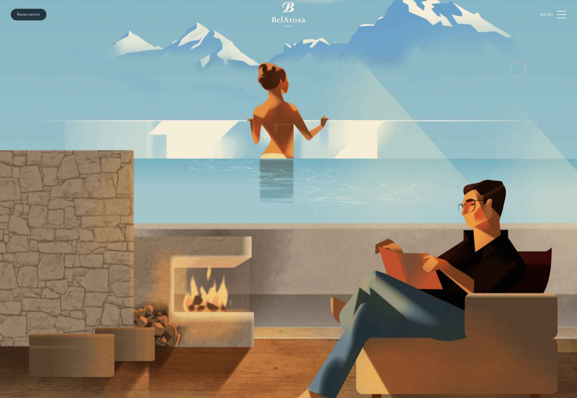
BelArosa Chalet
2022 was the year of illustrations, and BelArosa Chalet’s site used them to significant effect to sell a venue still under construction.
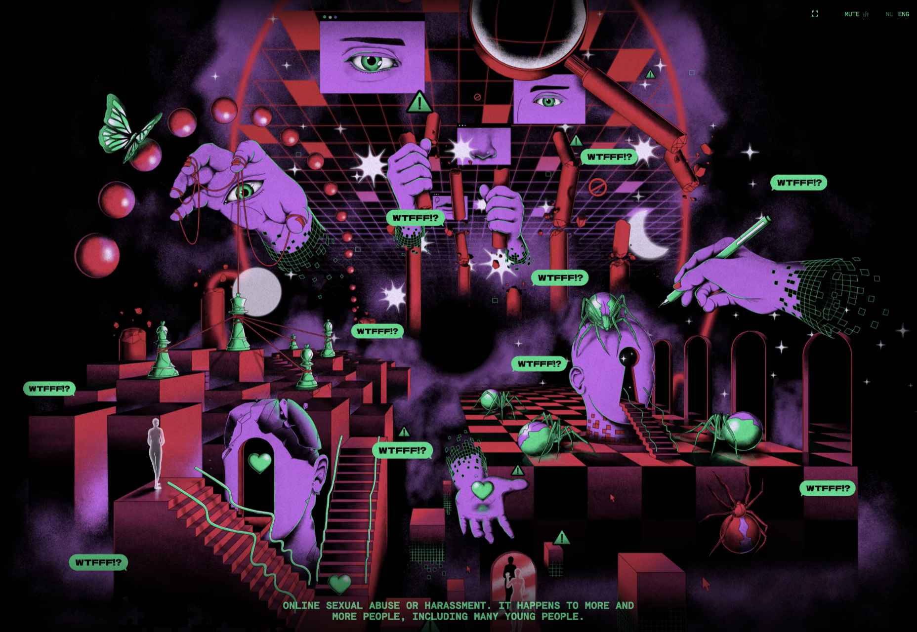
WTFFF
Online sexual abuse and harassment are particularly appalling when directed at young people. WTFFF tackled the issue sensitively.
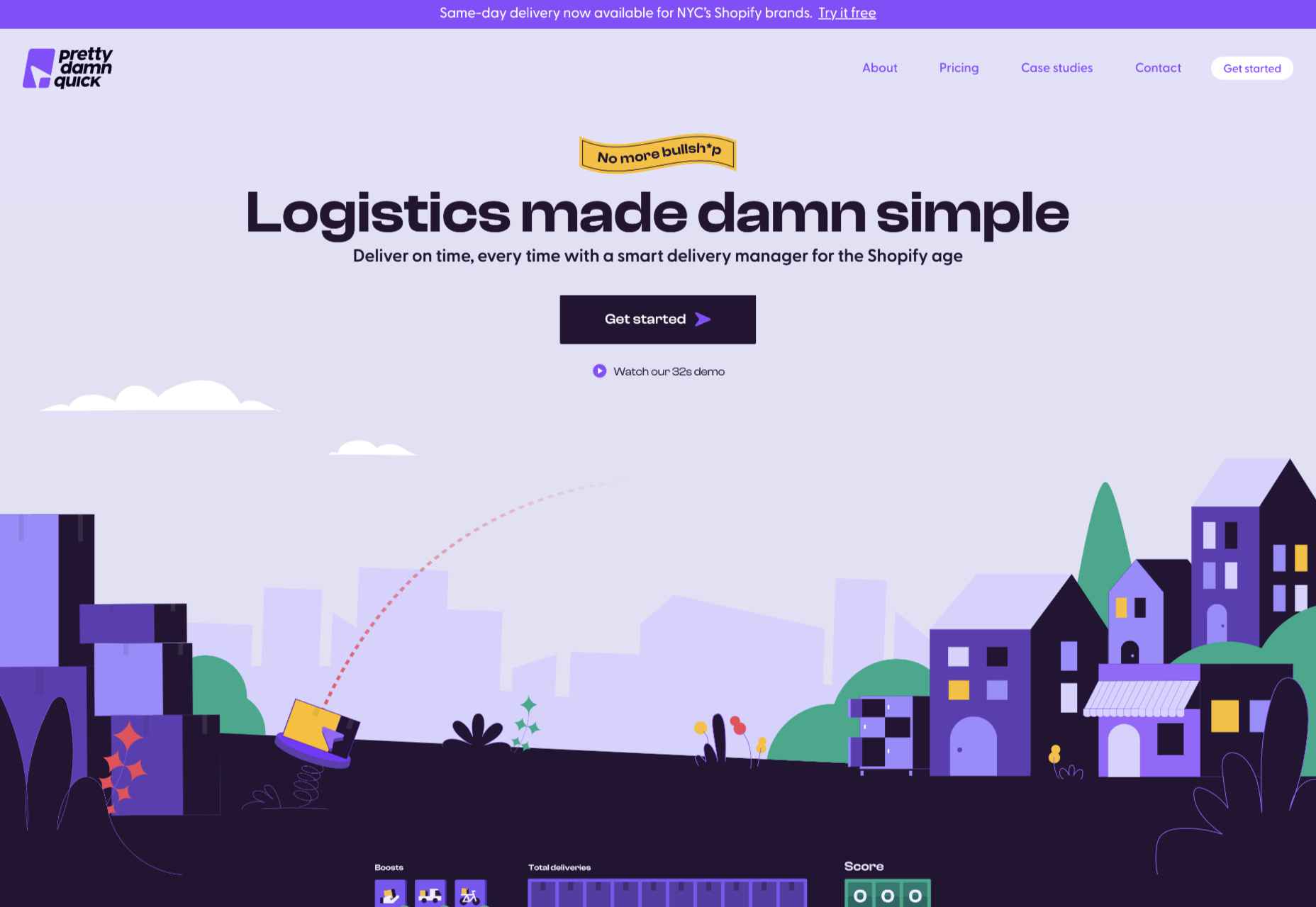
Pretty Damn Quick
Logistics aren’t the most engaging topic, but this friendly, illustrated site for Pretty Damn Quick grabbed us immediately.
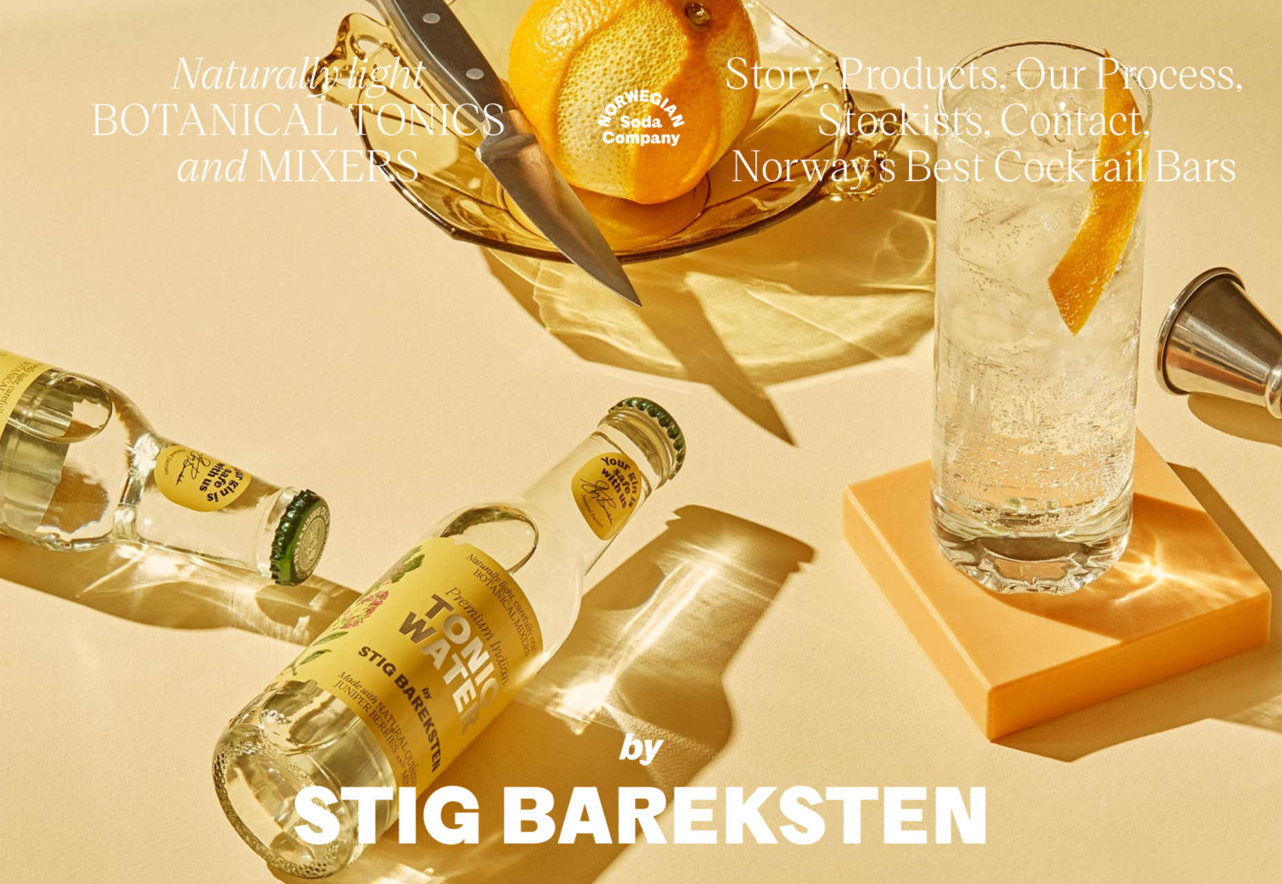
Norwegian Soda Co.
This site for the Norwegian Soda Co. uses beautiful photography to create an engaging one-page site.
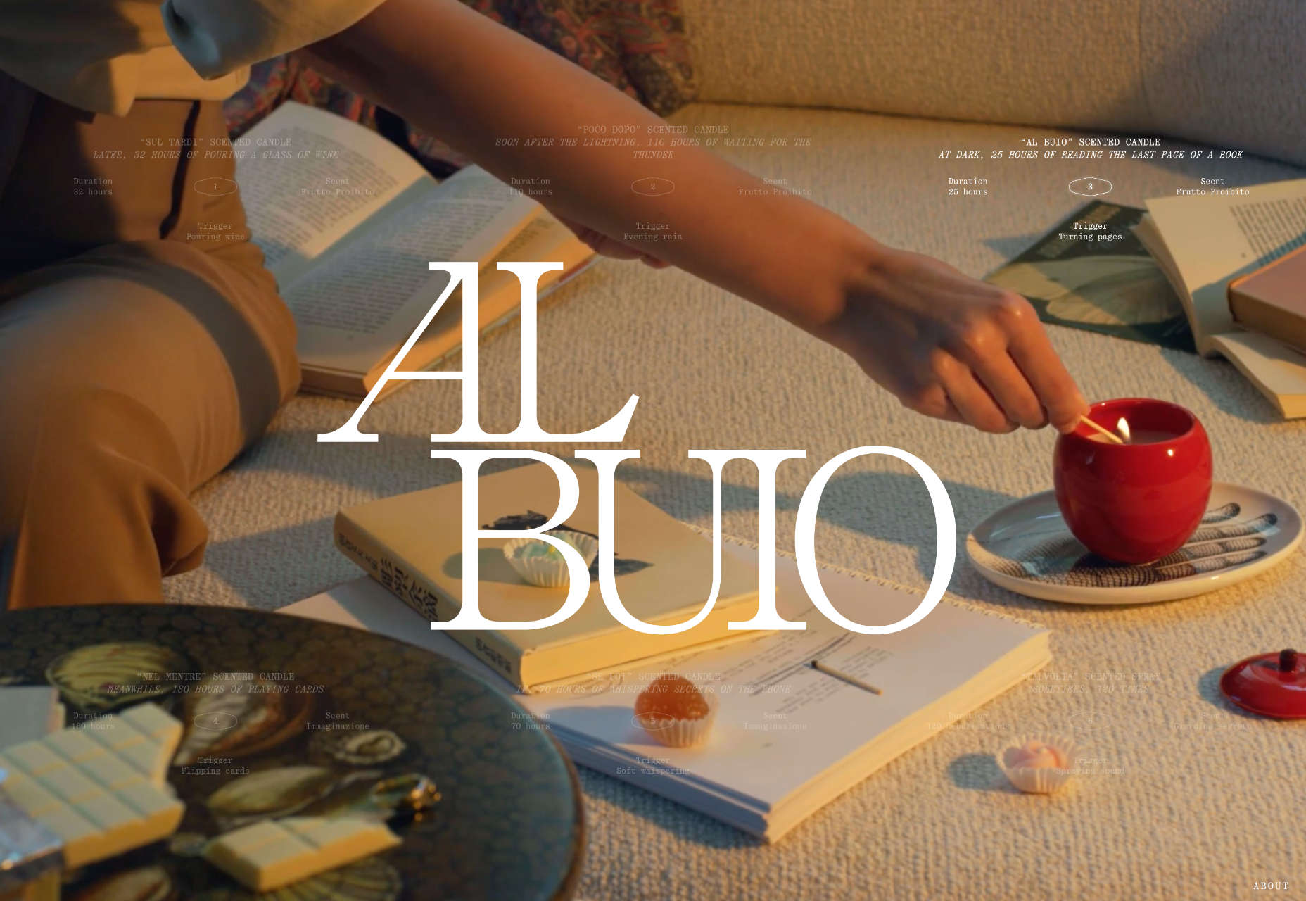
Fornasetti Profumi
Fornasetti Profumi wowed us with its long-form videos used to emphasize stillness and calm.
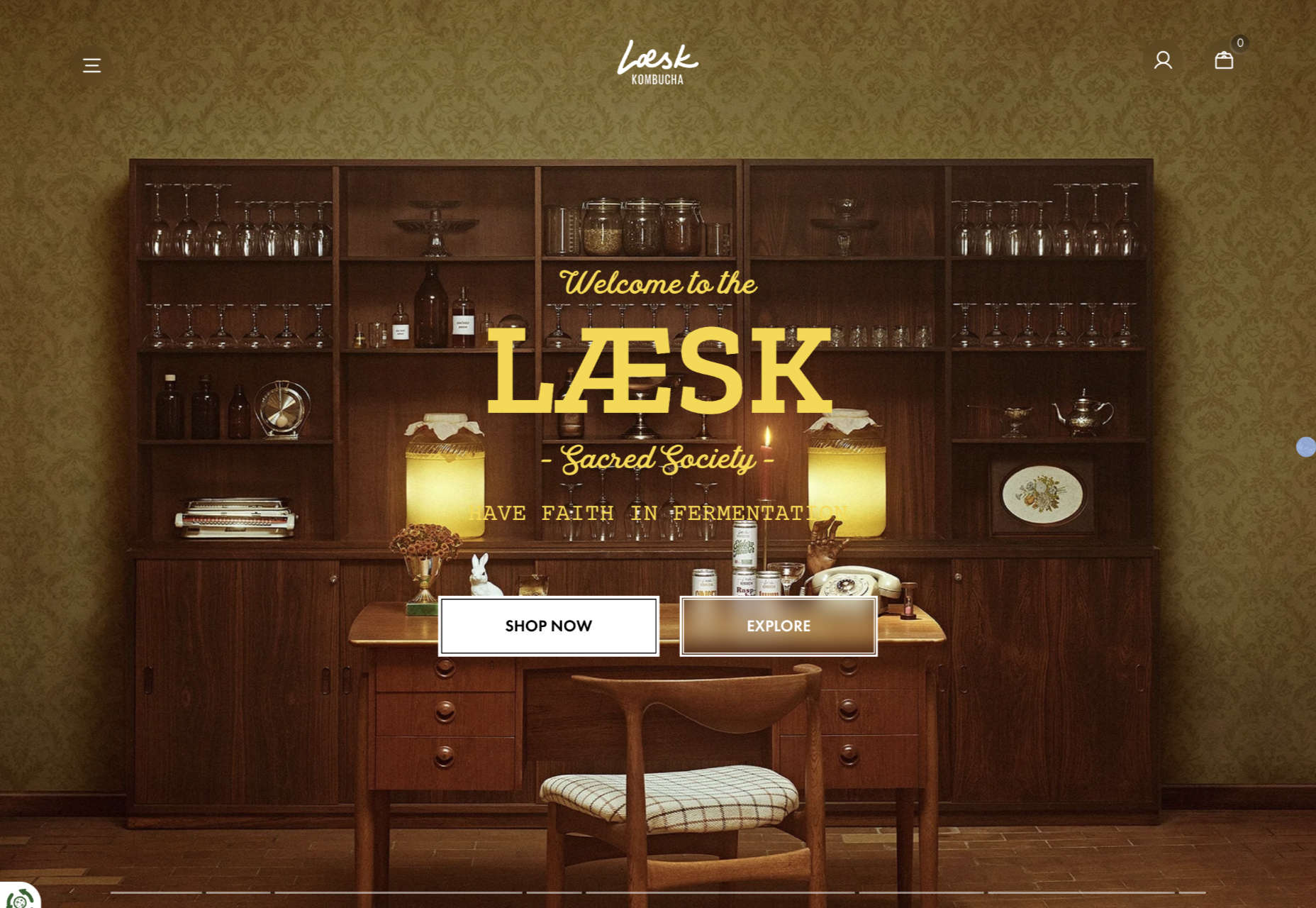
Laesk Kombucha
We were convinced this site for Laesk Kombucha had been produced by Wes Anderson.
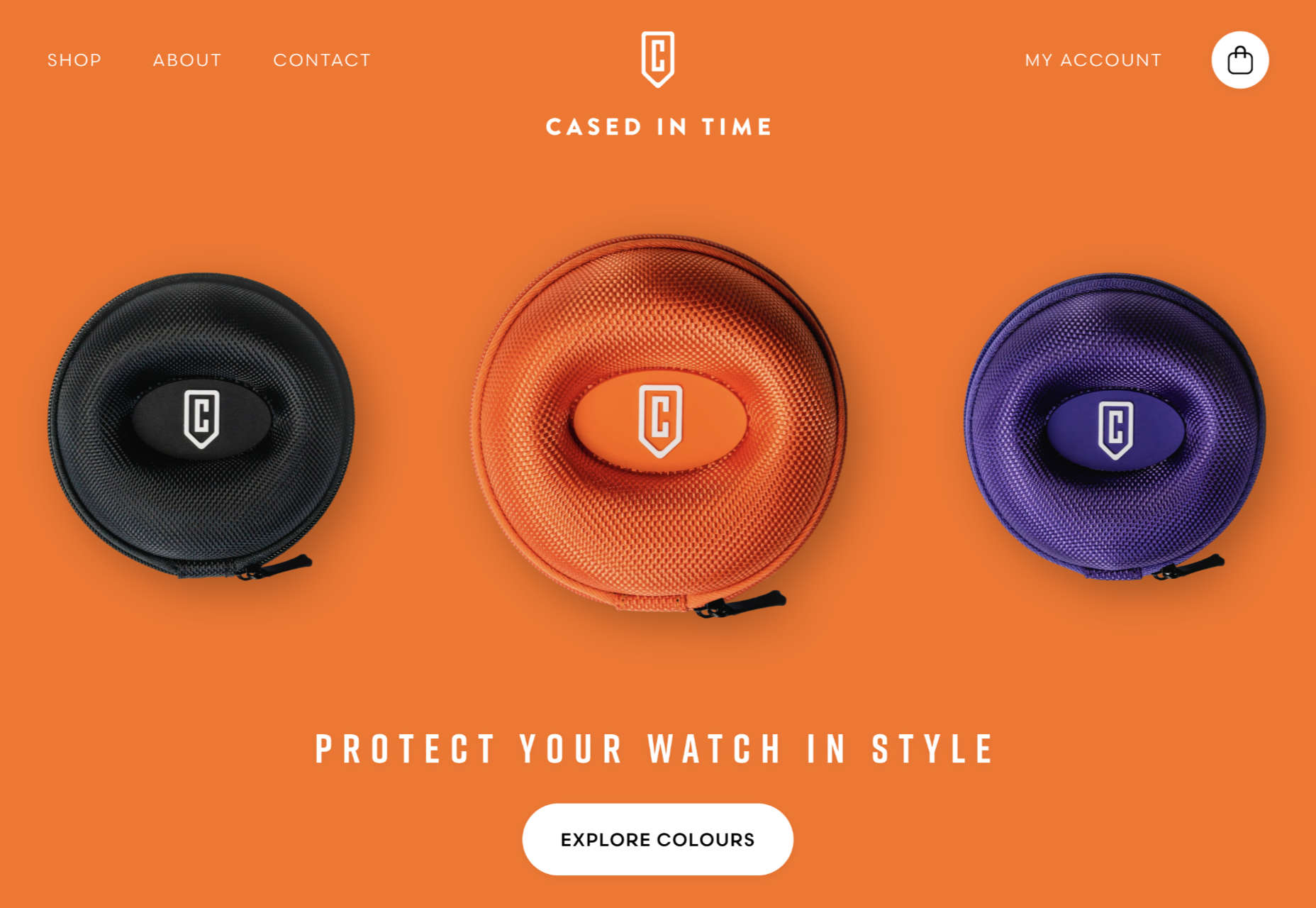
Cased In Time
Single-product sites are often underwhelming, but this excellent ecommerce site bucks that trend.
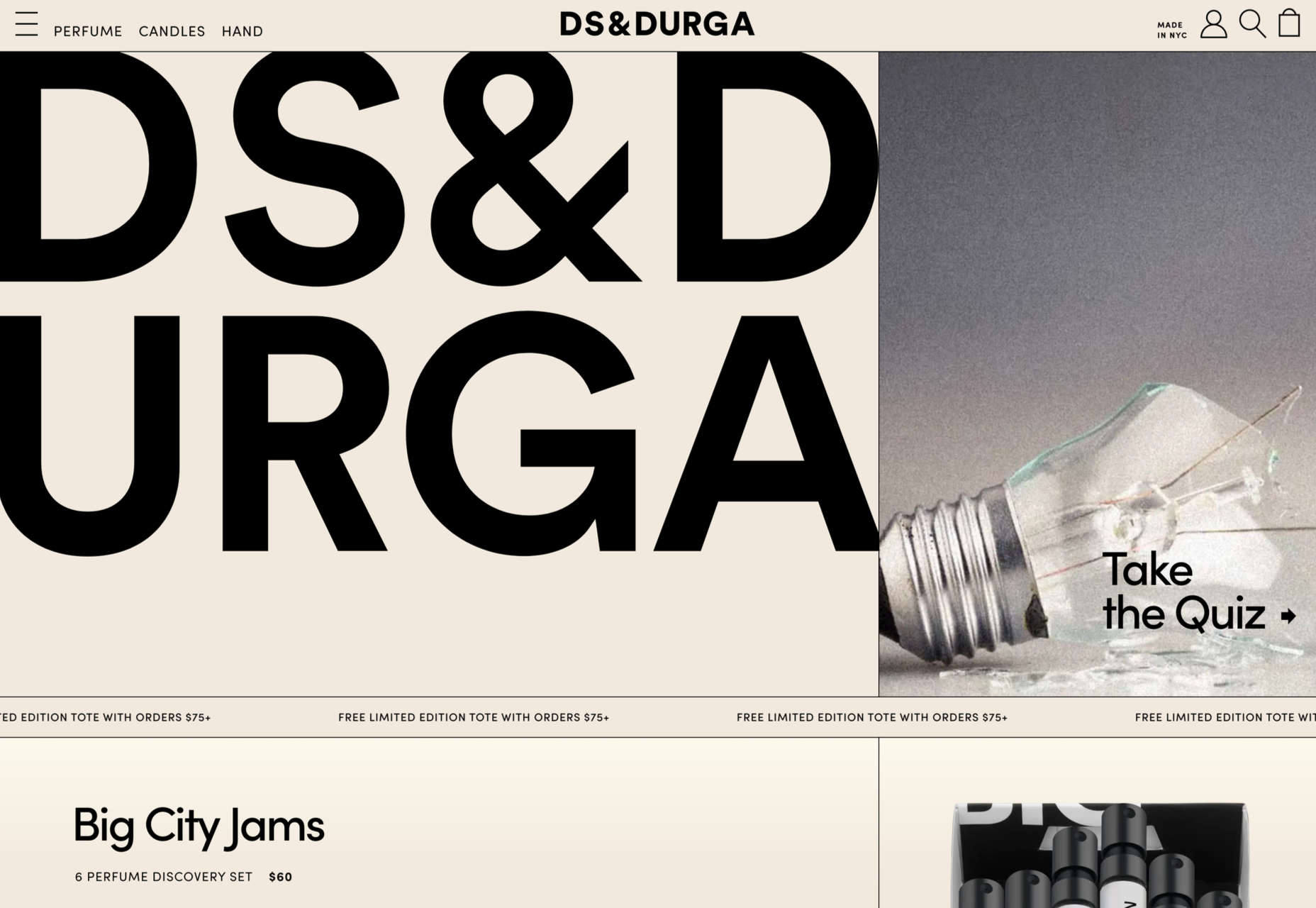
DS & Durga
Eschewing the well-trod approach of flowers and pretty models, this perfume site for DS & Durga fully embraces the brutalist trend.
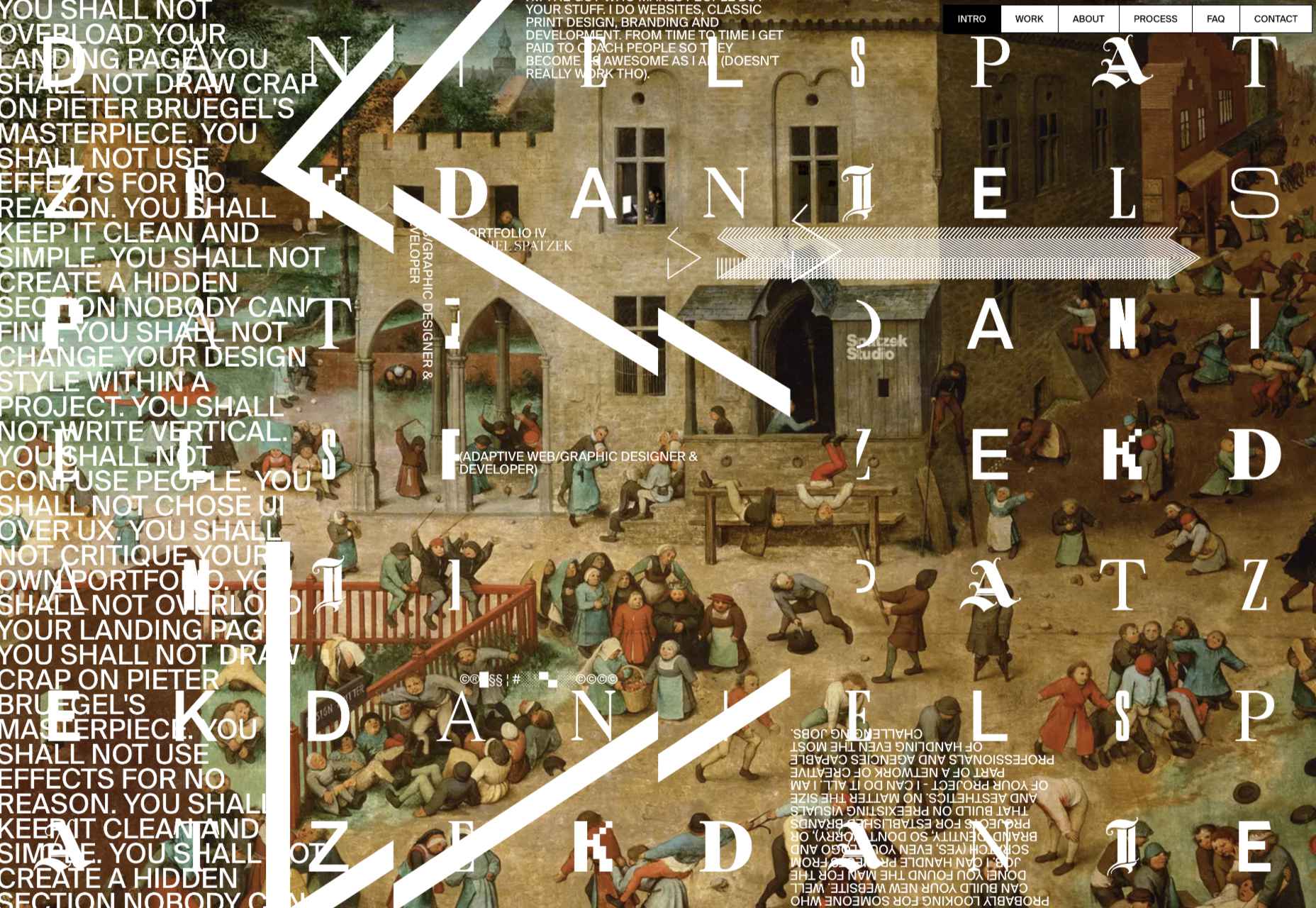
Daniel Spatzek
We loved the way Daniel Spatzek’s portfolio site broke all the rules and still managed to be informative and engaging.
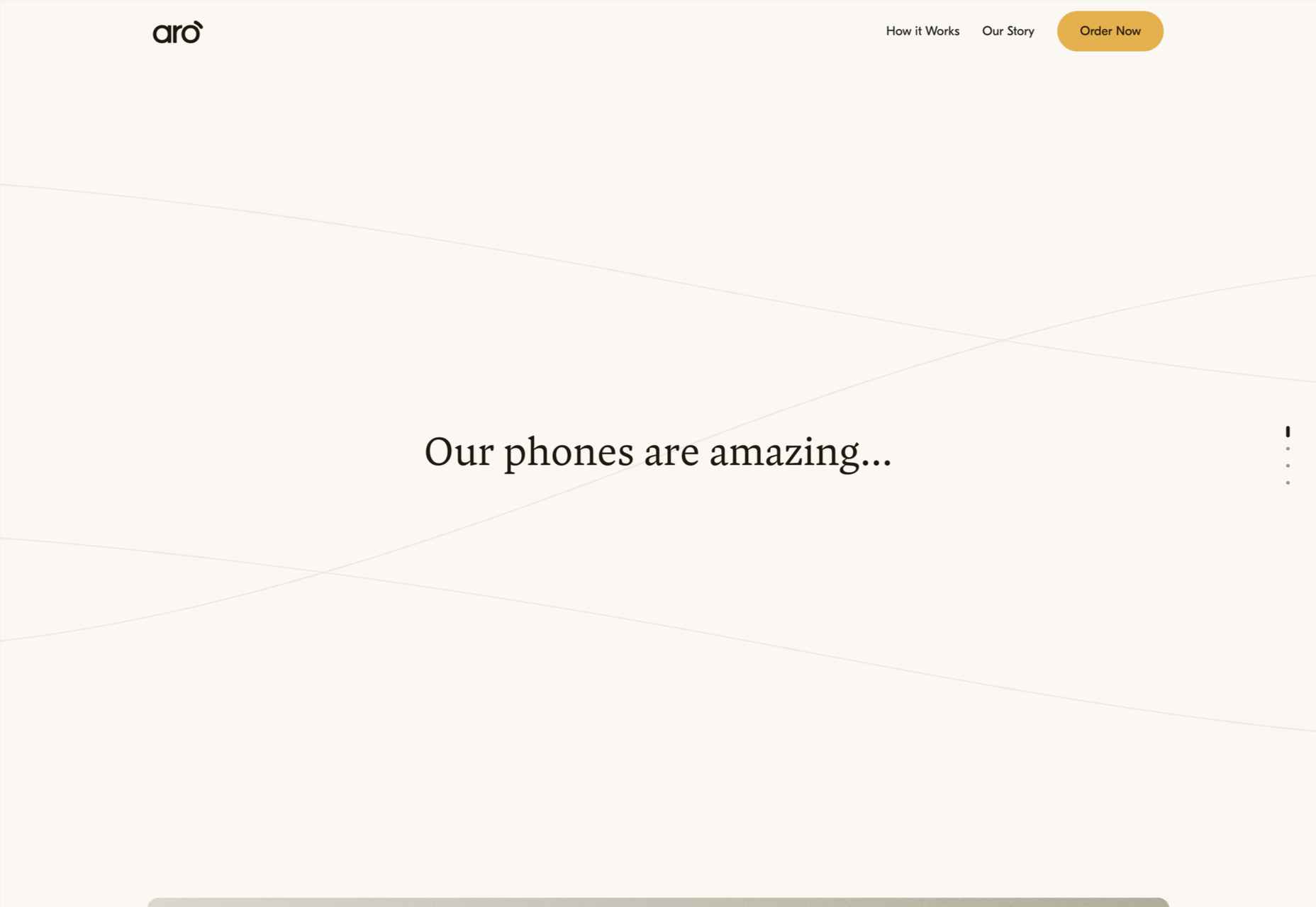
Aro
Aro kept minimalism alive with a simple site that exudes luxury while selling a simple concept.
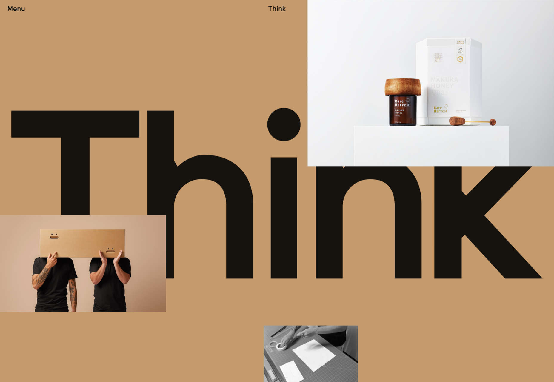
Think Packaging
Think Packaging took a case study approach to present its products, and it worked really well.
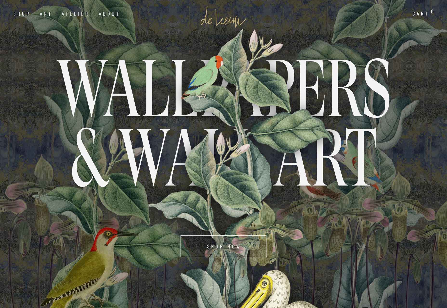
Steffie de Leeuw
Giant typography intertwined with botanical illustrations created a memorable site for Steffie de Leeuw.
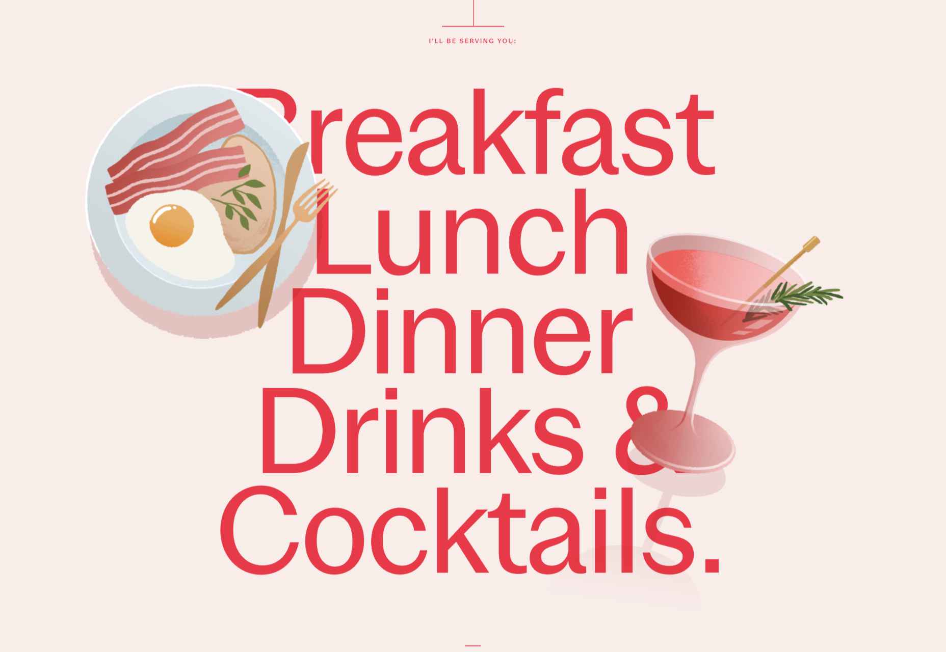
Anna Jóna
The prelaunch teaser site for the Ana Jóna café and cinema was elegant and modern and had us eyeing a long weekend in Reykjavik.
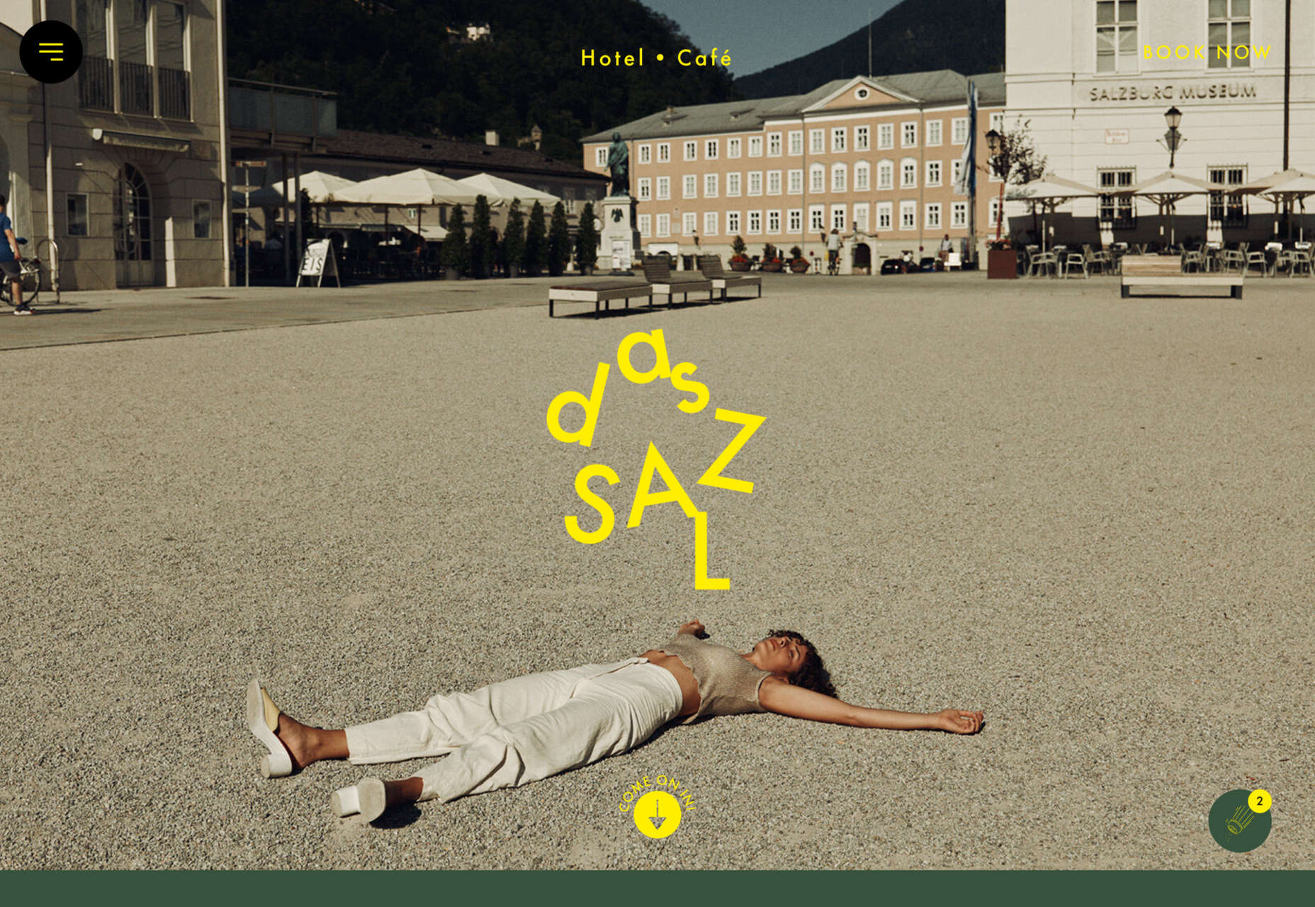
Das Salz
More wanderlust courtesy of the fresh, enticing site for the Das Salz hotel and café.
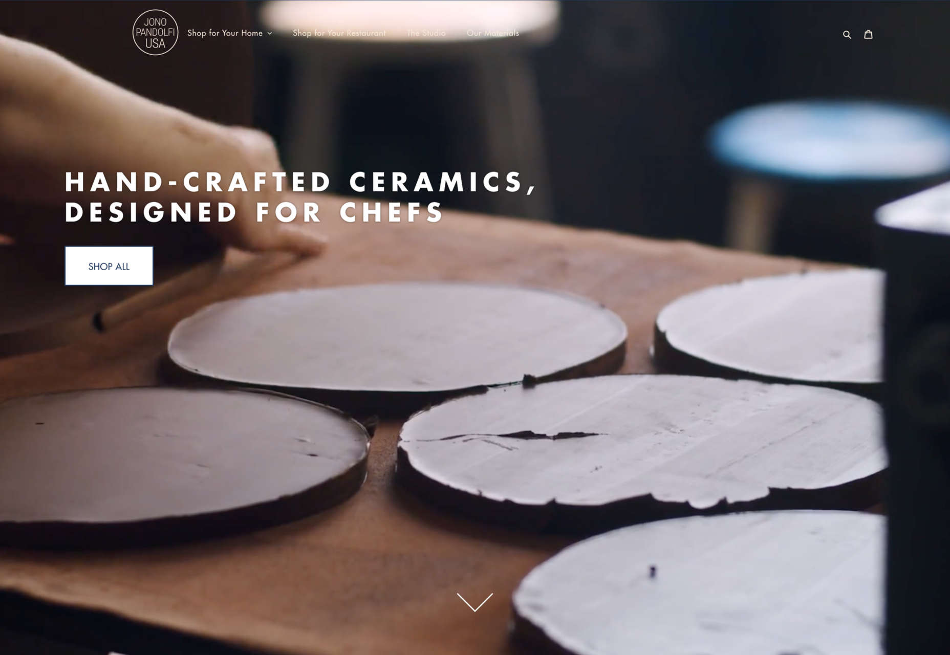
Jono Pandolfi
This simple-to-use site for US tableware and cookware brand Jono Pandolfi sold us on hand-made ceramics.
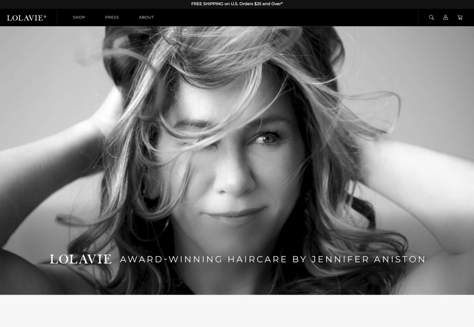
LolaVie
We still can’t get over the fact that it took until 2022 for Jennifer Aniston to produce a haircare range.
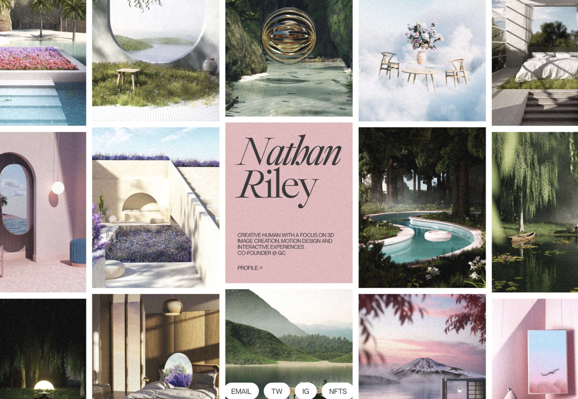
Nathan Riley
Another big trend in 2022 was masonry-style sites, and this portfolio for Nathan Riley was one of our favorites.
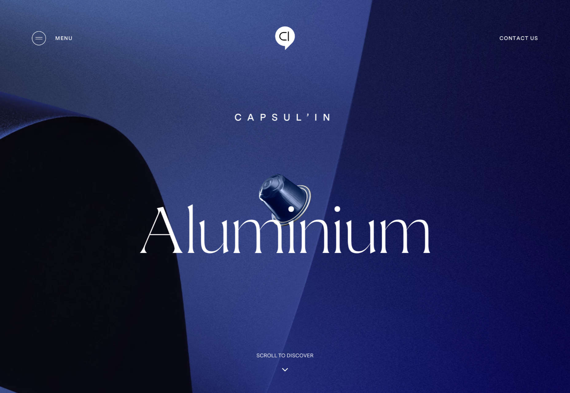
Capsul’in Pro
With the excellent application of animation and careful use of color, this site for Capsul’in Pro transformed coffee pods into luxury items.
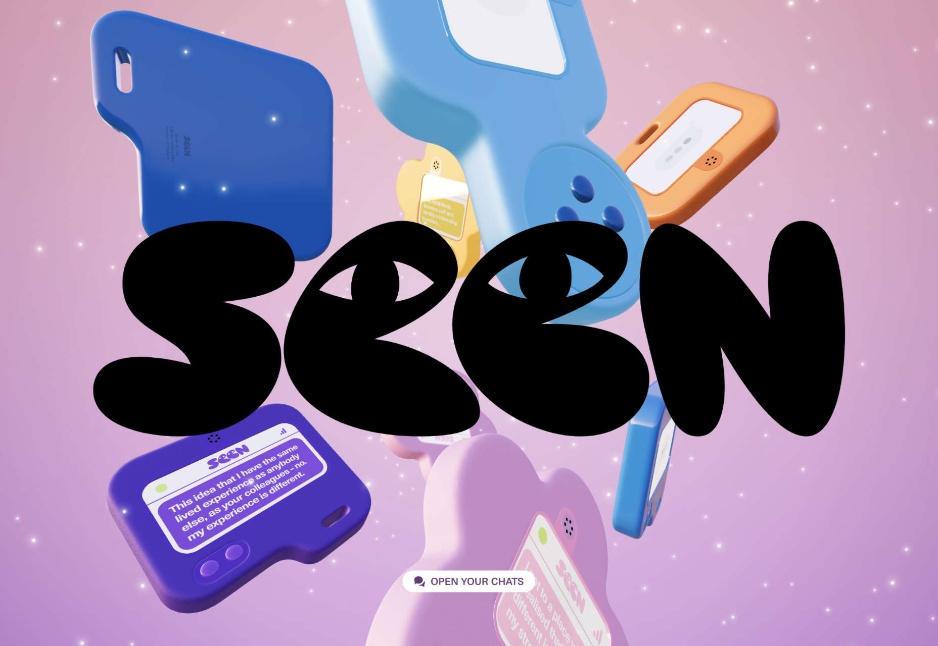
Seen
Seen is an essential site that explores themes of prejudice and racism in creative fields. It’s a strong approach to a difficult subject.
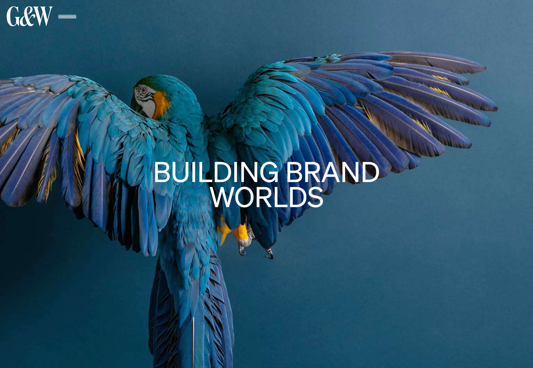
Glasfurd & Walker
Glasfurd and Walker’s superb portfolio site sets itself apart by over-extending the viewport. It’s a highly original idea.
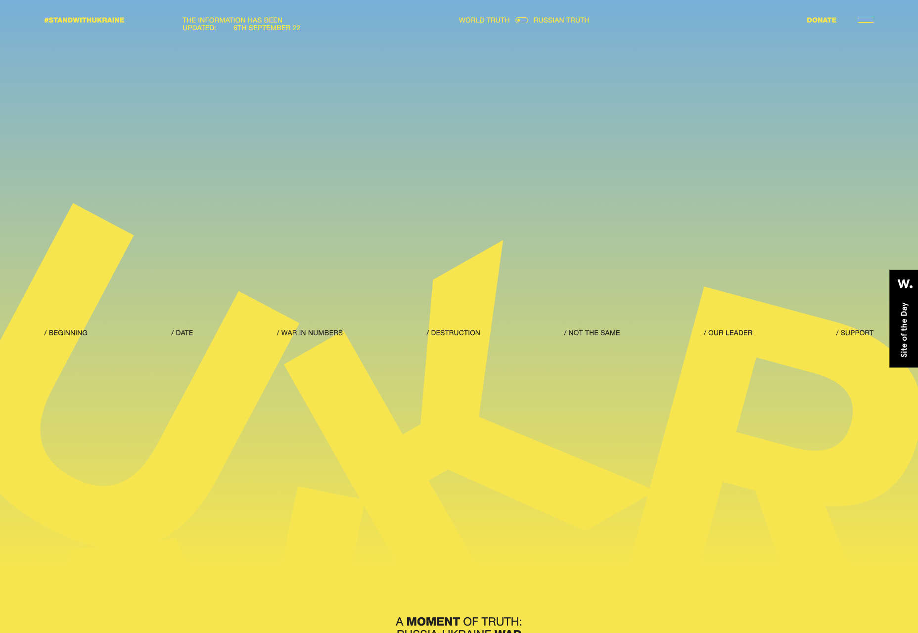
The Other Side Of Truth
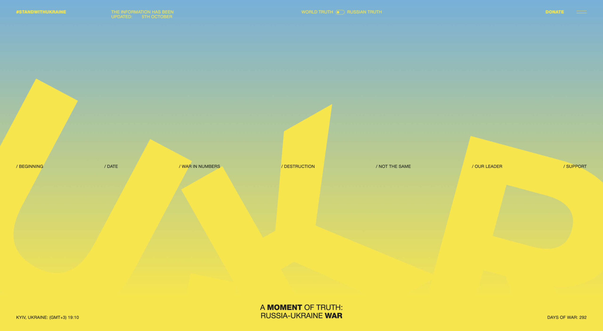
The Other Side of Truth is the standout site of 2022. It used the web expertly to present two interpretations of the facts surrounding the Russian invasion of Ukraine.
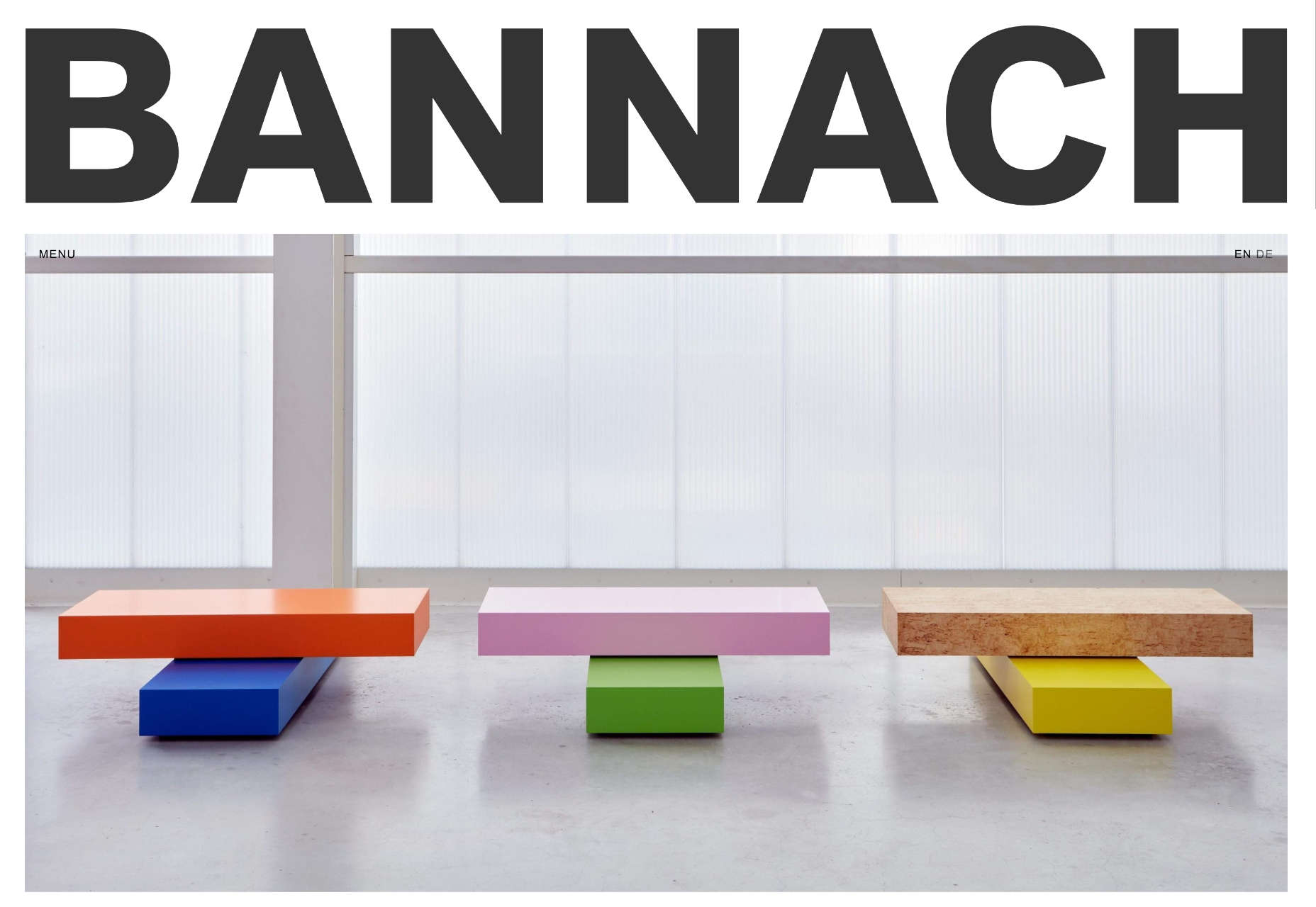
Bannach
Back in October, we fell in love with the pixel-block animation loading for the Bannach furniture brand.
Karina Sirqueira
Karina Sirqueira’s portfolio was a joy to browse through. The morphing shapes imposed simplicity on a series of beautifully presented case studies.
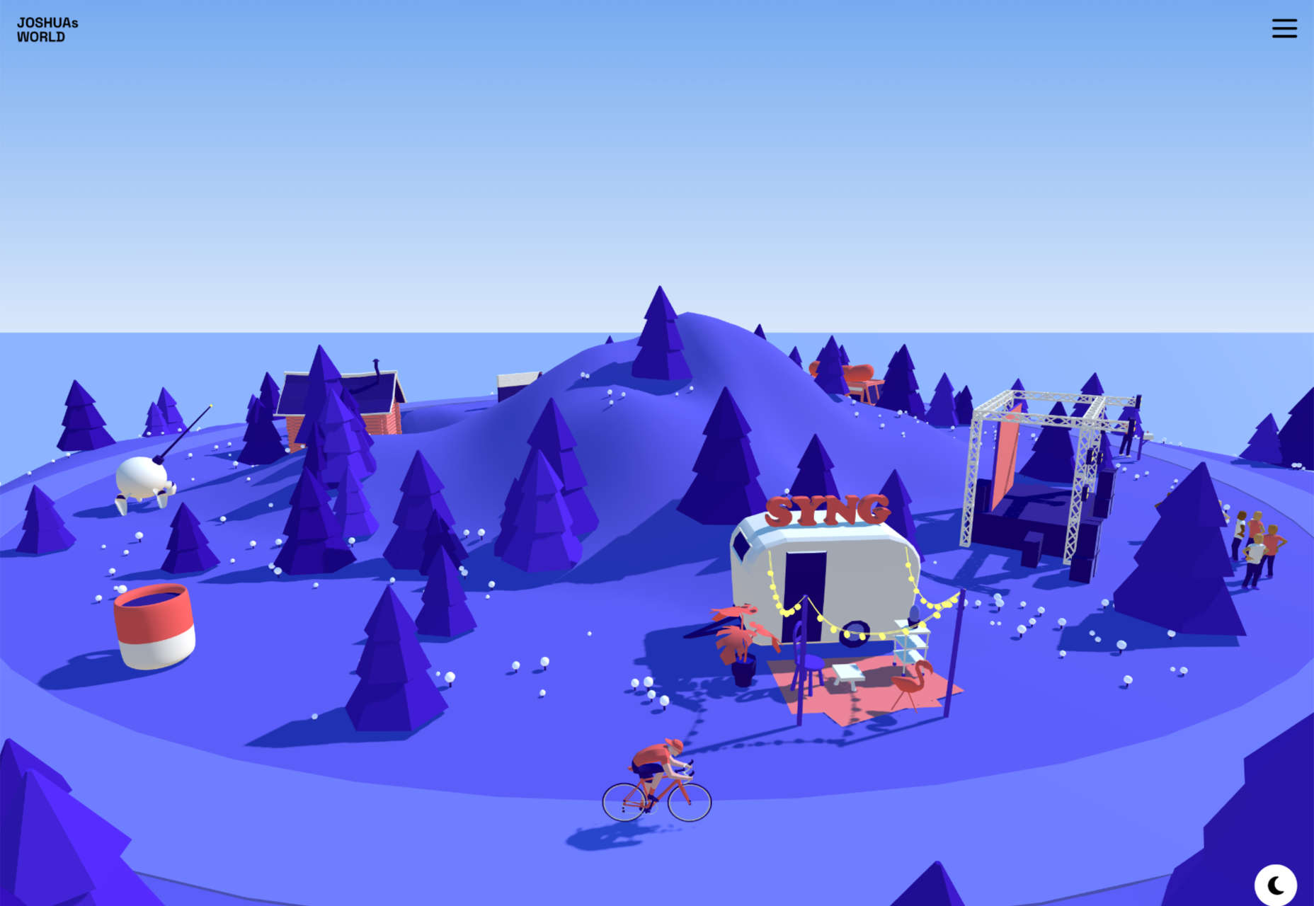
Joshua’s World
We were amazed by Joshua’s World, a little island that can be titled and rotated to power the little cyclist along his career.
SourceThe post 50 Best Websites of 2022 first appeared on Webdesigner Depot.


0 Commentaires