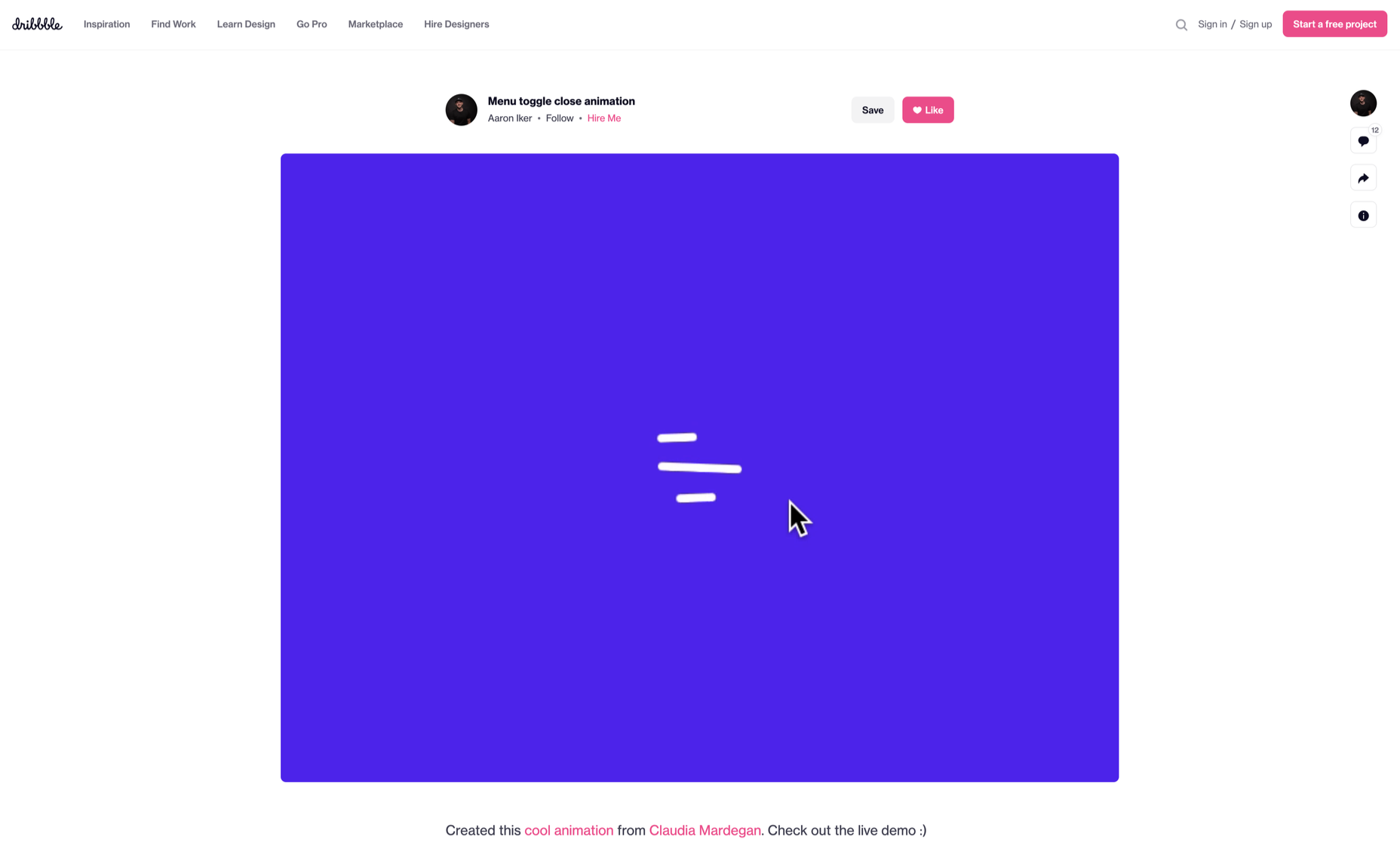
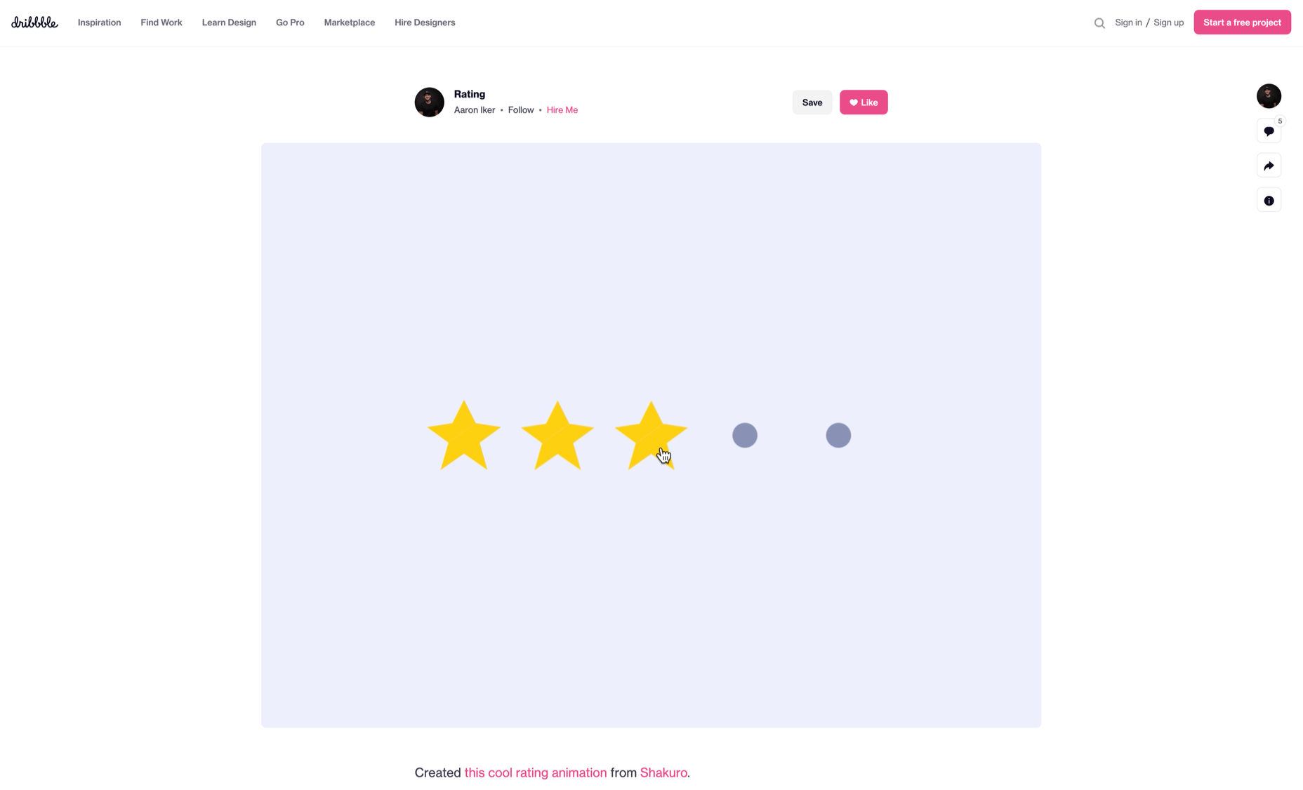
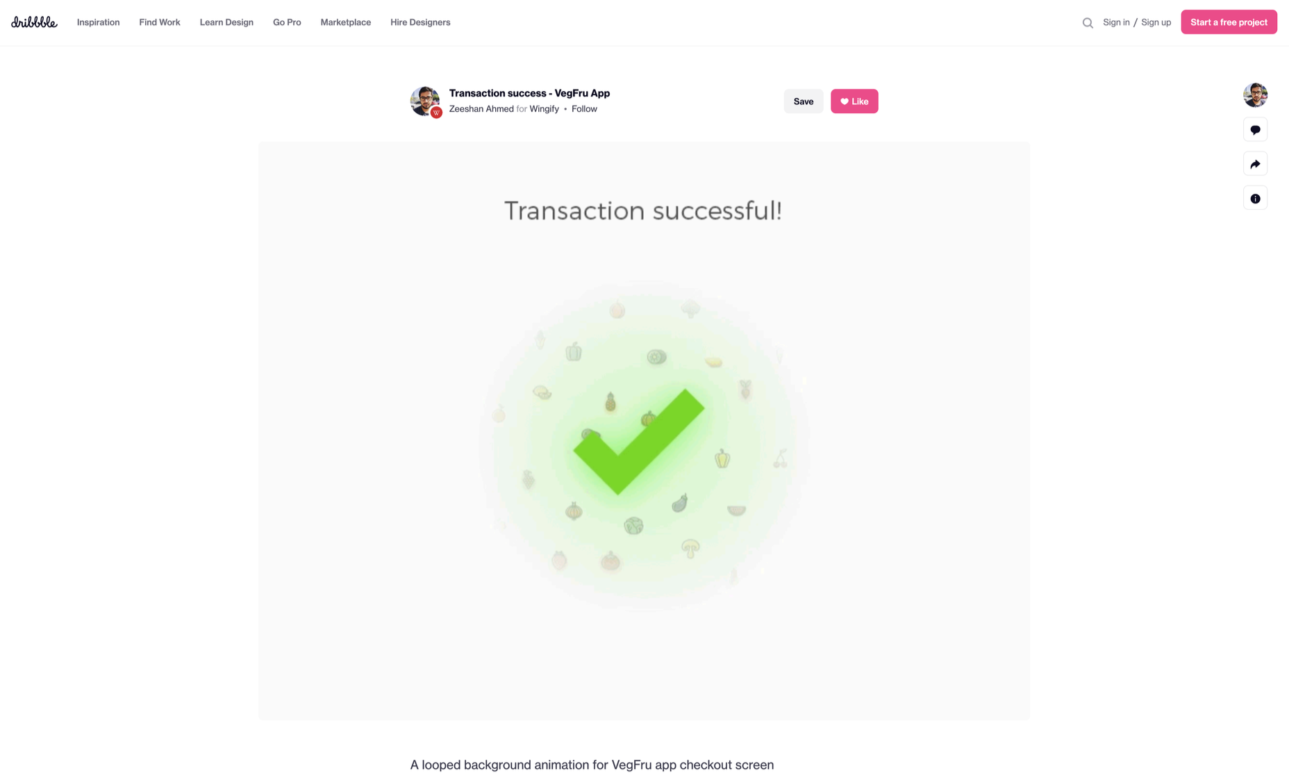
 Micro-interactions effectively communicate brand identity and ethos while strengthening ties with the customer. These habit-forming tools make for a fun and seamless user experience. Facebook’s ‘likes’ and Tinder’s ‘swipes’ are two classic examples.
Micro-interactions originated with the need to guide customers who had hit a snag while using a service or a product. The goal was to ease customers into being more product-savvy via subtle reassurance and feedback. Micro-interactions are now employed by everything from washing machines, to coffee makers.
Along with feedback, prompts, and recommendations, they can also present customers with an appealing visual reward upon finishing a task. When used optimally, micro-interactions drastically enhance the navigation and simplify how users interact with sites and apps.
How Micro-Interactions Work
Here are the four structural elements to a simple micro-interaction: triggers, rules, feedback, and loops. Every micro-interaction has a significant component to organize the operational cycle. It lets you control feedback and runs, so the users understand the consequences of their performance and feel motivated to follow through.
Triggers
This feature begins micro-interactions of both the user-initiated (prompted by user) and system-initiated (driven by the system) kind. For example, a click, scroll, swipe, tap, and pull are common triggers that users carry out. So making a payment, booking a cab, and clicking or tapping on the hamburger menu all fall under this category. On the flip side, the user’s alert prompt upon entering a wrong password is a classic system-generated trigger.
Rules
This element determines what happens after the user sets a prompt into motion via tapping, clicking, scrolling, or swiping. Rules refer to the fact that apps decide the triggers that users employ — Tinder’s ‘swipe’ feature illustrates this point. These rules gradually become a habit-forming action that users get accustomed to while regularly engaging with an app.
Feedback
During this process stage, the system informs the user via auditory, visual, or haptic cues. It engages the users and encourages them to proceed further in their process. For example, the progress bar of a download, the visual representation of steps cleared in a circle, or the visual, aural, and tactile indication upon the success or failure of payment are all a part of the feedback mechanism.
Loop/Modes
This final stage entails tiny meta-rules of the process and determines the frequency and duration. A classic example from an ecommerce app is the ‘Buy Now’ transformed to ‘Buy Another’ Before the user loses interest in the app, the app typically uses such a loop to get them to re-engage with the app.
How to Use Micro-Interactions
We’ve established that micro-interactions are fabulous, but not every UX interaction on your app or site needs one throughout the wireframe. Overusing this tool could saturate the overall creative experience your design may want to offer. Worse, it might even end up confusing the information hierarchy. It undermines the design and unbalances the user experience of discomfort and irritability. So it’s crucial to know when exactly to use them.
Let’s find out how few quick tips on micro-interactions can elevate and humanize your mobile user experience:
- Swipe right or left: A signature move made entirely on swiping micro-interaction featured in the famous Tinder app. Swiping is an easier action than clicking or tapping.
- Call-to-action: As part of the last step during payment or order, place a ‘Confirm Order’ or ‘Book Now’ prompt, which gives the task a sense of urgency. As a result, having acted on it feels like a minor achievement.
- System status: Your app user wants to know what’s happening. System status lets them know they are moving in the right direction and helps avoid confusion. Sometimes, users even run out of patience while uploading a picture, downloading a file, or filling up the registration form.
- Classic notifications: Users need a quick reminder of products selected/wishlist in their abandoned cart with a reduced attention span. A simple notification can nudge them toward finalizing the purchase.
- Button animation: Animated buttons are not only cute, but they also help users navigate the mobile app swiftly. Try out attractive colors, fonts, sizes, shapes, and clipart elements corresponding to the animation and create that cool button to pop up when tapped or hovered on.
- Animated text inputs: A simple process of a likable element like zooming in while entering data into a form or filling up card details for payment can enhance the user experience.
- Reward an achievement: Especially true for educational and health apps, micro-interactions celebrating big and small milestones with a badge or a compliment of encouragement can strengthen a user’s engagement with the app.
Benefits of Micro-Interactions
- Brand communication: A successful brand ensures that the transmission to the buyer is engaging, positive, and hassle-free. When micro-interactions show a process status clearly, it creates and reinforces a positive image for your brand.
- Higher user engagement: Experts say micro-interactions engage users better. These tiny elements subconsciously create the urge to keep interacting with your app. For example, each push or nudge notification acts toward redirecting your customers back to your app.
- Enhanced user experience: From shopping to banking to traveling to learning to staying healthy, there’s an app for everything. A wide range of activities elevates the overall user experience and stays ahead in the game. Micro-interactions can work that magic for your brand.
- Prompt feedback: It’s frustrating not to know what’s happening behind the blank screen, especially during a purchase. Instant feedback via visual, sound, or vibrating notifications makes for a pleasant user experience.
- Visual harmony: Micro-interactions initiated even with a tap, swipe, typing, or scrolling are all a part of the UX design’s overall appeal. The trick is to keep all the interface elements in perfect sync with the app’s visual features.
Micro-Interaction Best Practices
Here are a few basic principles you should follow when you introduce a micro-interaction to the user experience.
1. Keep it simple, stupid (KISS)
KISS is a famous design principle that becomes even more important in the case of micro-interactions. The goal is to make the user journey delightful and not be a distraction.
2. Keep it Short
It has ‘micro’ in the name itself. But, again, micro-interactions aren’t supposed to be show stars, and a lengthy micro-interaction only distracts the user.
3. Pick the Right Place
You should always consider the options carefully before choosing the spot for any micro-interaction. The widely used user-interaction designs are popular for a reason. Many people have already approved them, so you can safely continue with them. The use of micro-interaction should also sit well with your brand image.
See also if the placement of a micro-interaction is reaching your ideal customer or not. And even consider whether you need a micro-interaction to begin with.
And That’s a Wrap!
As UX designers, we can profoundly impact the overall design of sites and apps, the user’s journey, their interactions with our product/service, their connection with the brand, and the ease of doing a transaction.
We want customers to connect to our brand, love our products, and experience our exceptional customer service. But most of all, we want to earn their trust and loyalty.
Featured image via Pexels.
SourceThe post Using Micro-Interactions to Drive UX first appeared on Webdesigner Depot.


0 Commentaires